|
|
|
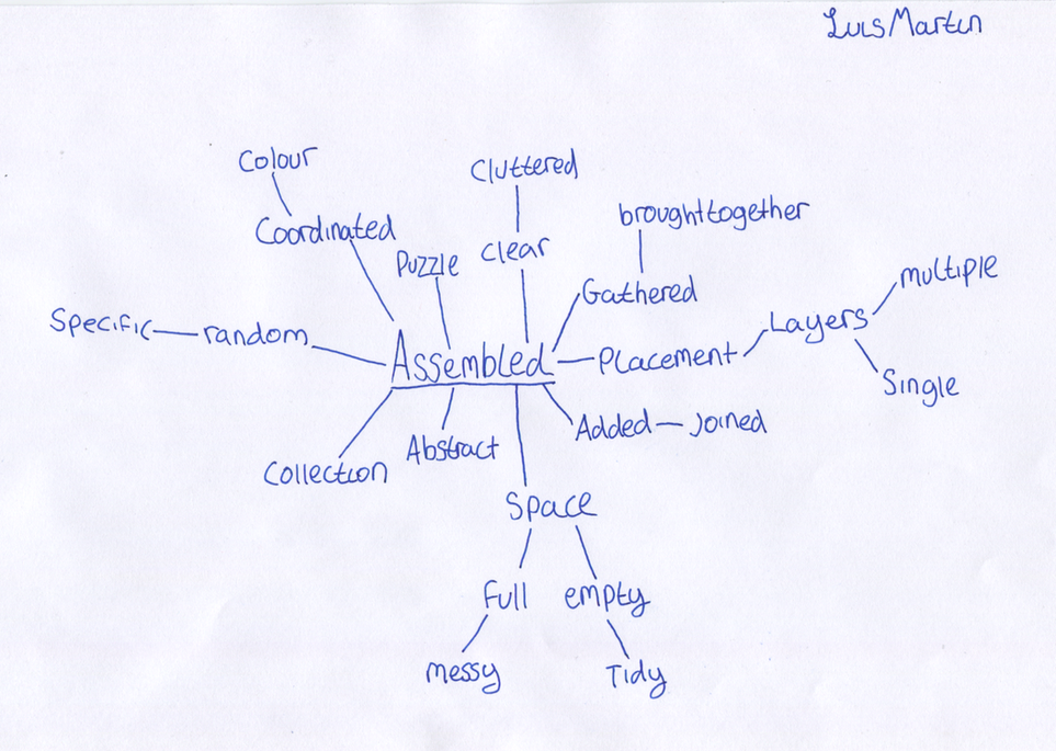
Assembled
For unit 2 of the GCSE photography course I have decided to chose the theme of assembled, I think that I will be able to create an interesting final piece that will have drawn inspiration from a variety of different photographers and artists who contribute to the theme.
Catherine Losing
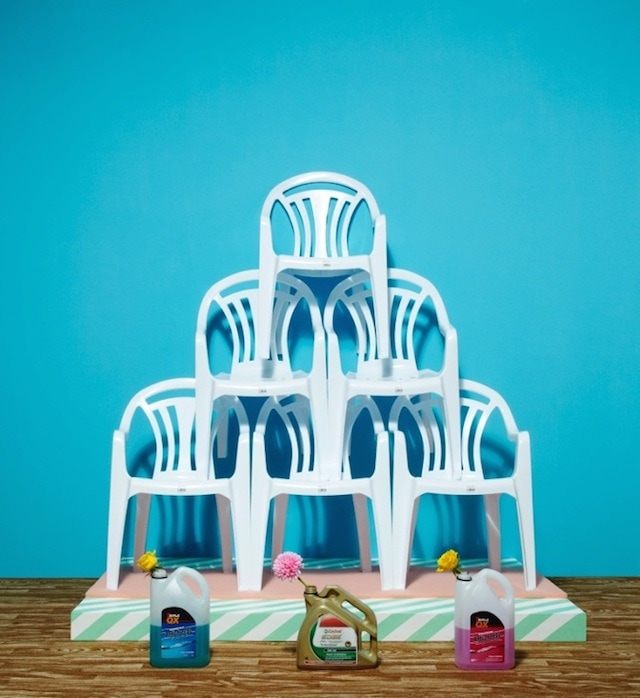

Catherine Losing is a photographer based in London who focuses on still life, her works are very bright and colourful, she pays a lot of attention to shapes and arrangements.
Her pieces link into my theme because she has focused on spacing and colour, she assembles seemingly unrelated items and organises them to create very aesthetically pleasing pieces of art.
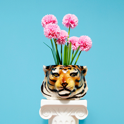
This is my favourite image by Losing. I like the image because of the ways that the colours compliment each other, the hot pink of the flowers and the soft blue of the background create a warm feeling within the picture.
All of the objects within the image would not normally be seen together, for example it is very rare that you would see a Tigers head filled with Pink Flowers, this makes the image interesting.
Her pieces link into my theme because she has focused on spacing and colour, she assembles seemingly unrelated items and organises them to create very aesthetically pleasing pieces of art.
This is my favourite image by Losing. I like the image because of the ways that the colours compliment each other, the hot pink of the flowers and the soft blue of the background create a warm feeling within the picture.
All of the objects within the image would not normally be seen together, for example it is very rare that you would see a Tigers head filled with Pink Flowers, this makes the image interesting.
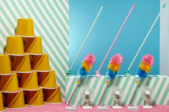
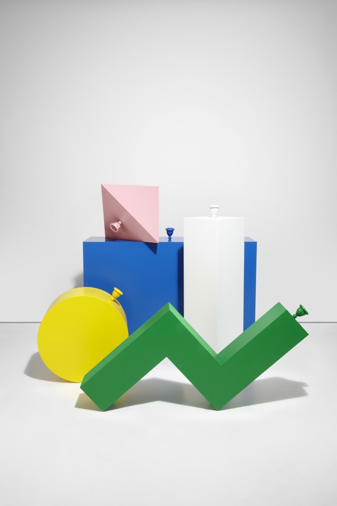
Dan Cretu
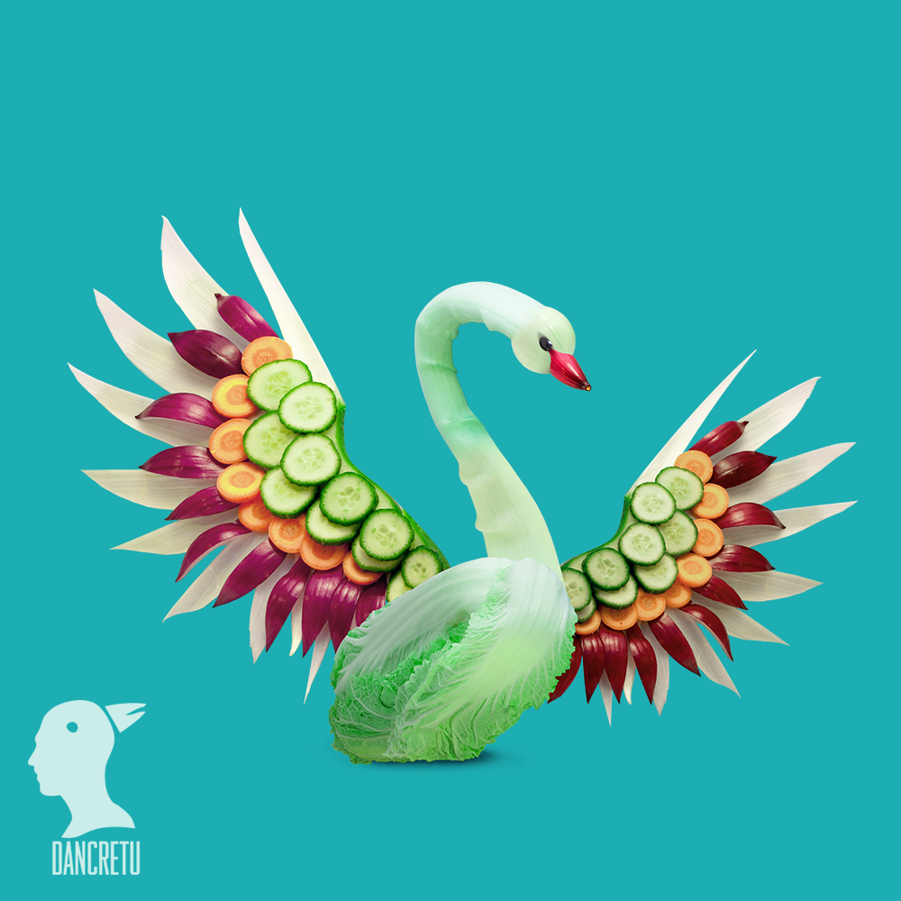
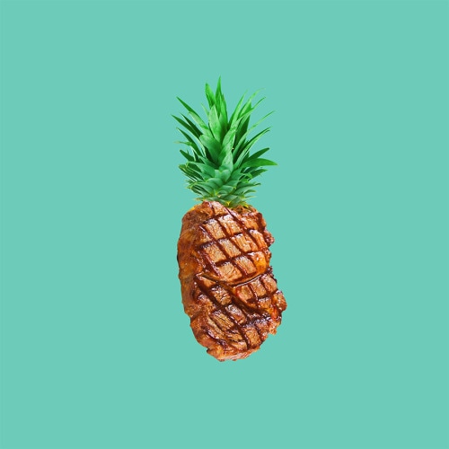

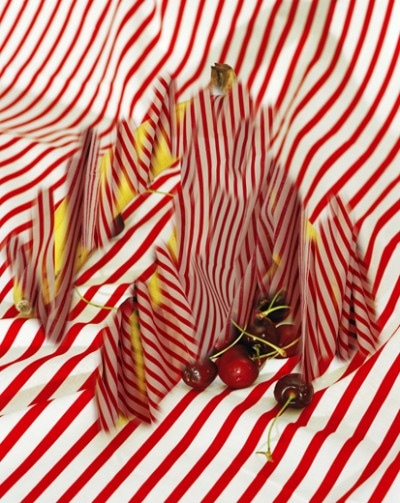
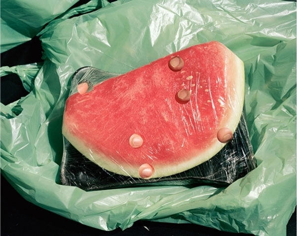
Dan Cretu is a photographer and artist who's speciality is using regular household objects and foods like fruits to assemble patterns and sculptures.
Much like Catherine Losing, Cretu's work is very bright and vibrant, he often uses blues in his work giving it a cold feeling. Cretu often creates images using foods.
This is my favourite image that Cretu has created, I like the simplicity of the subject in the image, the normal at first glance Pineapple fits into the centre of the image making it the obvious thing in the image, the dark Cyan background also makes the image feel warm, just as Losing's background did in her image.
First experiments

For my first images for this unit I wanted to experiment with colours and placement of images, the three images took inspiration from Dan Cretu, I like the way that he uses background colours as a key element to his work. The outcome of my experiment is very rough however I do see a concept within the images, I will continue to pick at the concept until I get an idea of how I can refine it into one final piece.
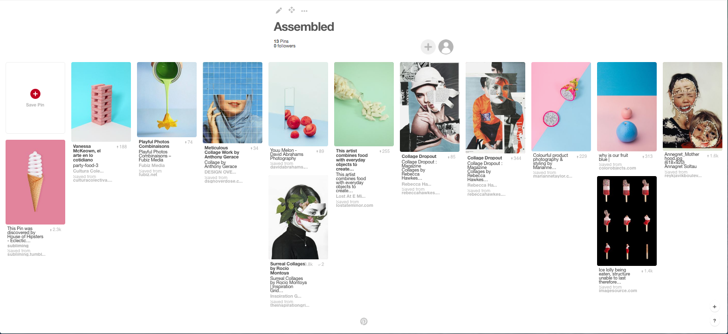
Here is my Pinterest board for the Assembled theme, whilst looking through the website I stumbled onto certain images that have pastel colour backgrounds, I like this theme as I think that by using lighter colours I can create a large contrast by adding in a different image which is a darker cololur.
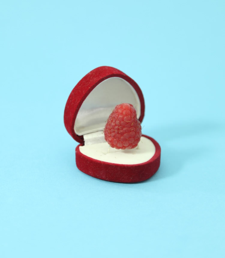
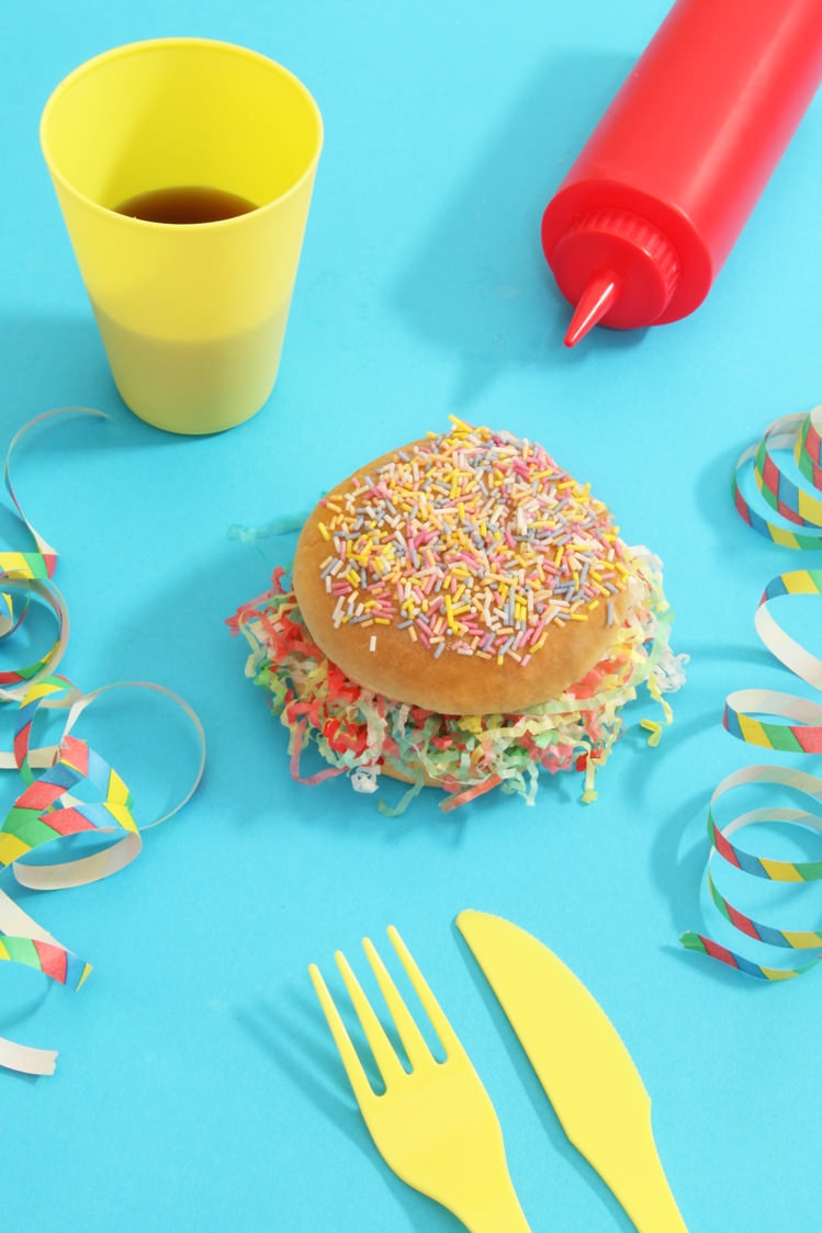
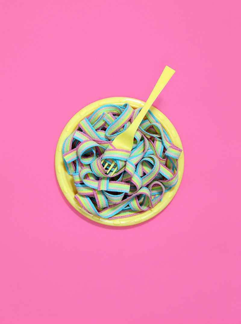
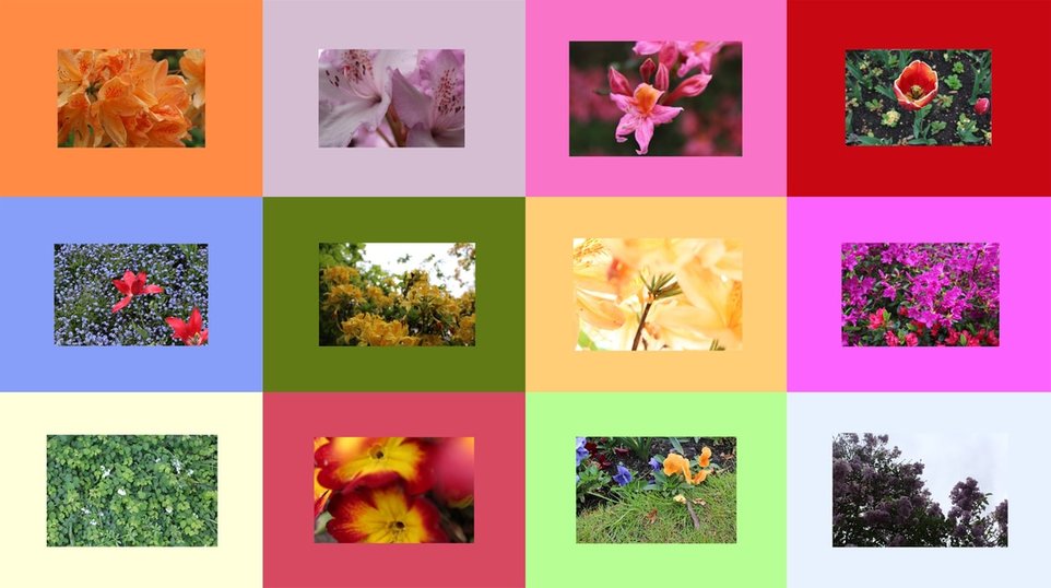
Vannesa mckeown
Vannesa McKeown is an artist that creates very interesting pieces of art out of fruits, her work is very similar to Dan Cretu.
She uses light pastel colours as the backgrounds of her pieces. Her work consists of turning fruits into shapes or more conventional day to day items.
My favourite image of hers is the third image in the gallery of her work. I like this image because of the way that the colours compliment each other, it very obvious to the viewer that McKeown has focused her attention on the colouring of the image, the hot pink background allows the light yellow of the bowl and spoon to appear very vibrantly, in my opinion the vibrancy is important within this piece as the bright colours draw the viewer into looking at the picture.
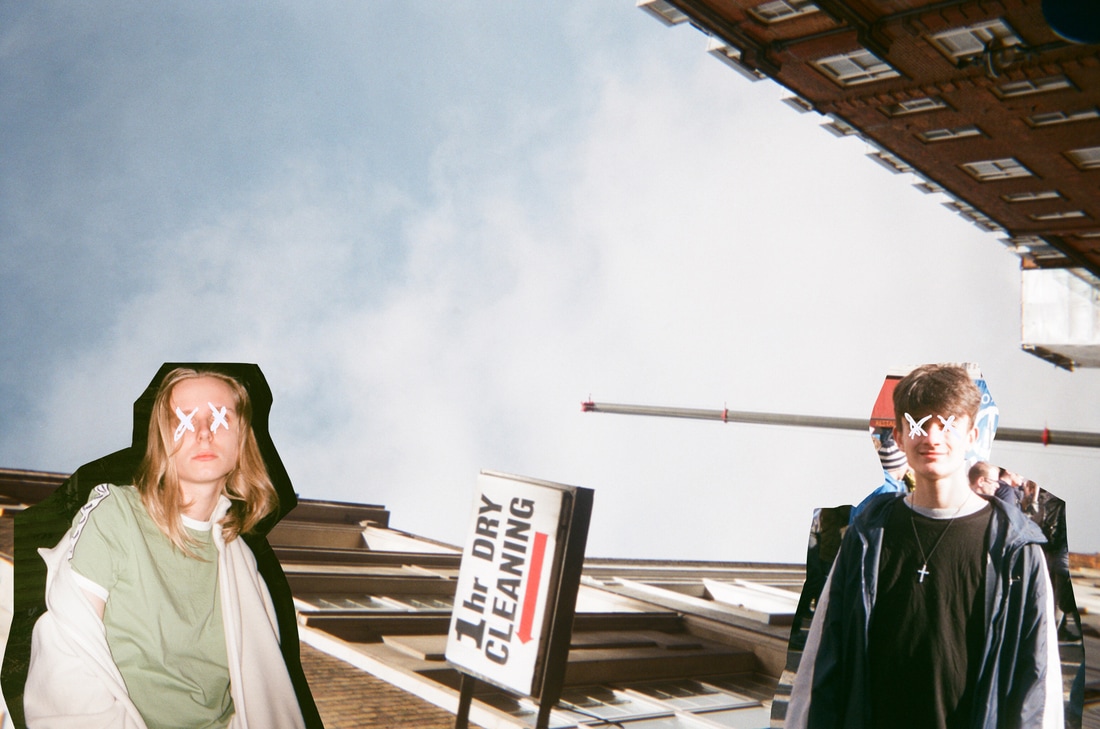
first piece (experiment)
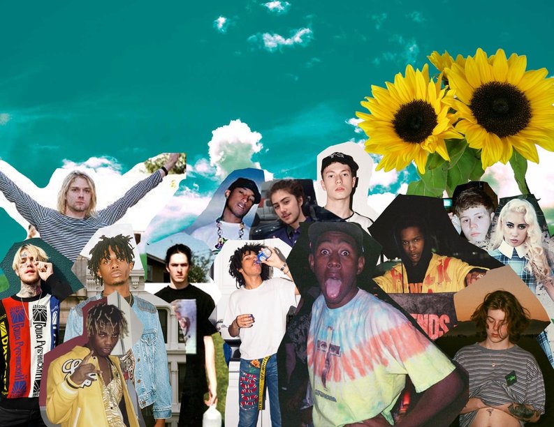
For my first piece for Unit 2 I wanted to try and create a image consisting of images of some of my biggest inspirations, this fits into my theme for assembled as I would be assembling different images.
I am happy with the outcome of my piece, initially I was going to print out and assemble the images with my hands, I decided to assemble them using photoshop because I would be able to be accurate when placing them.
I decided to crop each image with a jagged outline so it would look as if it were cut out.
To improve on this image I should think about resizing the images so that more of the background is visible.
The image was inspired by The Sargent Peppers Beatles album cover which was designed by Peter Blake and his wife Jann Howorth, I wanted to create a piece inspired by their work but by using people that Iam heavily inspired by.
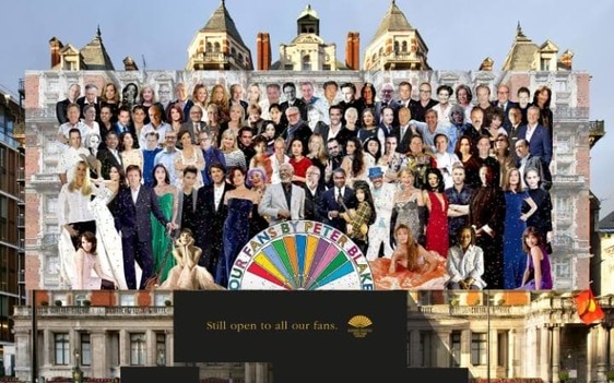
SARGENT PEPPERS ALBUM COVER
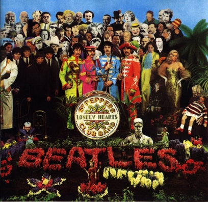
My first piece for this personal project was inspired by The Beatles 1967 album Sargent Peppers Lonely Hearts Club Band's cover which was designed by Peter Blake and his wife Jann Howorth. The cover shows the members of the Beatles surrounded by a variety of celebrities and important cultural figures.
The concept of the album cover first came from Paul McCartney who had drawn images of the idea, he gave the drawings to Blake and Howorth. However four years prior to the release of the album a mysterious swedish band called Mercblecket gave McCartney a copy of their EP, the cover is very similar to the Sargent Peppers cover, this is rumered to have been an influence on the design of the cover.
This year marks 50 years since the release of the album. Recently it was revealed that Peter Blake would have a new piece on display at the Mandarin Oriental Hyde Park in Knightsbridge, the image plays off of the theme of the Sargent Peppers album cover whilst giving it a modern twist by using celebrities from today.
NEXT STEPS
My next step in the project will be to refine my first experiment, the refined version will act as my first completed piece of the unit.
I will refine the piece by experimenting with a projector, using this I will project the images onto a wall, this will make the image appear bigger, in the foreground to the picture I will have the original version of the image, this will create an interesting effect.
I will refine the piece by experimenting with a projector, using this I will project the images onto a wall, this will make the image appear bigger, in the foreground to the picture I will have the original version of the image, this will create an interesting effect.
second images
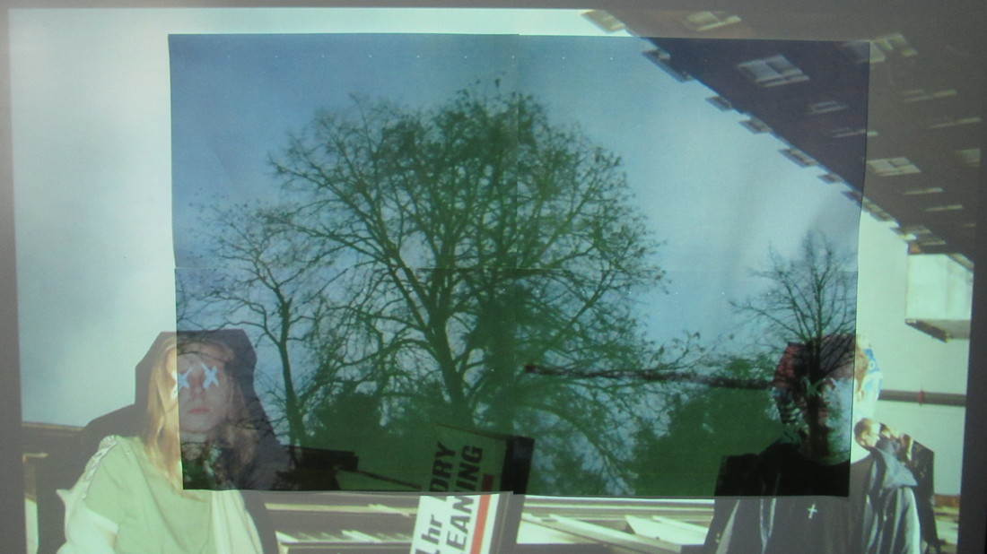
I created three different images using photos that I took on a disposable camera, I used photoshop to crop elements of each image and paste them onto a background, I then used the white board and projector to project the images over a new background image creating a layered effect. The projection has created a ghostly effect over the images.
Here are the images that I projected.
Here are the images that I projected.

In order to use the background I had to cut it into four, I was forced to do this because the image would of been far too small to project onto.
The initial background image had too small a resolution, this caused the image to be pixilated, however I feel that by having the more pixilated background the images feel more abstract. The theme of assembled is shown because the layered images are assembled in random and abstract ways.
This technique was interesting for me to experiment with, I feel that the images that I created could be a building point for me to create my final piece.
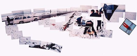
Lucas blalock
Lucas Blalock is a photographer based in New York, his work uses Photoshop and is often layered and distorted. He uses the tools in Photoshop almost incorrectly in attempt to create interesting new patterns. He shoots all of his photographs on a large format camera then scans the original image in order to distort or alter it. I learnt about his work through a video posted on Vimeo, the video shows an insight into the mind of the artist, it shows how his thought process works whilst designing and creating.
His work links to my theme of Assembled because he is assembling strange patterns into seemingly regular objects.
Here is some of his work, out of the three images that I had selected my favourite is the middle photograph. I like this image because Blalock has used a tool in Photoshop that usually would be used to remove problems within an image to obscure a rep and white background. Other than this image I like the first image, this image is appealing as the artist has layered multiple images and used the eraser tool in photoshop to give the impression that objects within the image repeat.
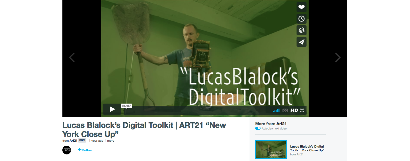
The video I discovered him through.
ideas for final piece
After researching a number of artists who create works that could be put into the theme of assembled I have started to come up with a number of ideas for my final piece.
I aim to use elements from a variety of different artists. One element that I am interested in implementing into my piece would be Vannesa Mckeown's use of bright coloured backgrounds, I am interested in this concept because I feel that I would be able to either match certain colours with details from photographs. This would be interesting to experiment with.
Another technique that I want to experiment with is Blalock's photoshop tools. By using these tools I will be able to distort images and give them different and unique patterns.
This is an image that I created experimenting with the bright coloured backgrounds used by Vannesa Mckeown. I chose the acid green colour because I thought that it would show an interesting contrast between the dark natural greens that are shown in the central image. This concept shows how to make an image more eye catching. By seeing the radical colour first your eyes would later be drawn to the actual image and not just the boarder.
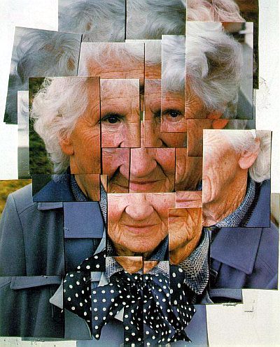
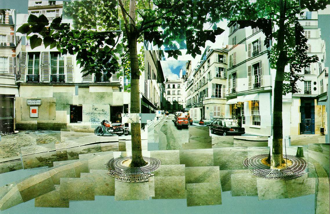
david hockney photo collages
Whilst looking at the art of David Hockney I found some of his photo collages, the collages fit into the assembled theme very nicely.
In the images Hockney has created a story or journey through a selection of images layered over each other. Hockney was famously quoted saying that "Photography will never equal paintings". He personally called his layered collages Joiners, by compiling the individual images he was able to create one final complete picture.
In my opinion the "Joiners" allow the viewer to experience more than just one regular image, there is a very clear narrative present in the images.
He first made the collages by accident, he taped two polaroid images together, when he looked at them he noticed a narratives between the images.
Hockney's Joiners are very similar to the works of Lucas Blalock because of the attention to detail of the layering.
Here is a selection of the Joiners.
My favourite image is the middle image, this particular image stands out to me because of the placement of each layer, the way that Hockney has layered them almost makes the image appear to be 3D.
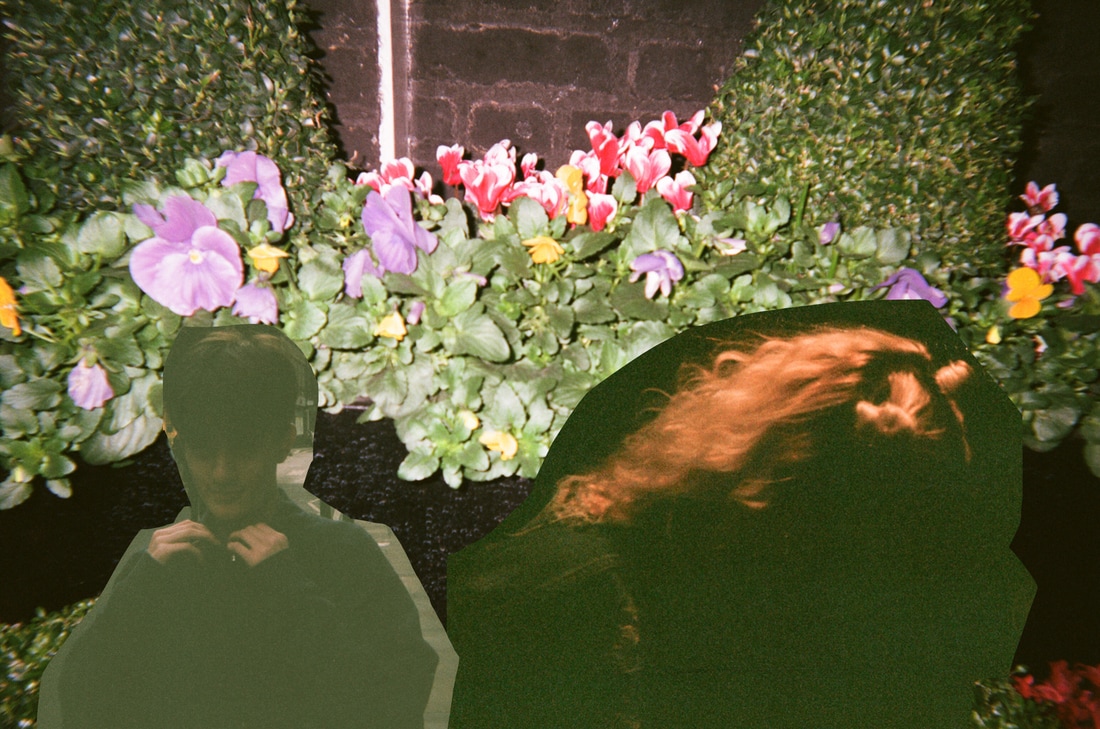
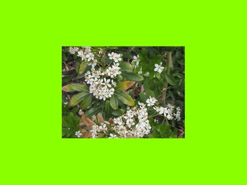
RESPONSE TO THE JOINERS
The image above is my response to Hockney's Joiners, I used photoshop tools to edit out parts of the flower. Then I changed the size of the different layers to create the effect that Hockney shows in his images. To improve my piece I could add more layers.
The image is fairly abstract and gives a very warm feeling due to the combination of colours. The part of the image that strikes me as the most interesting is the red outline of the flower because the colour is very eye catching.
My response follows along the same lines as Hockney's joiners, the main difference is that when I look at the joiners you get a colder feel.
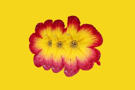
andy warhol's flowers
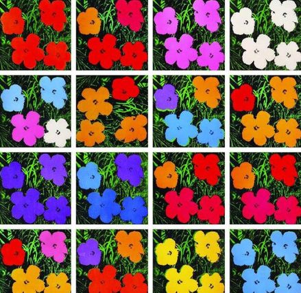
Andy Warhol was an artist based out of New York, he is considered as a leader of the pop art movement, he died in 1987. One of the pieces of his that I liked was this collection of coloured flowers. I feel that this links into the theme of assembled.
The image shows a grid with painted over flowers in a variety of colours, the image is interesting to me because it is the opposite of the idea that I experimented with where the background was the bright colour and the image in the foreground is unedited.
Warhol is known for his use of bright and bold colours, the image is very eye catching due to the insides of the flowers being the main source of colour. The grid layout lets us see a variety of different colour combinations.
Bellow is my response to Warhol's work. I adapted the initial concept by switching the colour from being the inside of the flower to being the background, this also links to Vannesa Mckeown's work where she used bright colours as the background for her work.
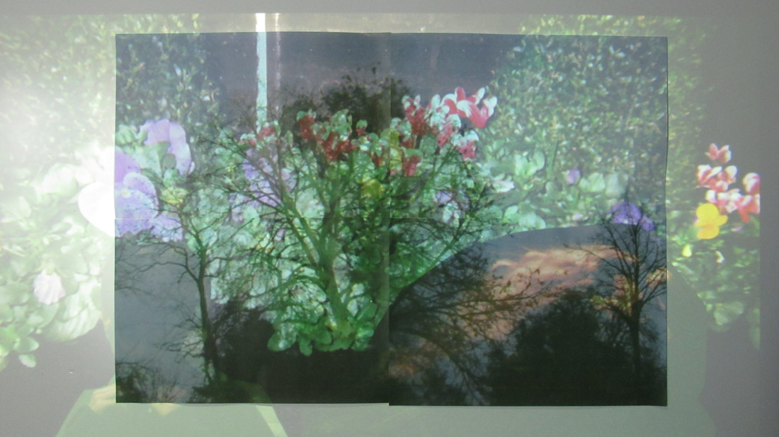
PROJECTIONS FOR FINAL PIECE
For my final piece Iam going to make a zine of the flower images, Iam going to use the projection technique that I used earlier in the unit, the technique creates a ghostly spooky effect. I feel that the layering of the bright vibrant colours will create an interesting effect.
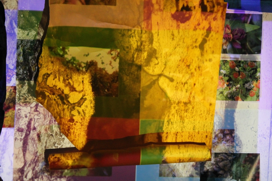
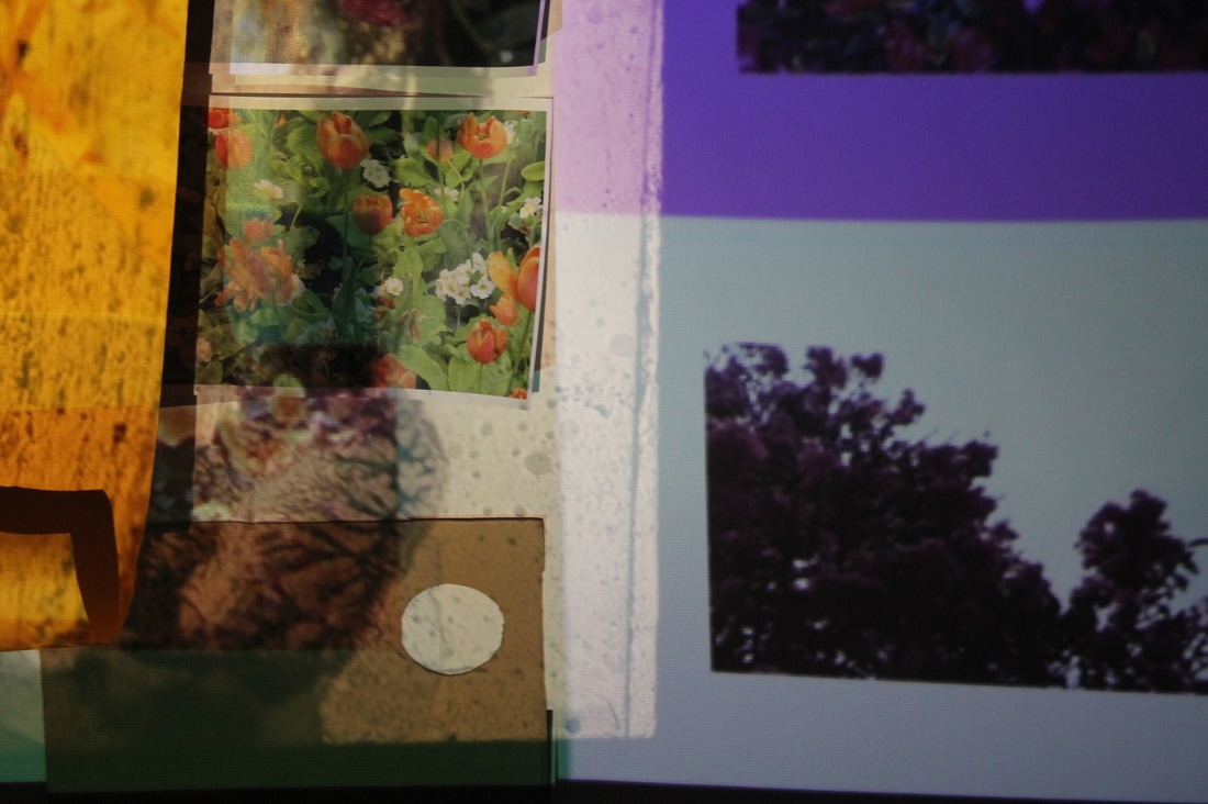
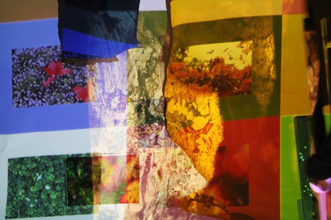
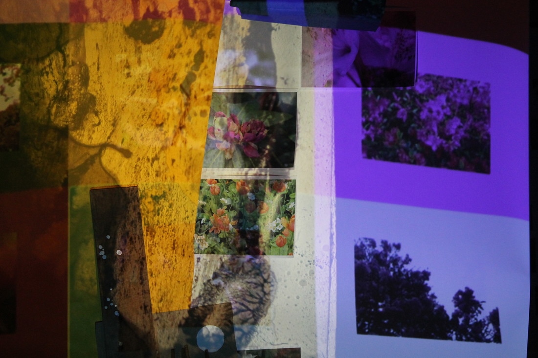
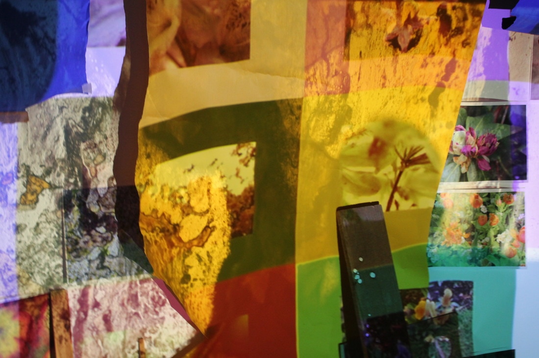
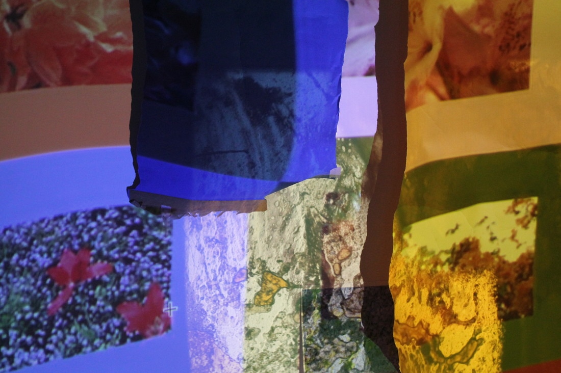
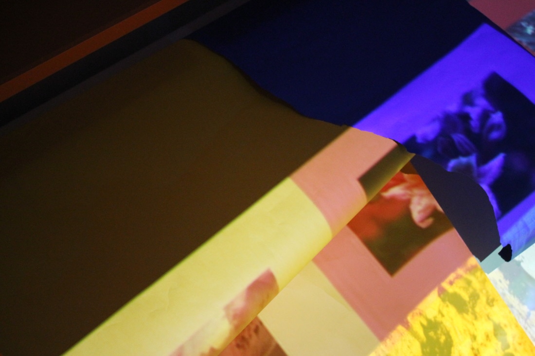
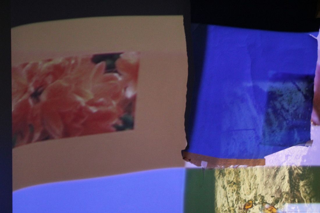
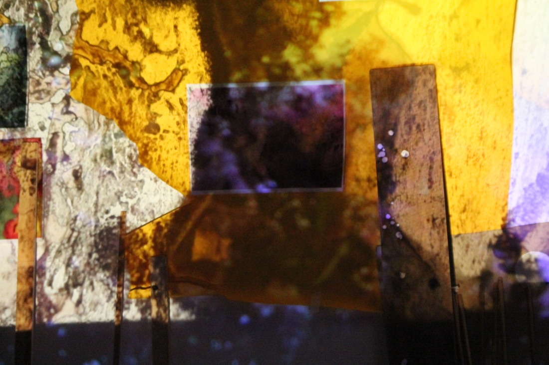
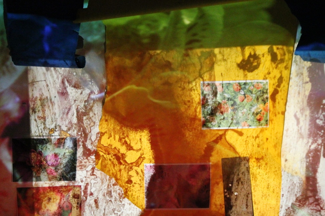
evaluation of my final piece
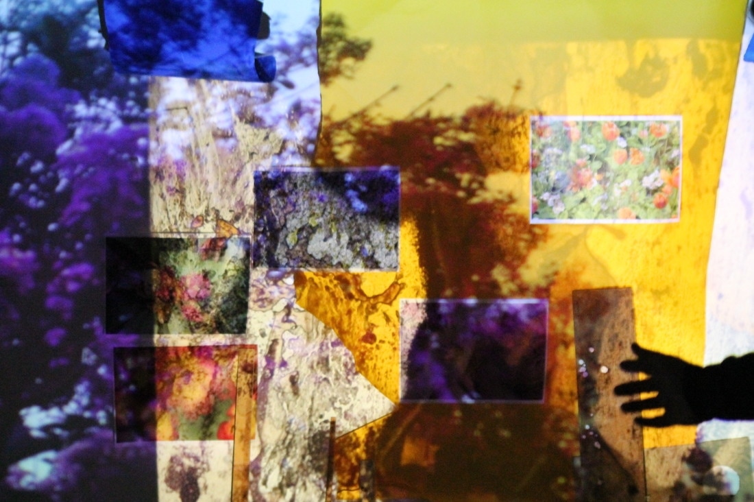
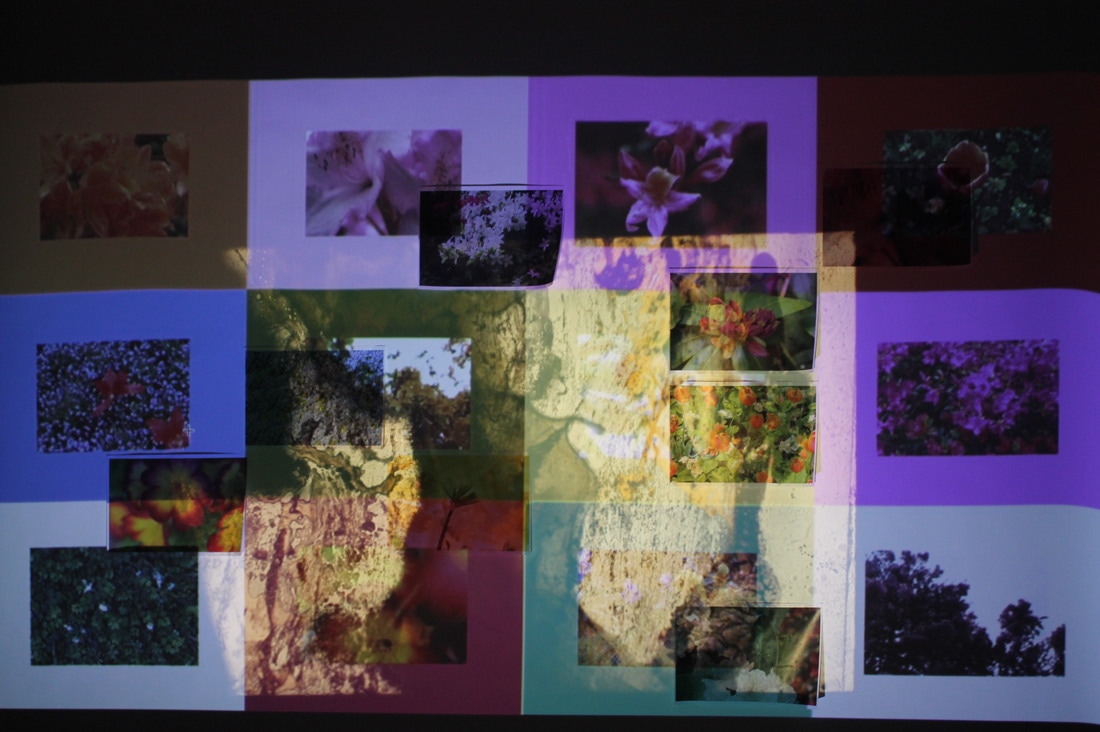
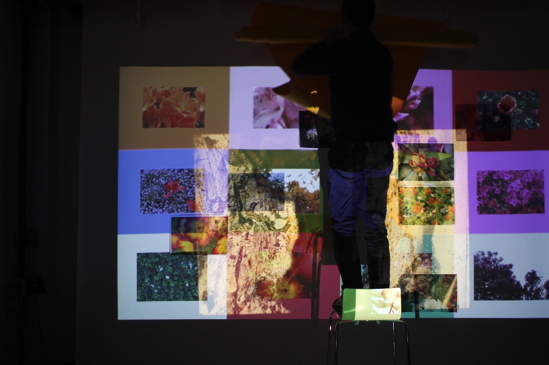
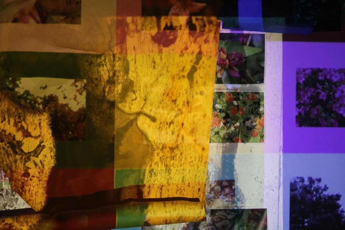
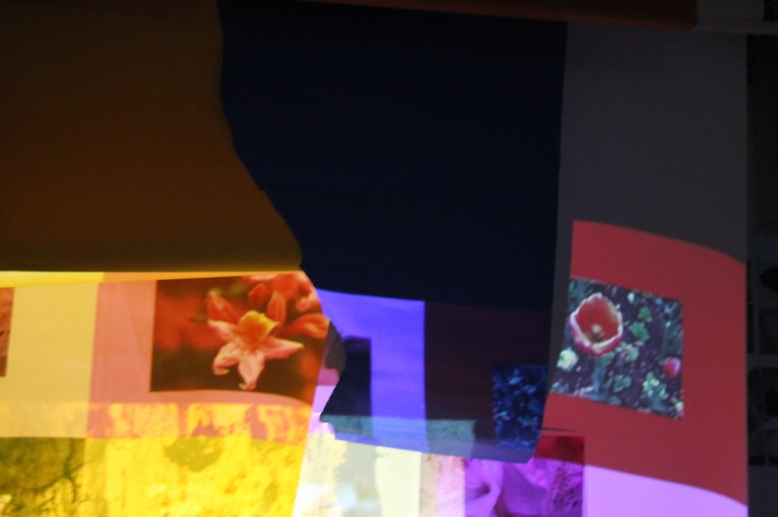
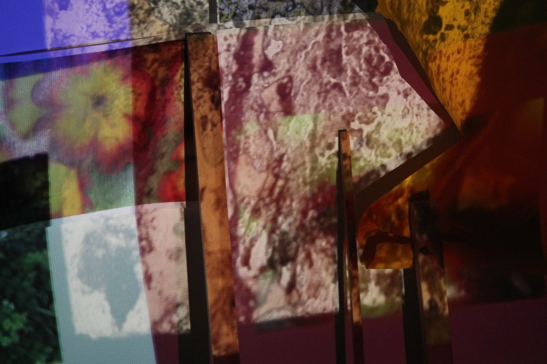
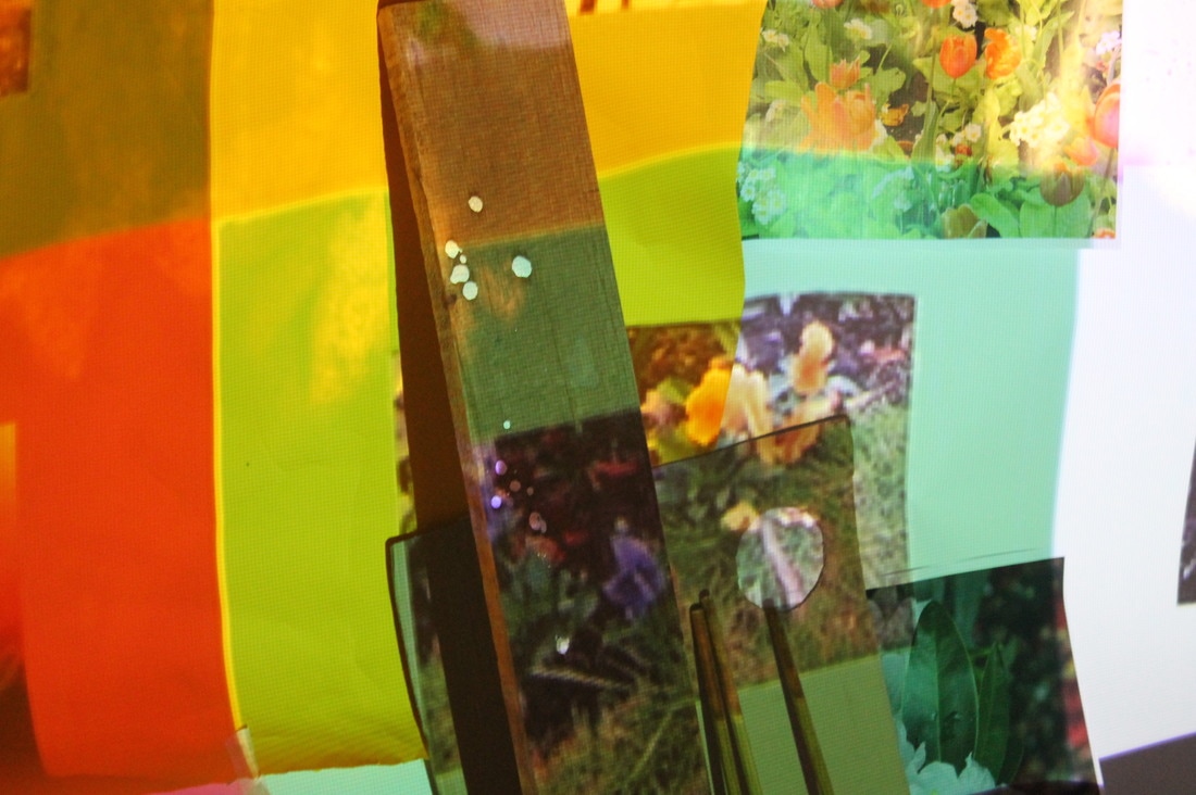
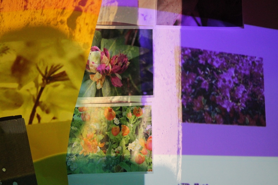
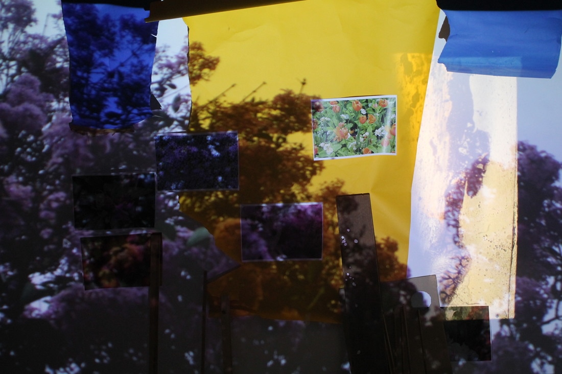
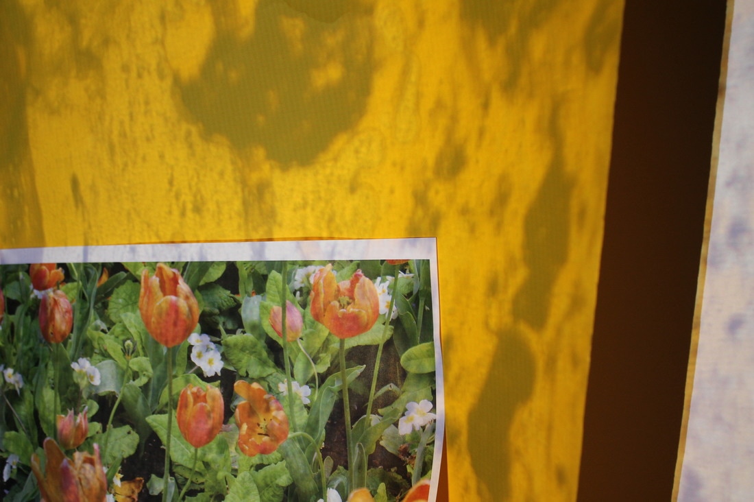
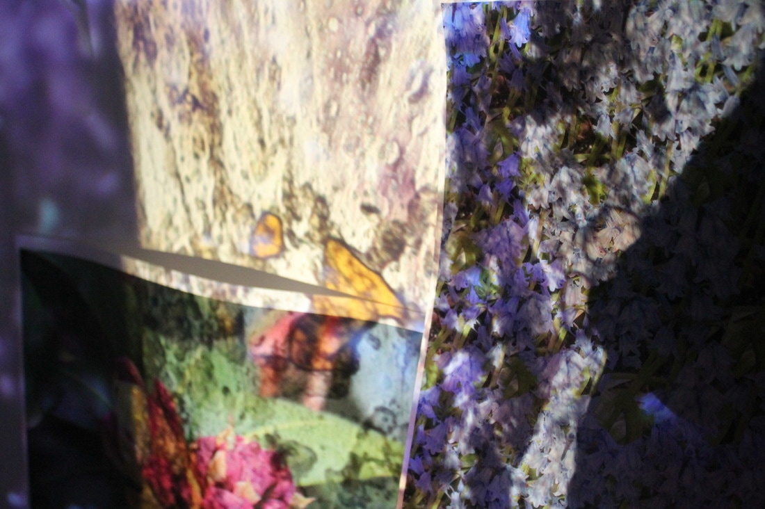
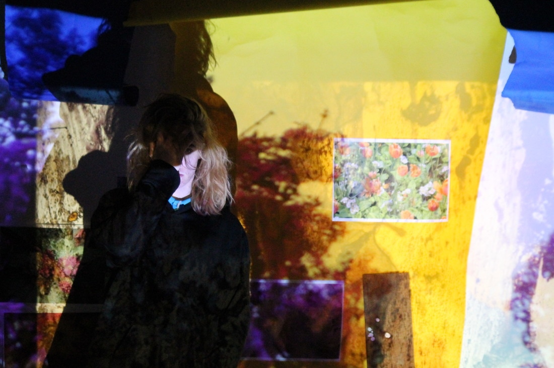
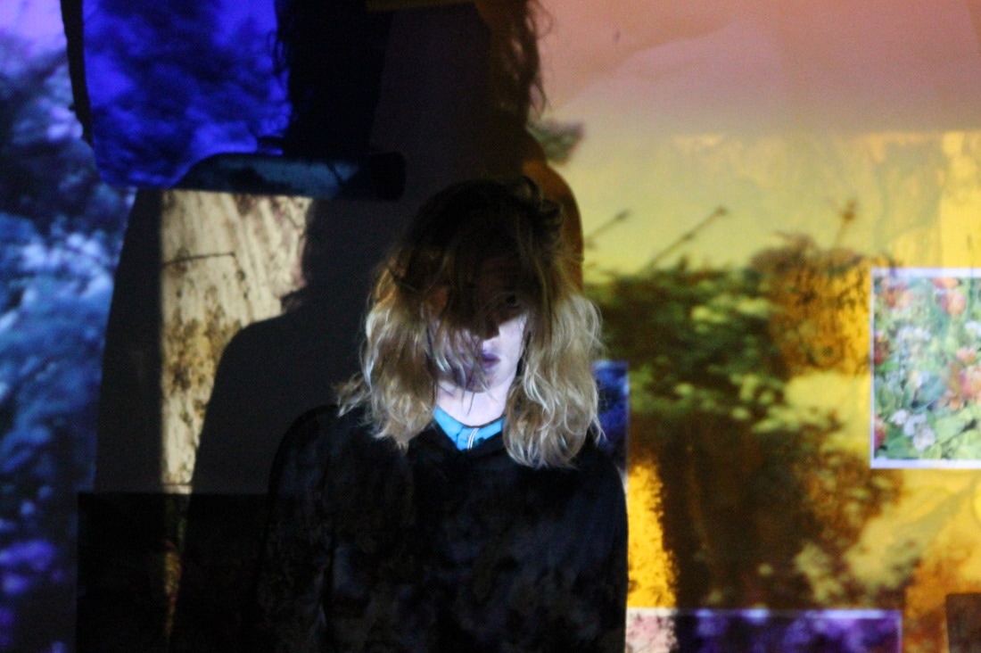
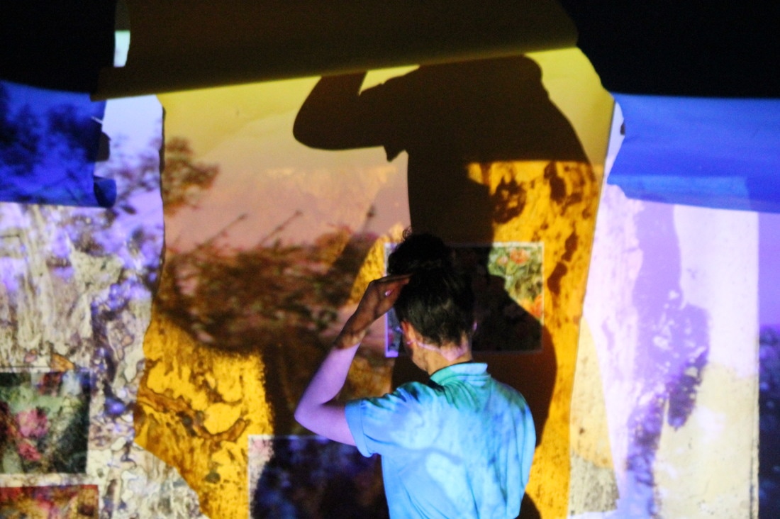
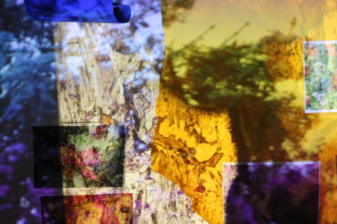
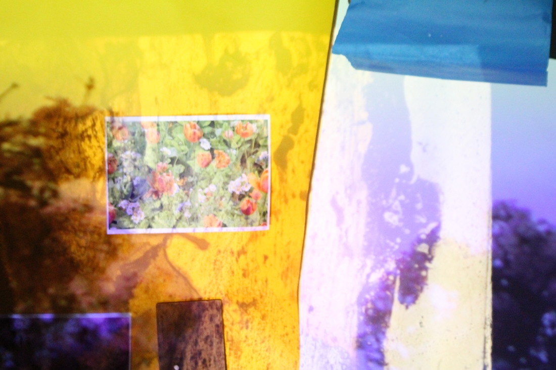
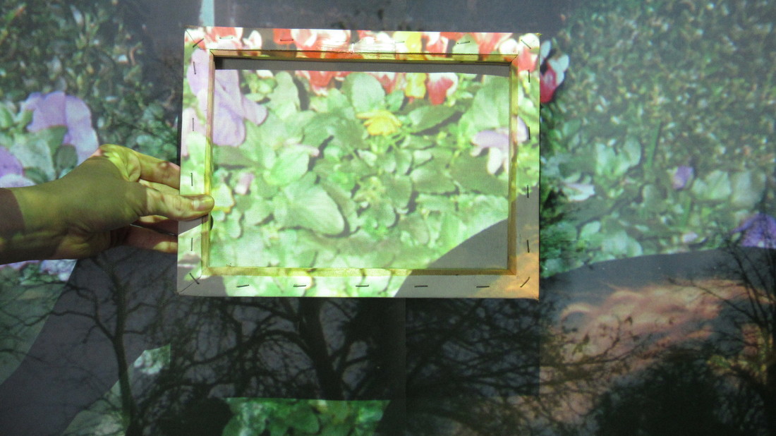
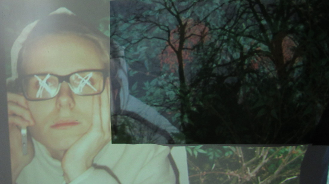
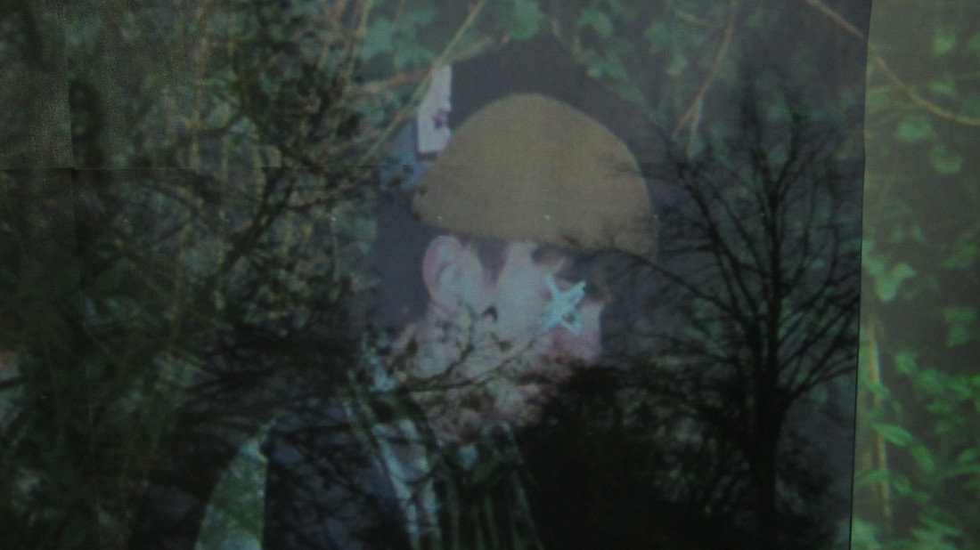
My final piece for Unit 2 consisted of images that I took of flowers being projected onto another image that I created, in the foreground to the projected images I placed random objects to create a more layered effect.
This is a refinement on the projection experiment that I under took earlier in the unit. The outcome of my project is very abstract and due to the layering and the opacity of the projections, the anarchic and random way in which the light fell onto certain parts of the piece allowed different parts of the work to be seen in strange ways, for example the projection that falls over the yellow banners gives it a speckled effect.
The layout of the images in the piece are fairly bipolar, everything is either very scattered or very close together. After photographing the piece on its own I decided to try and add people into the foreground of the picture, I felt that this would give the photo more depth whilst still maintaining the ethereal and spacey atmosphere that was created by the bright projected colours, with the addition of people in this piece there were shadows being created, I liked the effect that this had on the rest of the work because it distorted certain parts maintaining the spacey and lo-fi aesthetic that I had created.
The most eye catching part aspect of the piece was the yellow card that was pinned up onto the white background, in my opinion this is because it covers a large amount of space, as well as its size it also had an image projected onto it. I feel that the piece is effective as my final piece and fits into the Assembled theme because of the shapes, colours and objects that I had to assemble to create the piece. Bellow are the three images that I feel embody the piece and clearly show what is happening, I feel that these images do this because
they show the wide spectrum of colours that are visible in the piece.
The meaning of the piece is that there will alway be colour even if it being covered up, this is represented by the images and objects that cover the bright and colourful backgrounds.
The images that were being projected showed very vibrant colours and were all of flowers, I enjoy taking pictures of flowers because you often come across very interesting and unique colours.
To improve the piece I would make the objects that I assembled much clearer as I feel that this was an important factor in the piece and in the images they aren't as visible as I had hoped.
Over all I am very happy with my piece as I feel it shows refinement of older experiments from the unit and it shows that I have been able to use research of other artists to develop ideas for final pieces.