ABSTRACTION
Introduction to Abstraction
Our first Personal project in Year 10 is Abstraction, this topic uses the theme of not always understanding what a picture is.
The definition of Abstract is " consider something theoretically or separately from (something else)".
First impressions
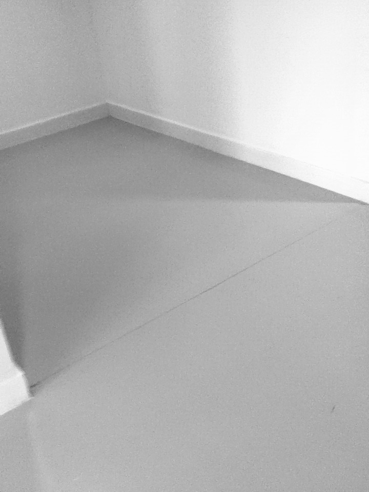
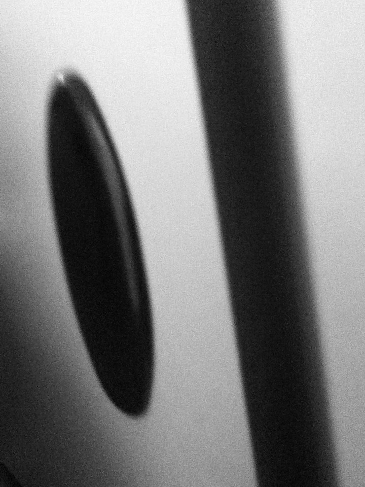
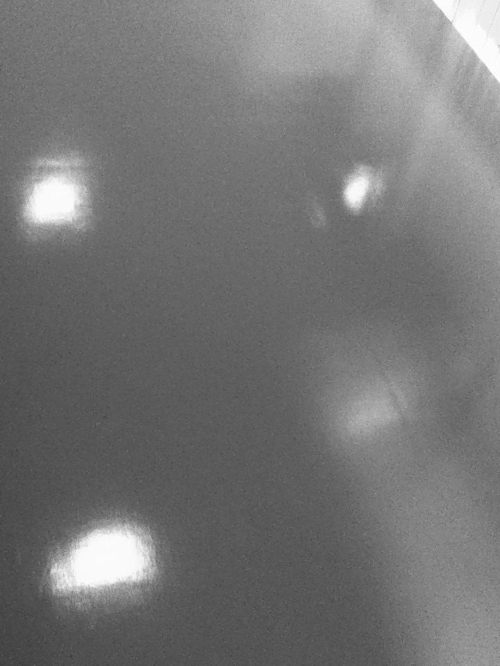
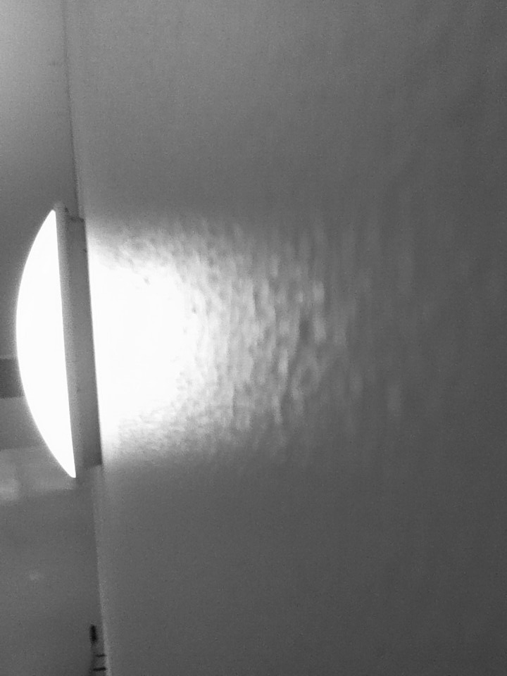
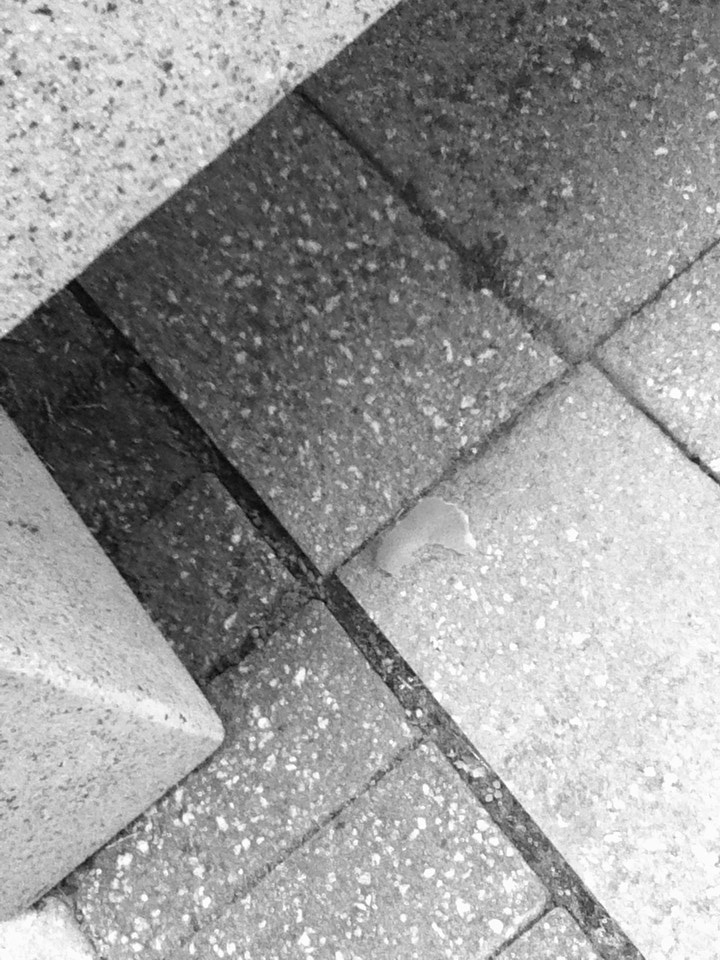
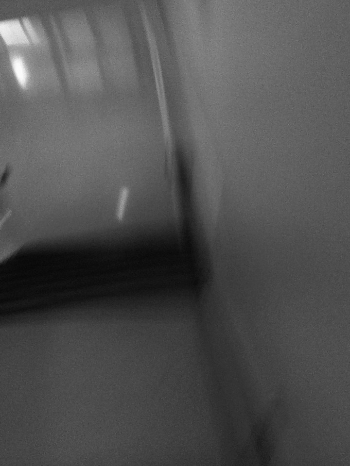
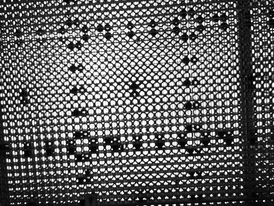
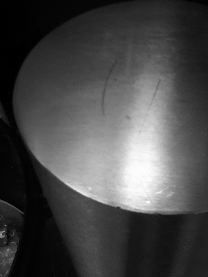
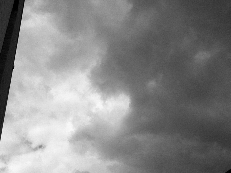
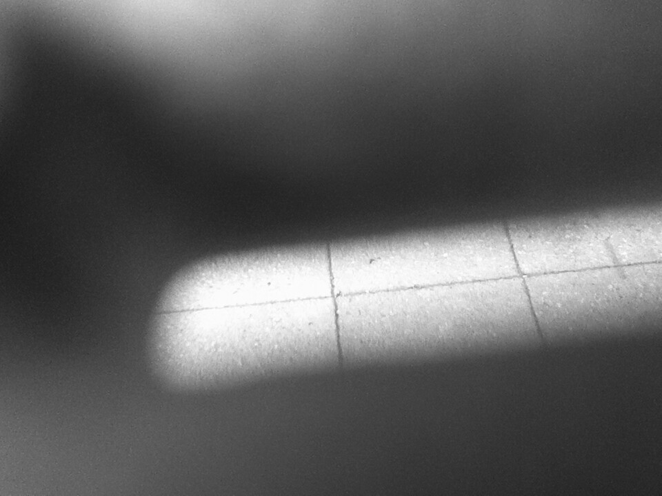
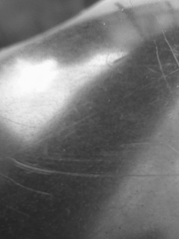
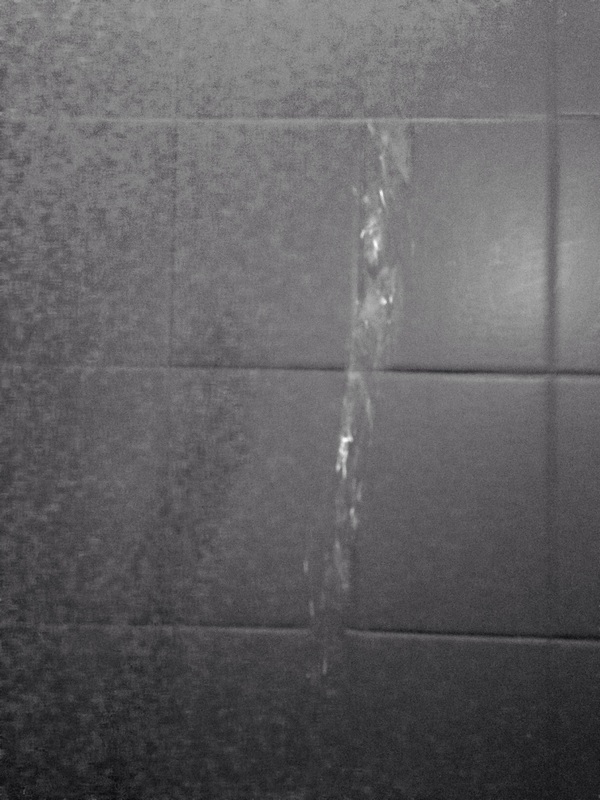
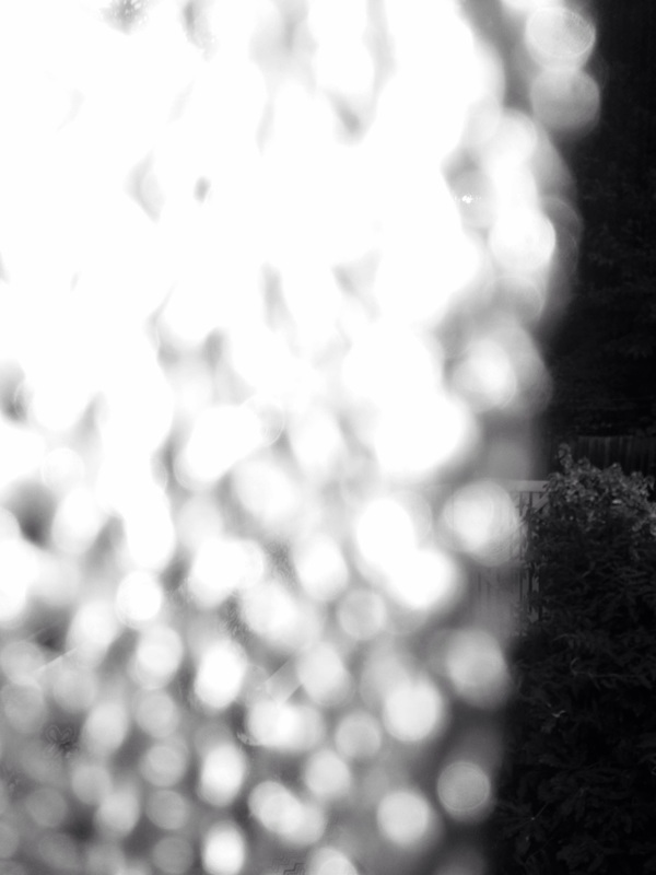
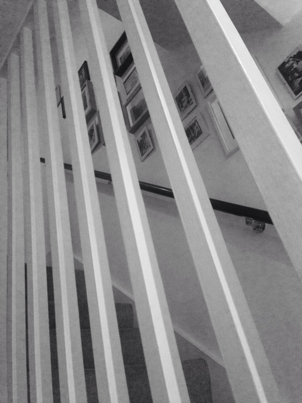
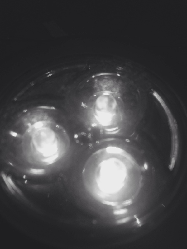
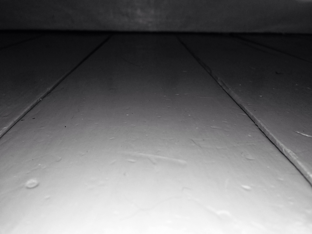
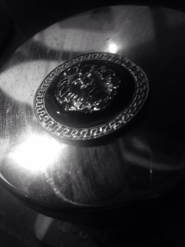
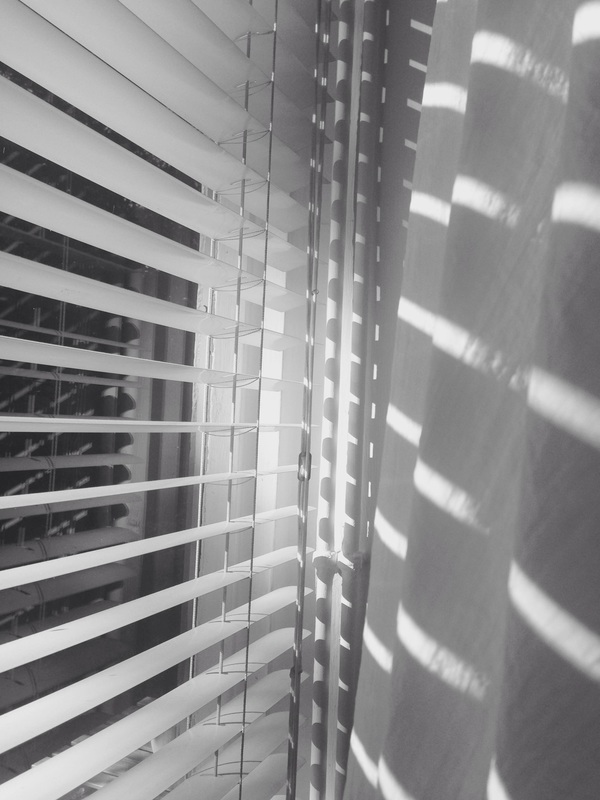
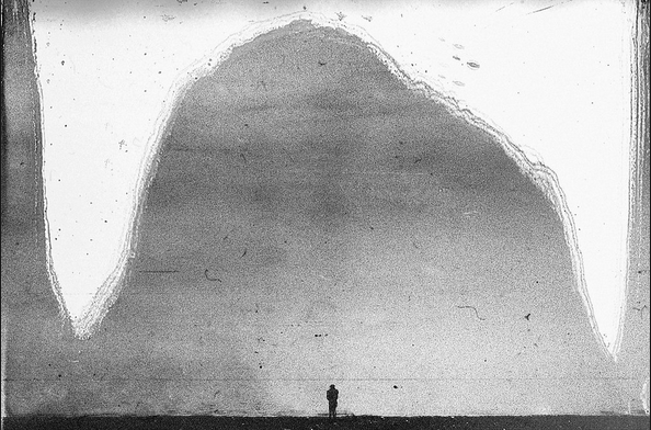
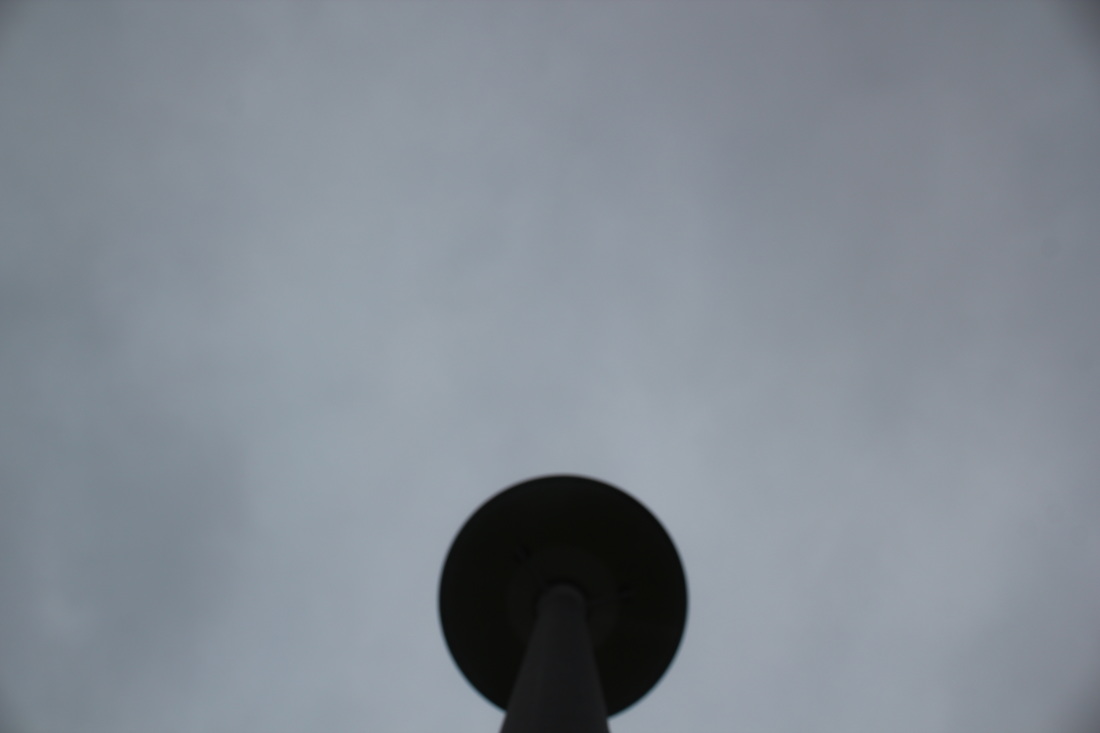
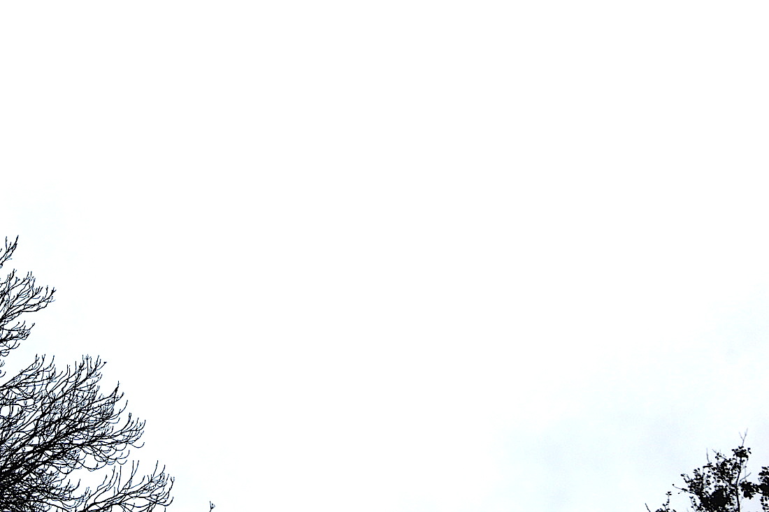
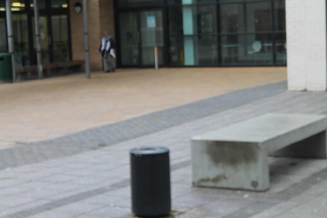
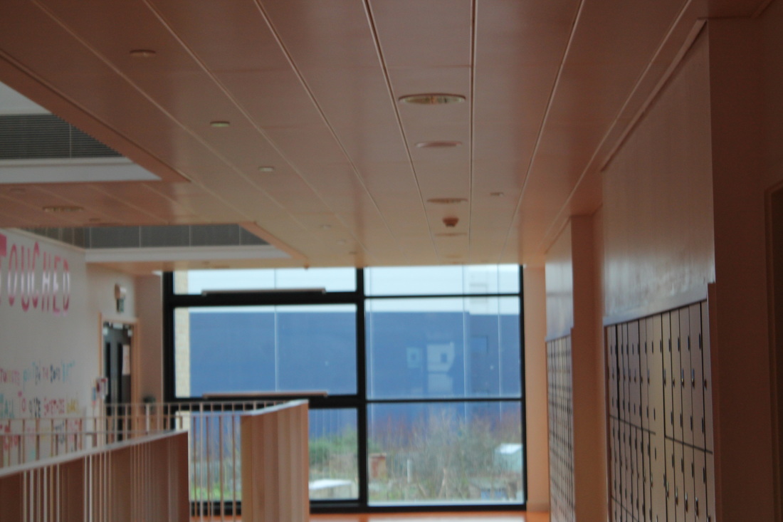
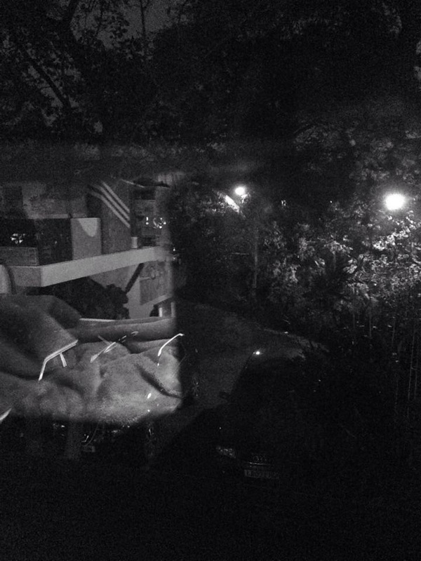
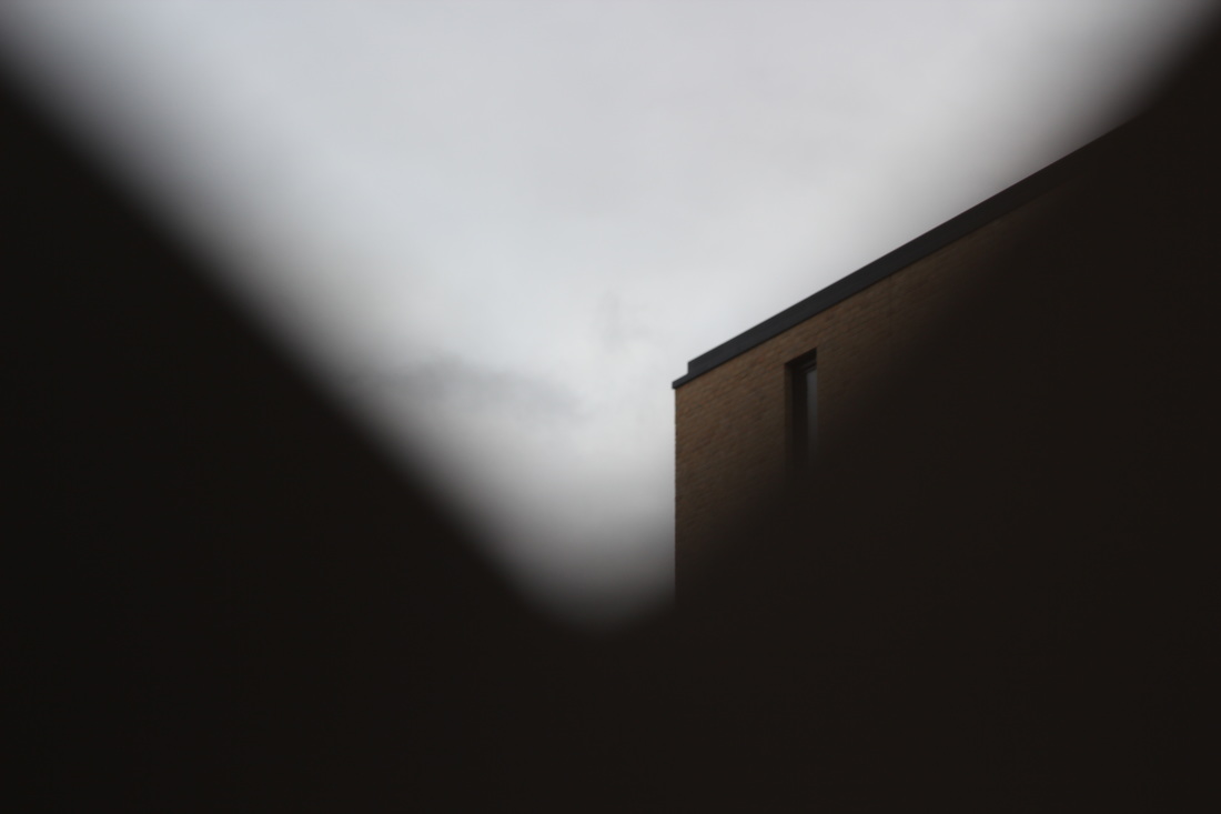
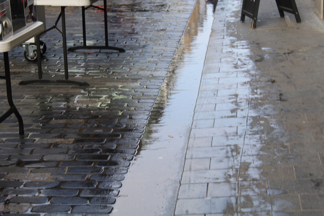
Here is my first batch of Abstract photos. I took them outside in the play ground and I focused on the light and shadows rather than the con-tense shown in the picture. Even I, the photographer, can't identify what the picture is of, whilst taking the photos I focused on getting a reflection, a ray of light or a shadow.
My favourite photo is the one of the metal pole (second photo on the third row), a WWW for the photo would be that I captured a ray of light that has been reflected off of the metal, an EBI would be to obscure it more and make the viewer think about what it might be.
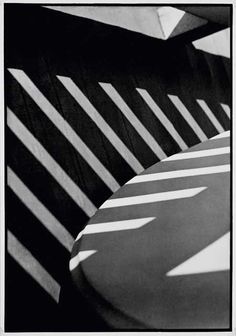
Paul STRAND
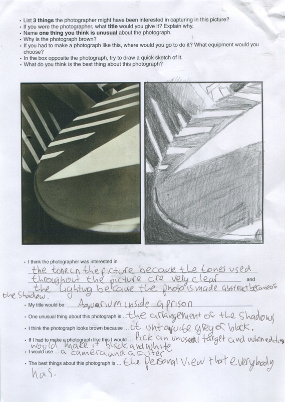
Paul Strand: Here is a piece of work done in our first lesson of the year. It is about a Paul Strand photo, we had to try to copy the photo with the correct shading.
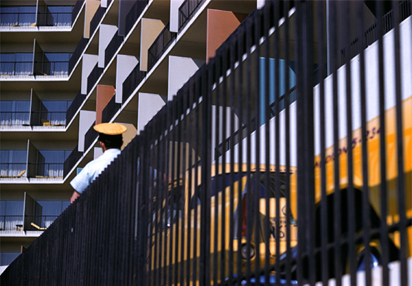
There were then questions which we had to answer about the photo, I said that I would call it Aquarium inside a prison because the outline of the shadow looks like bars in a prison.
There were then questions which we had to answer about the photo, I said that I would call it Aquarium inside a prison because the outline of the shadow looks like bars in a prison.
FIRST HOME Abstract photos
|
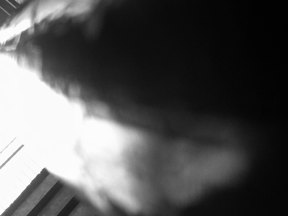
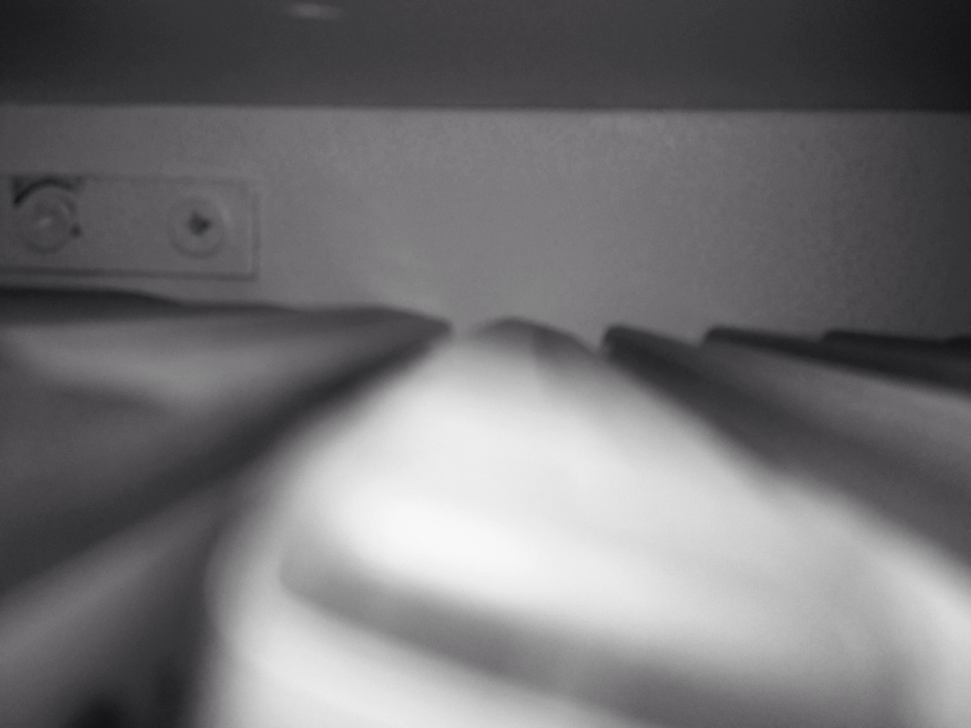
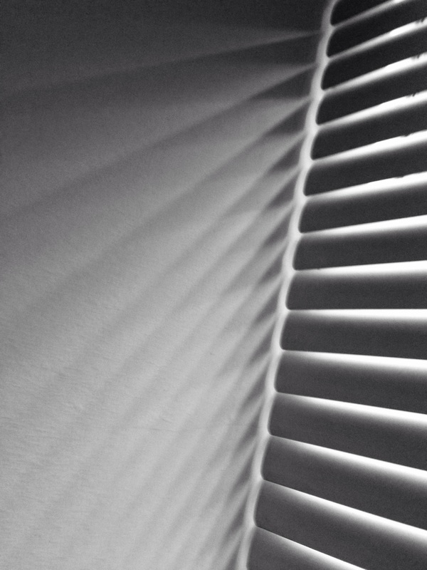
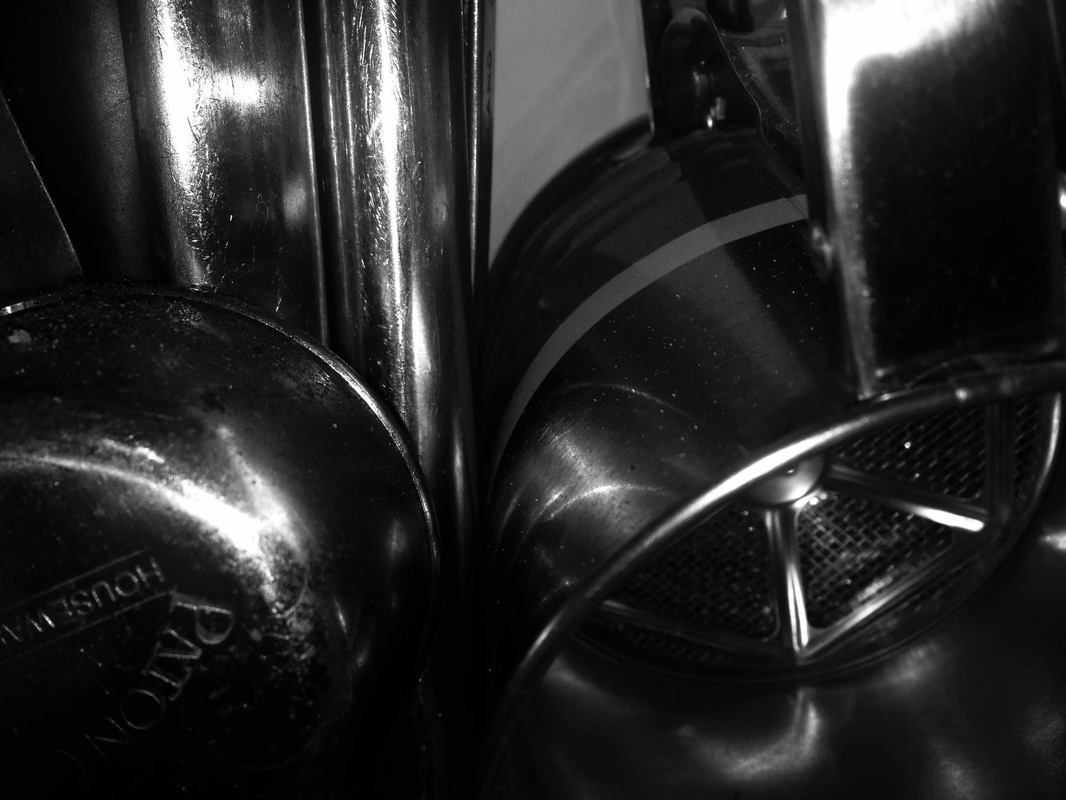
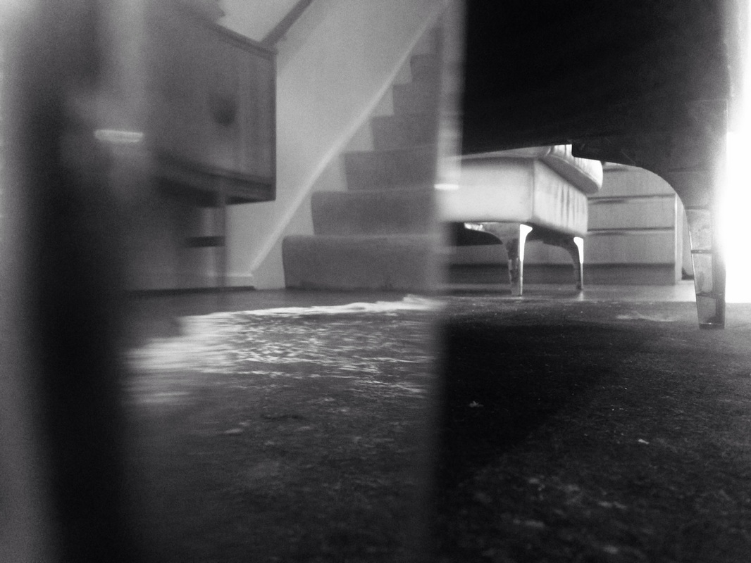
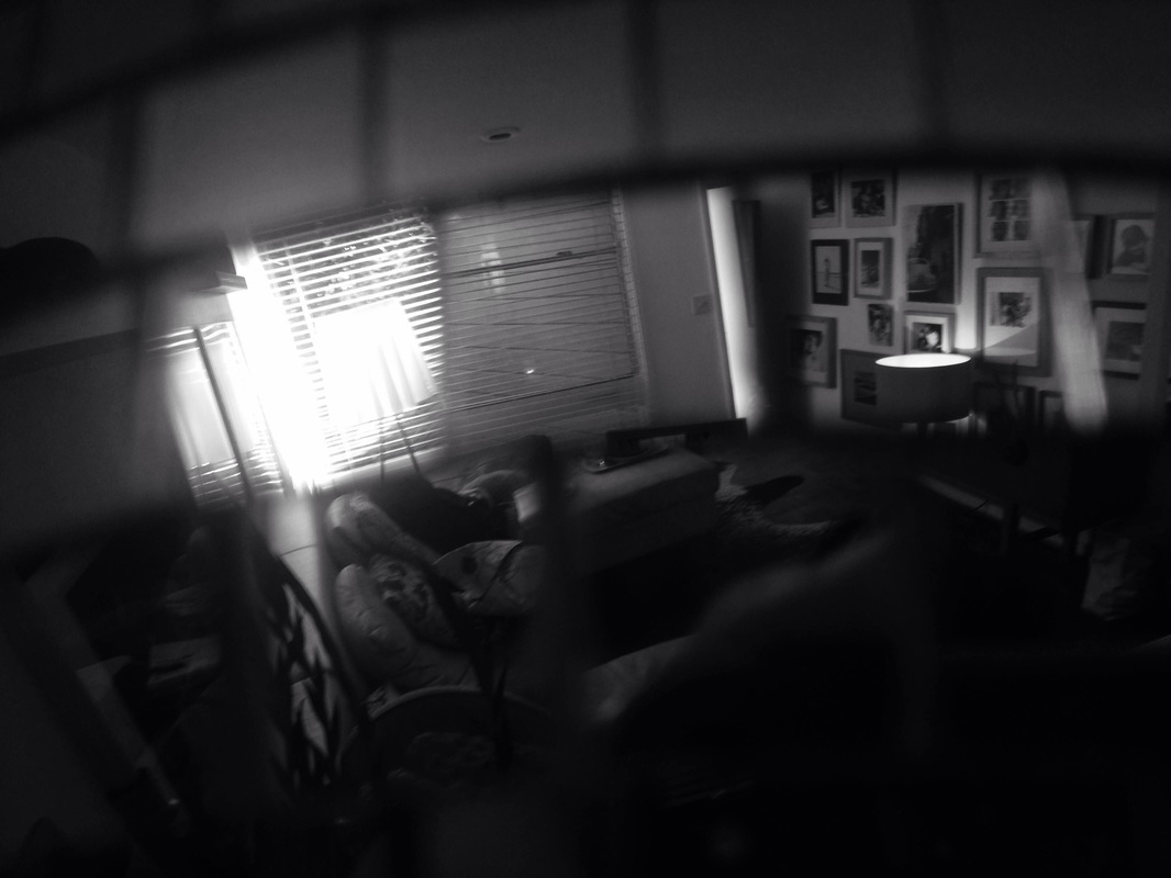
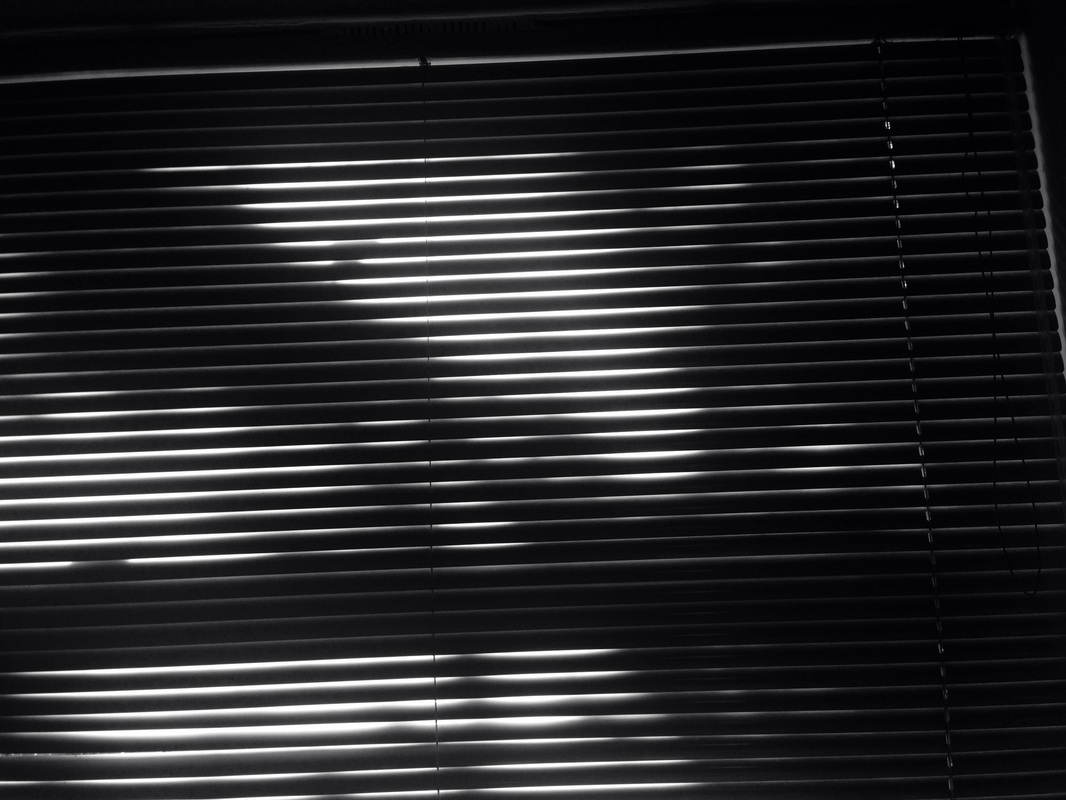
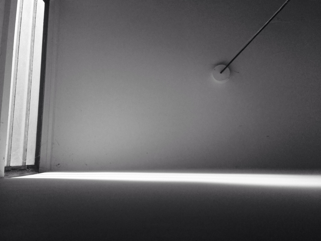
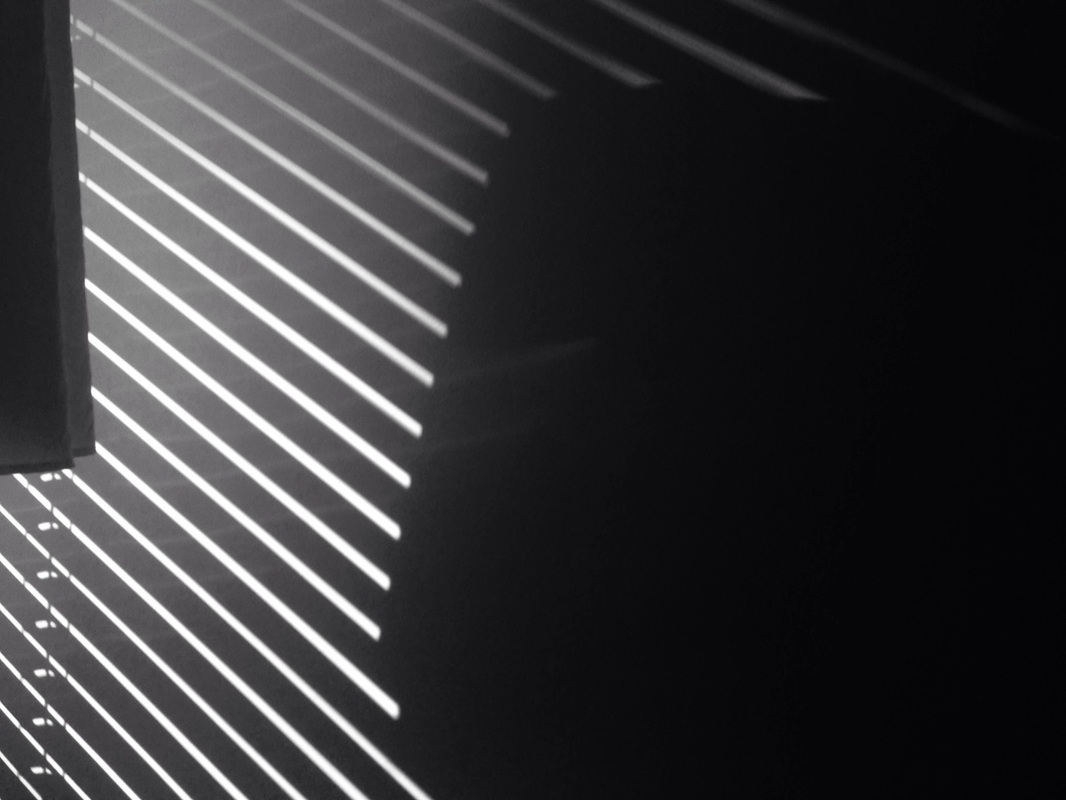
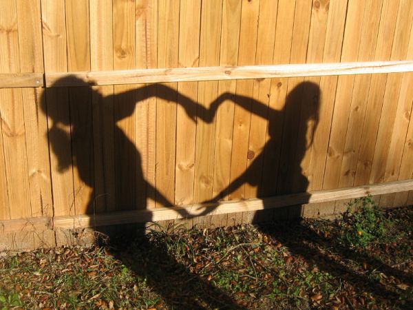
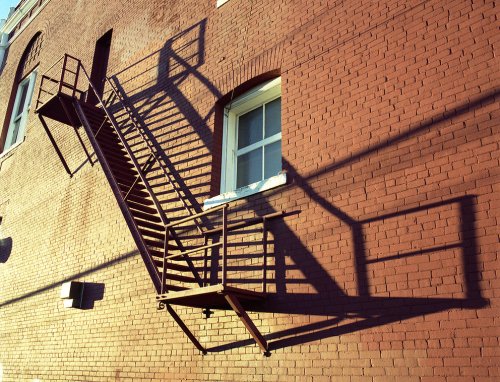
Here is my first set of Abstract photos that I have taken at home. I spread the taking of the photos over a four day period, the reason for this is because on Thursday the 10th of September it was sunny and the light created clear shadows (shown in the last five photos).
My favourite picture is the third photo on the fourth row because I think it shows different types of shadow whilst keeping its ability to be an abstract photo. A WWW for the photo would be that I managed to capture a defined shadow from a low angle, this reminds me of much of the work of Paul Strand, an artist we looked at in class, much of his abstract work has very defined straight shadows. My least favourite photo is the middle photo on the sixth line, I feel that it lacks imagination and is fairly un-abstract, an EBI for this photo would be to change the background to something darker and add more of a flash to the photo so it adds shine. |
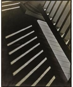
Paul Strands abstract work
|
THE FORMAL ELEMENTS
Photographers are usually aware of the ways in which they can create interest in their images beyond the simple fact of the subject. This is what separates good pictures and bad pictures of the same thing. The following list describes some of the abstract elements in any photograph. Below the list is an example of how you can analyse a photograph looking for these things specifically and how this helps to give the image meaning:
|
Focus:
Light: Line: Repetition: Shape: Space: Texture: Value/Tone: |
Which areas appear clearest or sharpest in the photograph? Which do not?
Which areas of the photograph are brightest? Are there any shadows? Does the photograph allow you to guess the time of day? Is the light natural or artificial? Harsh or soft? Reflected or direct? Are there objects in the photograph that act as lines? Are they straight, curvy, thin, thick? Do the lines create direction in the photograph? Do they outline? Do the lines show movement or energy? Are there any objects, shapes or lines which repeat and create a pattern? Do you see geometric (straight edged) or organic (curvy) shapes? Which are they? Is there depth to the photograph or does it seem shallow? What creates this appearance? Are there important negative (empty) spaces in addition to positive (solid) spaces? Is there depth created by spatial illusions i.e. perspective? If you could touch the surface of the photograph how would it feel? How do the objects in the picture look like they would feel? Is there a range of tones from dark to light? Where is the darkest value? Where is the lightest? |
|
|
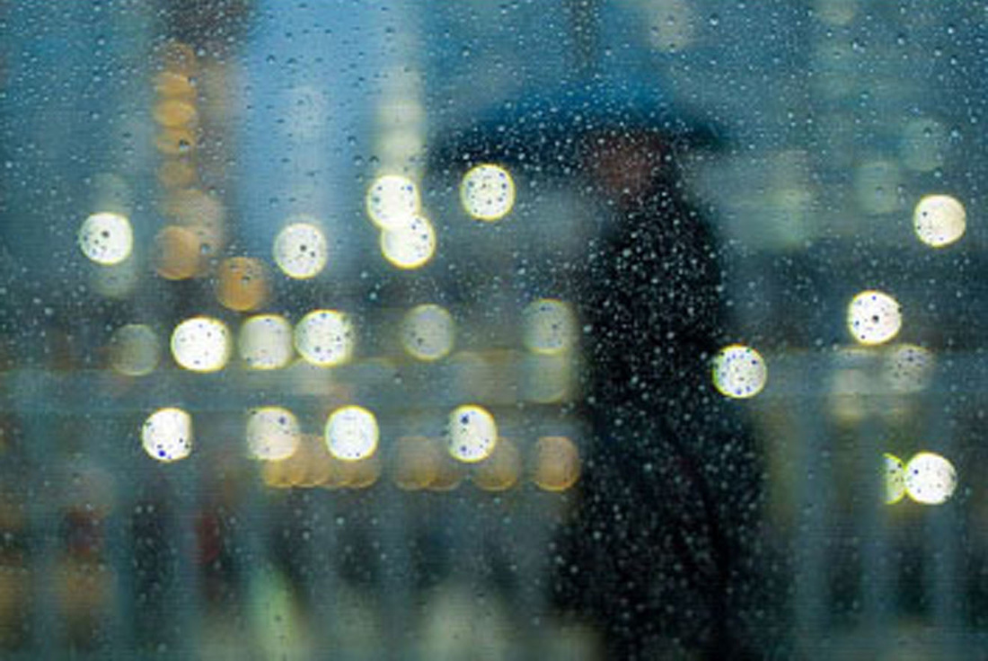
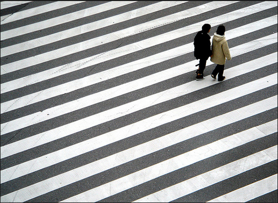
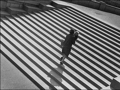
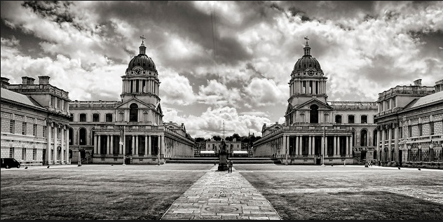
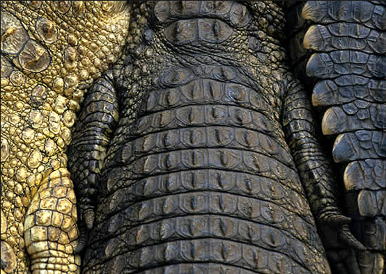
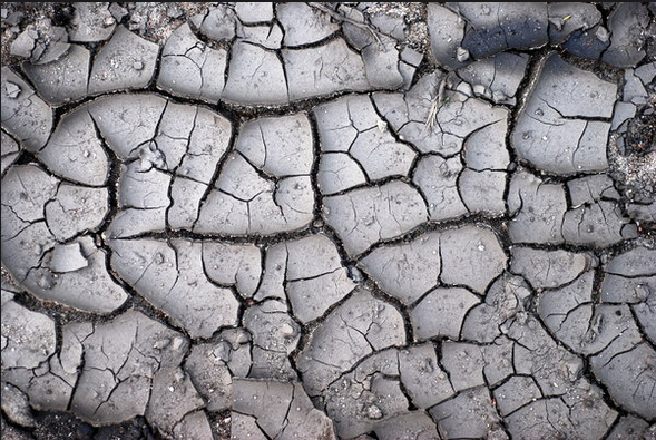
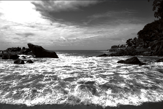
Focus: The two photos are out of focus and are very blury ,one is obscured by rain drops and the other is completely unrecognisable Light: Both of the photos show light and the shadows that they have created because of the position of the sun. My favourite from the two photos would be the one on the right as you can't tell where the stairs end and the shadow begins Line:The two photos to the left show very straight lines, either created by paint or shadows. The line effect looks good when it is interrupted by a person. Repetition: Repetition is when a shape or shadow repeats in an order. Both of the pictures have a repeated shadow, one of the photos is in black and white, still with this effect it has a clear repeated shadow Shape: Shape is important in photography because it creates outlines and also shadows, the two pictures that I have chosen have two very clear shapes. Space: The two photos show that space is important as you get a larger view of what the background is. One of the photos is in Greenwich and shows different tones in a large space Texture: Texture shows how sharp or soft something is, the alligators in the first photo are rough and hard and the other picture is smooth and also hard. Value/Tone: Tone shows how light things are in a photo, it also shows the contrast of photos. The two photos to the left have different tones or shades of grey, black and white. |
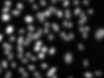
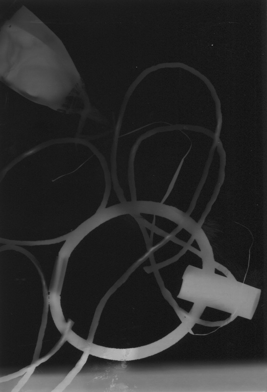
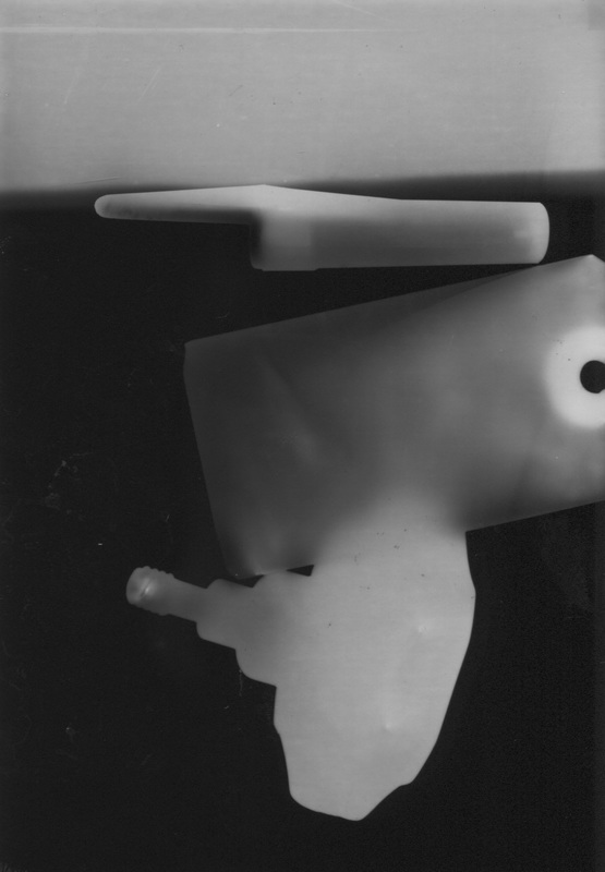
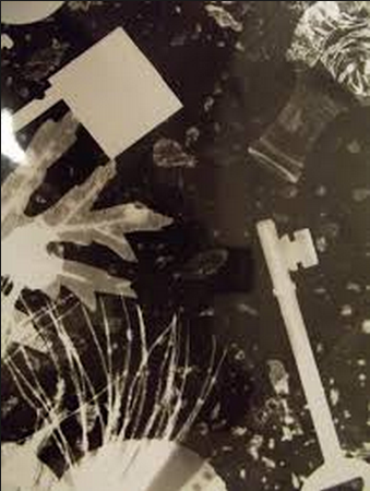
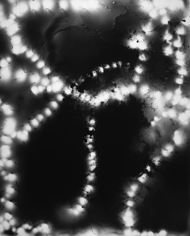
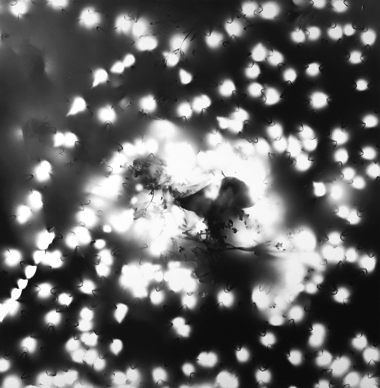
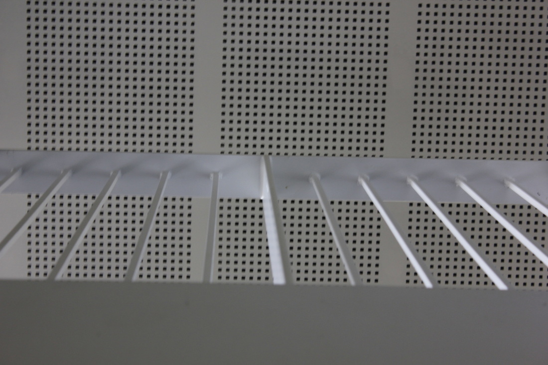
Making abstract photogramsWe decided to re-visit the technique of Photograms and pair it with our new project Abstraction, lots of Photograms are very abstract and are sometimes hard to describe. The pictures to the right (for me) display an abstract edge and are fairly hard to describe ,my favourite picture is the one on the top at the right hand side because it has letters that are distorted. There is a gun without a barrel, this allows it to be see through.
We had to go into the dark room and create a set of abstract photograms. Here are my first abstract photograms. WWW1: On the second picture it has a ghostly effect. WWW2: On the first picture there is a congestion of string this breaks up the picture EBI: There is to much black in both of the pictures this could be filled by more random items.
|
|
RESEARCH INTO PHOTOGRAM PHOTOGRAPHERS
To gain inspiration for Abstract Photograms I researched artists who have made photograms, the artist that I researched is Michael Flomen, he is a Canadian Photographer who made photograms, he is also well known for his street photography. His photogams look like flashing lights. Here is some of his work. I like how the photograms have a variety of textures.
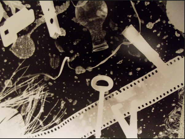
second set of abstract
We set out to create our second wave of photograms, I wanted to experiment further by trying different techniques e.g drops of water, this technique didnt work so I dripped the developer on the photographic paper, this revolved some of the picture.
How i can make my photograms better
1)The first thing that I could do to improve my photograms is to use more random items to make the photos more abstract, all of mine so far have been fairly un-abstract, this is an improvement that I can make without a problem.
2)The second thing that I could do is to plan out which items I will use, this links in with the first improvement.
3)The final thing that I will do is that I should experiment with different techniques that will create different patterns.
2)The second thing that I could do is to plan out which items I will use, this links in with the first improvement.
3)The final thing that I will do is that I should experiment with different techniques that will create different patterns.
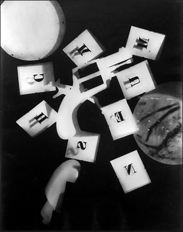
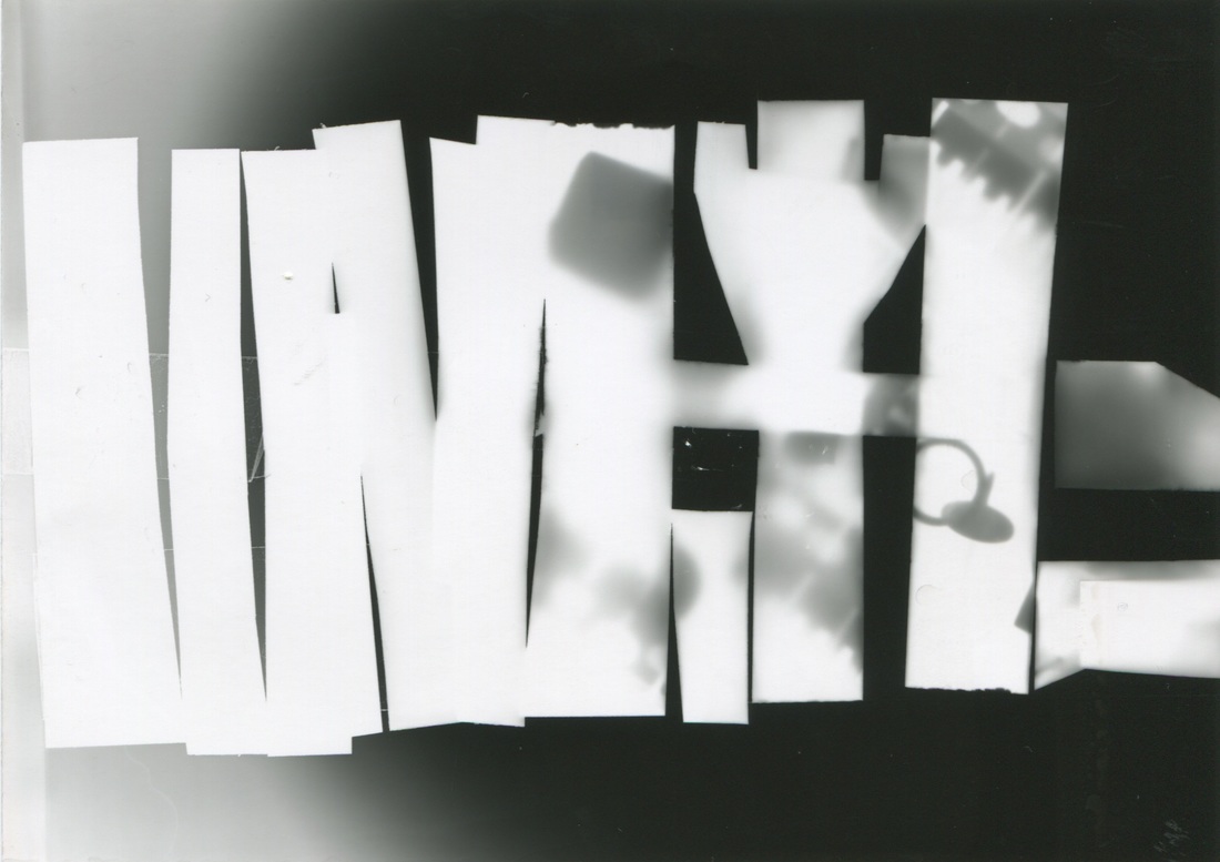
Photogram cut ups and colouring them on photoshop.
|
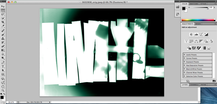
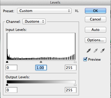
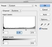
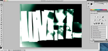
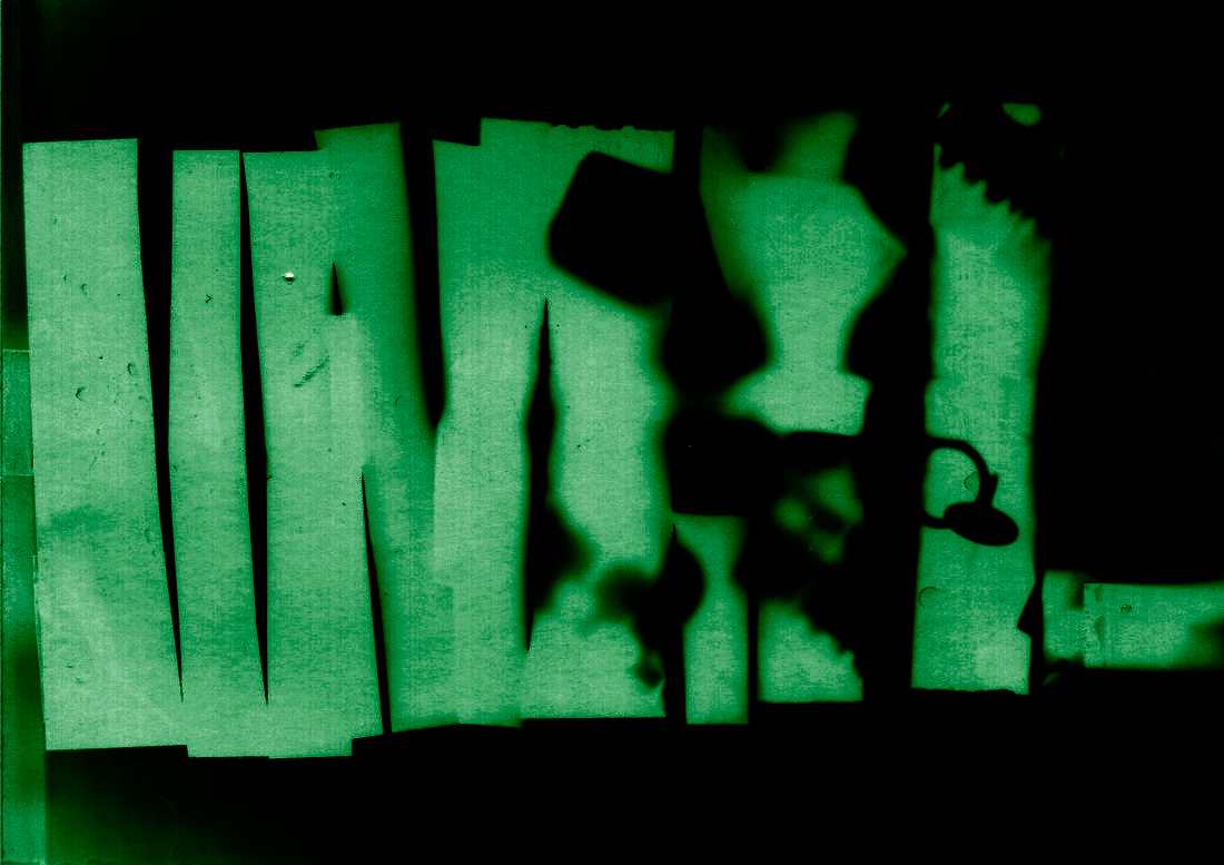
In class we were given the task of cutting up one of our old photograms and re-arranging them into a new shape, this would give the effect of a Photogram in a Photogram, we developed other techniques to improve our photograms including using Duo-tone colouring on Photoshop.
|
|
|
|
|
|
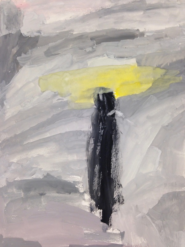
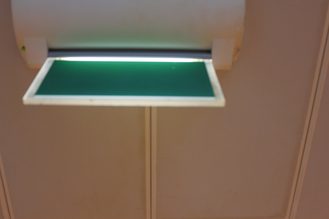
This is my finished Duotone, I added the colour green whilst editing on photoshop.
WWW: I like the contrast between the green and black. EBI: I could make the picture more clear and not a blurry. |
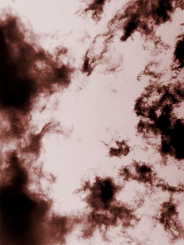
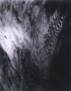
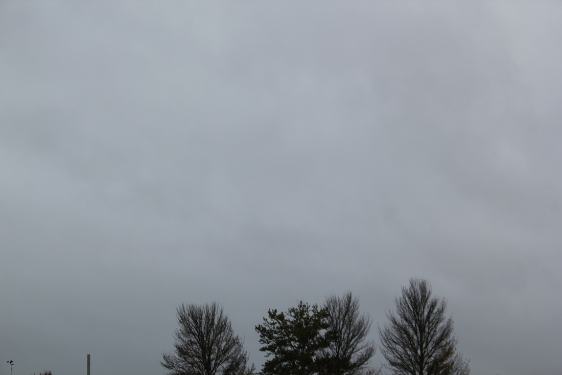
MY IMPERSONATION OF ALFRED STIEGLITZ.
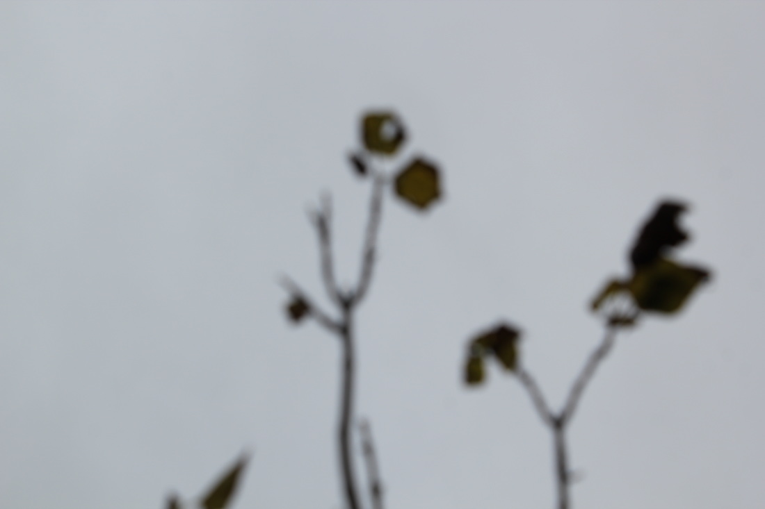
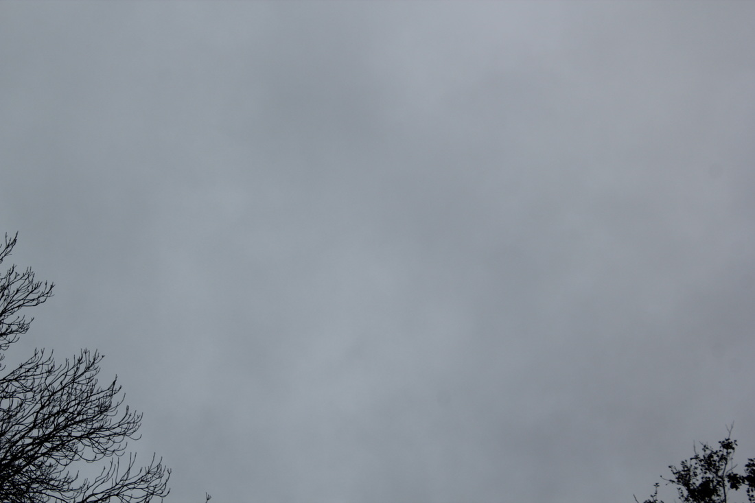
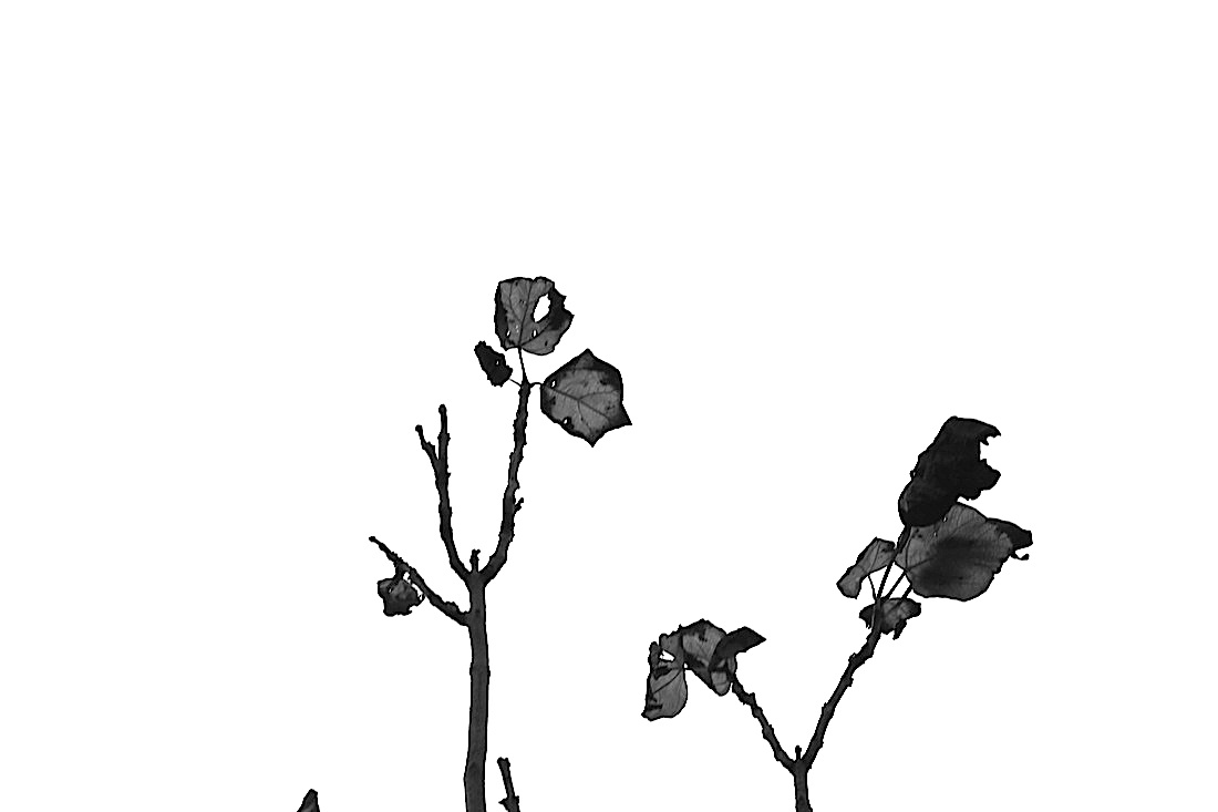
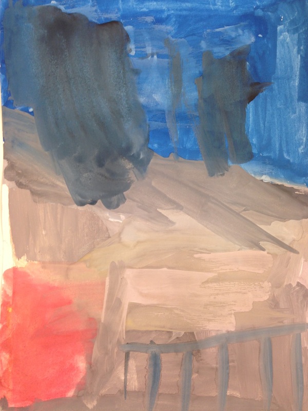
Alfred Stieglitz was an American photographer who took photos of clouds, Iam interested in his work as it links in well with our topic of Abstraction. Clouds often take odd forms and are very abstract. Here are Alfred's photos. My favourite photo is the last one because I like the mixture of the blacks and the whites.
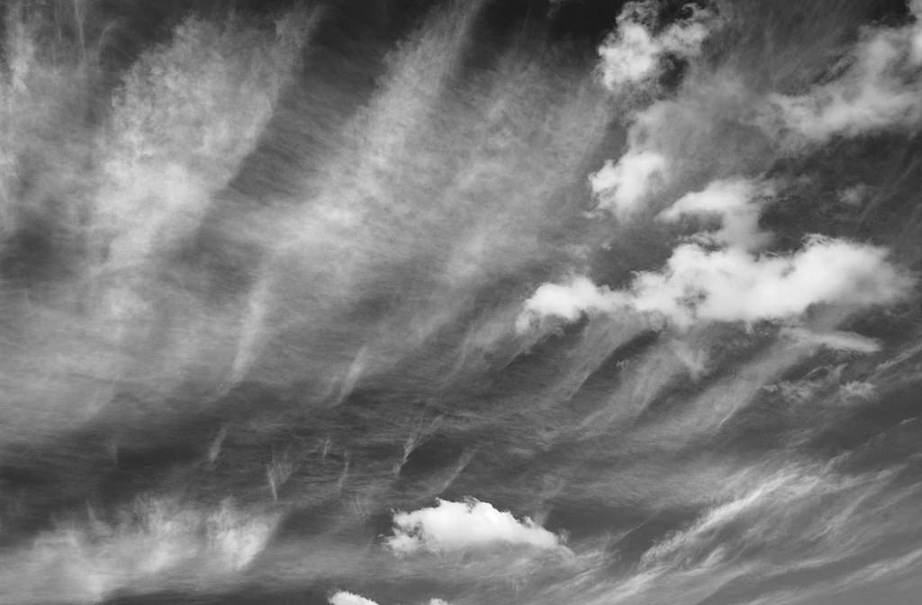
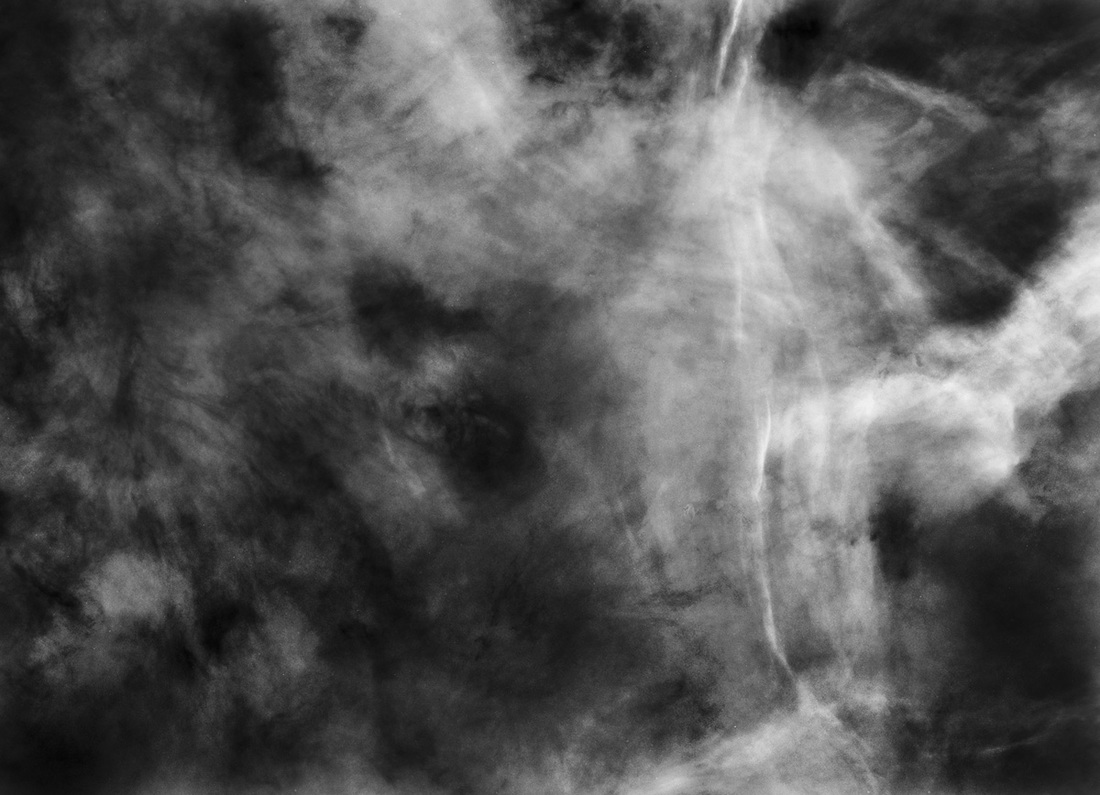
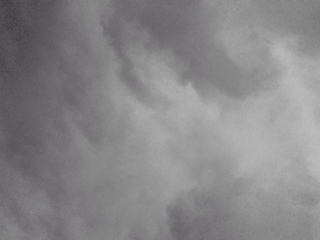
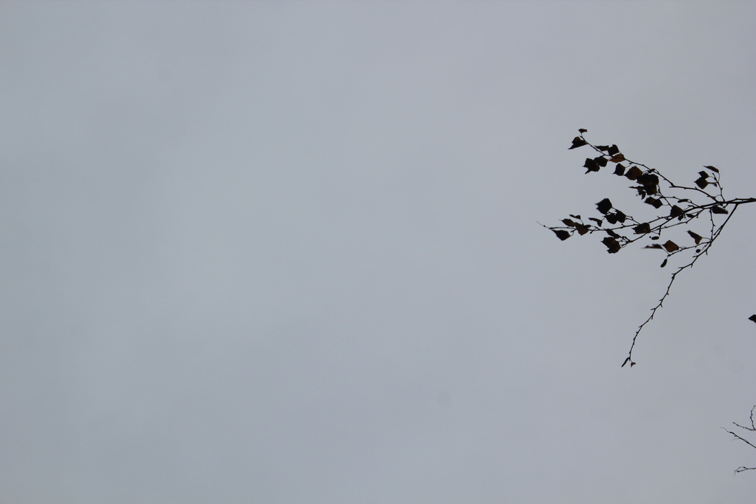
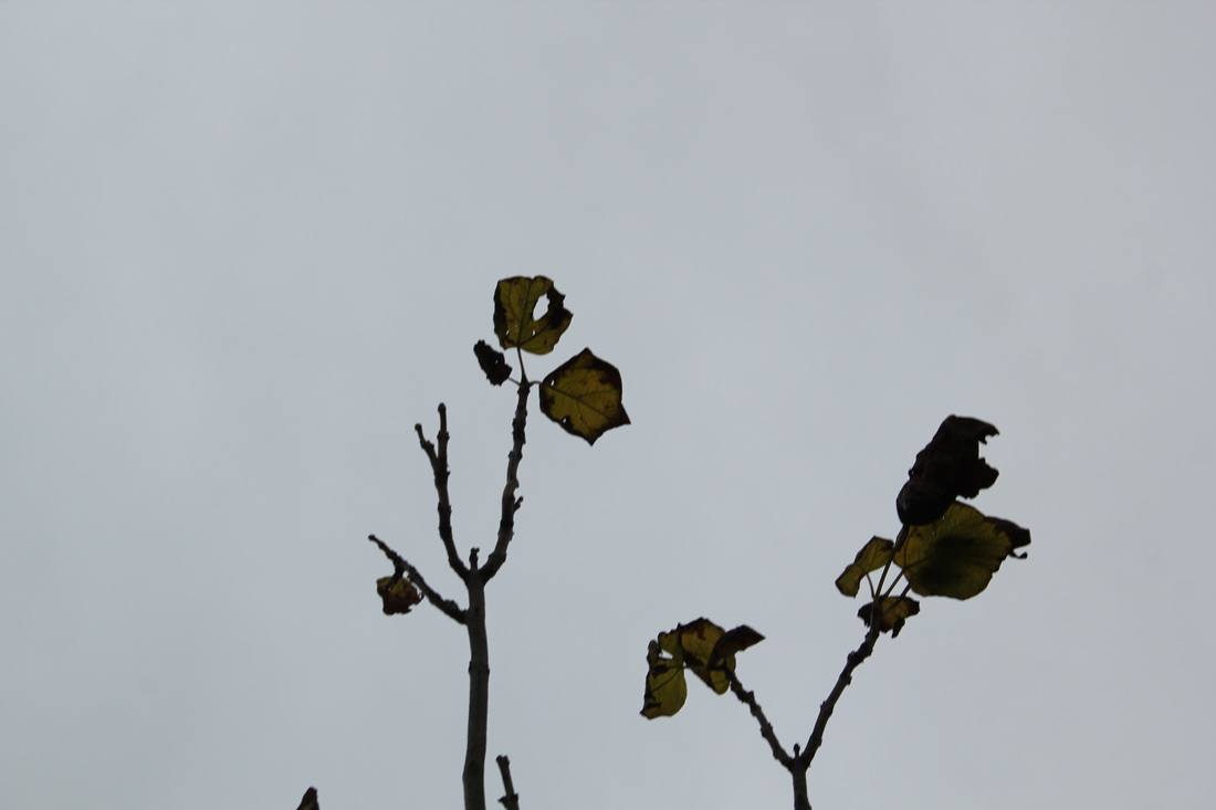
Here are my photos that I took, I was upset because there were no abstract clouds and my pictures just show grey skies, I decided to try and add parts of trees in the corner. This adds an element of mystery to the photo.
My favourite photo is the first photo on the bottom row, I like it because it has a small touch of yellow, it is very subtle but changes the tone of the photo.
My favourite photo is the first photo on the bottom row, I like it because it has a small touch of yellow, it is very subtle but changes the tone of the photo.
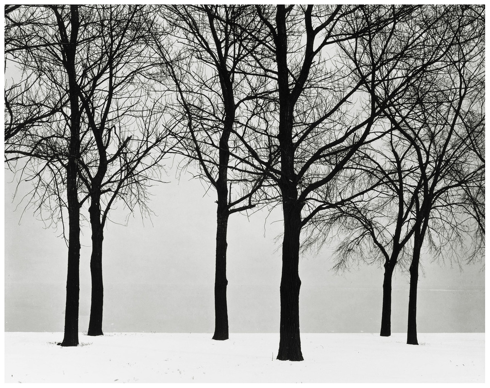
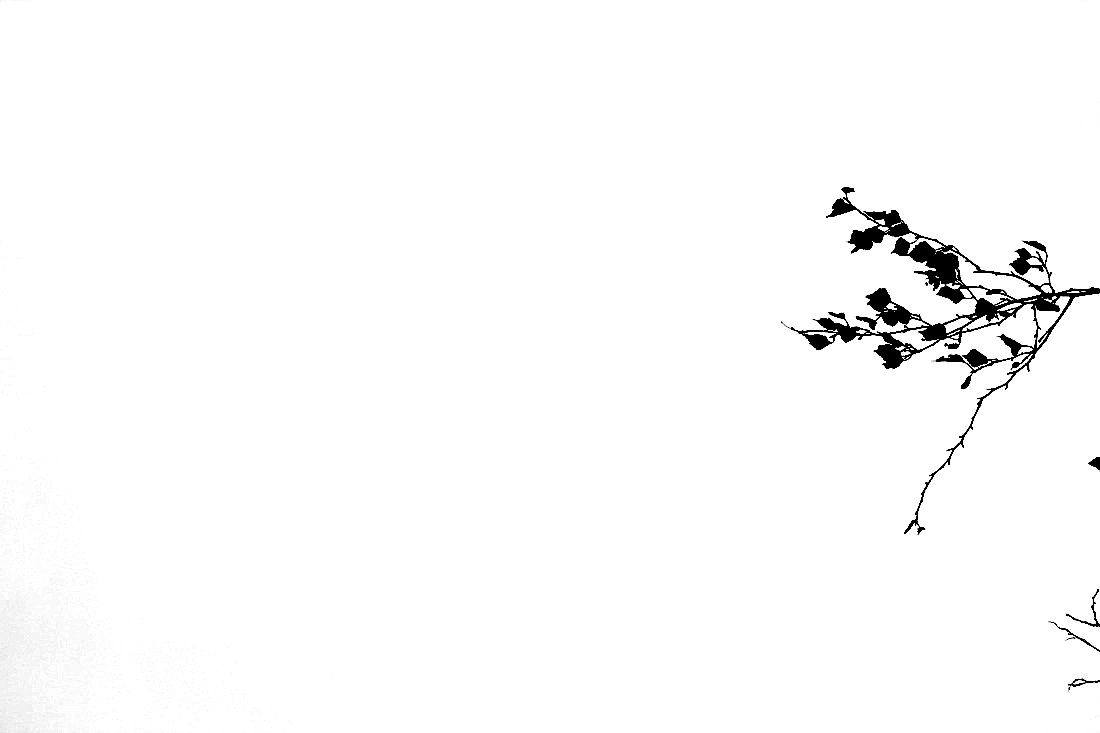
Harry Callahan
Here are photos by Harry Callahan, he uses shade and repetition to create a set of unique images. These photos are incredibly interesting and my favourite is the first one. I like it because the shades are so defined, the blacks are so defined. There is also a change from grey to white this gives the picture a subtle line. The last picture is also interesting as it makes the audience question what it actually is. Once again Callahan has made the shades very pronounced.
Written controlled assesment
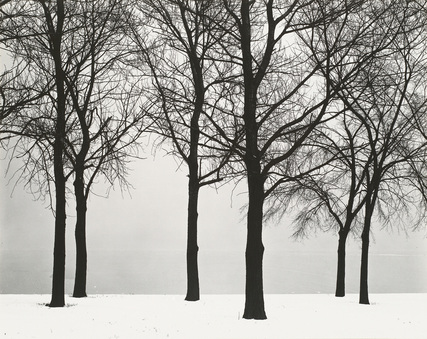
Photo by Harry Callahan
The photo that I have decided to write about was taken by Harry Callahan. The picture shows a white background and black trees. The photo uses two shades of white, there is a divide between the two shades. The contrast of the photo is very clear because of the depth of the blacks and whites, there are six trees, all have no leaves which, they are all fairly straight, they contain a few bends and curves.
The sky in the back of the image is appears to be grey or dark white, this could be because of the deep fog that was present when the photo was taken.
The photo contains both abstract and naturalistic features, if Callahan would have zoomed in on the thin branches of the trees it would be more abstract. The photo looks like a drawing or an animation because of the deep blacks and the empty whites. To take this photo Callahan would of used a large format camera, there are lots of fine details which may be the result of a negative contact print. The texture of the photo looks very soft and smooth because there are no bumps on the trees or the snow on the floor, the light in the photo may of been captured because of the reflected light, the light could of reflected off of the white snow.
The picture looks different from real life because the tones are so defined, the sky is almost a grey shade. The part of the photo that caught my eye was the intricate detail of the small branches. They are only visible because of the light sky.
The spacing of the photo is very interesting because at the bottom of the photo it is very open and spacious but as you move up the picture the space deteriorates and it become more congested and complex. The part of the of the photo that I like the most is the almost invisible line that separates the pure white snow from the slightly grey, foggy sky. If I could name the photo I would title it White because of the different shades of white in the picture. In the photo there is a bed of snow, I came to this idea because of the unnaturally white ground.
The only thing that I dislike about the photo is that some parts of the photo lack texture, I think that the spatial awareness of the photo is worth remembering because the trees are laid out well, If I lived in the photo I think it would feel very cold and bitter, there are no leaves on the trees which means there are no warm colours in the picture.
If the photographer was here I would ask him how did you consistently keep the detail in the picture.
I think Callahan took this photo because it would never be the same.
The blacks in the picture look like they have been coloured in with a black pen, the shades in the picture are very pronounced this is why I like it.
How to take photos like harry callahan
1)Think about the formal elements especially Tone and Lines because looking at Callahan's photos the lines and tones are very defined.
2)Choose a camera that would help you take similar pictures, the camera that he used was a large format camera because it helps capture more detail, but you can use a standard camera then edit the picture
3)Now you need to decide something to photograph, Callahan often took photos of trees without leaves, this would allow the large format camera to capture lots of the details of the tree.
4)You will now have to consider angles, Callahan is often central.
5) Stay on a standing level because his photos are from a standard position.
6)Focus on getting an empty background with trees in the foreground.
7)After the photo is taken you should alter the contrast and make the photo black and white, all of his photographs are in black and white so this is very important.
8)There are often only blacks and whites not greys.
9)You now have a photo that imitates Harry Callahan.
Photos like harry callahanI took the following photos because I was trying to imitate Callahan, I took the original photos and changed the contrast and exposure, the photos now look like Callahan photos.
|
|
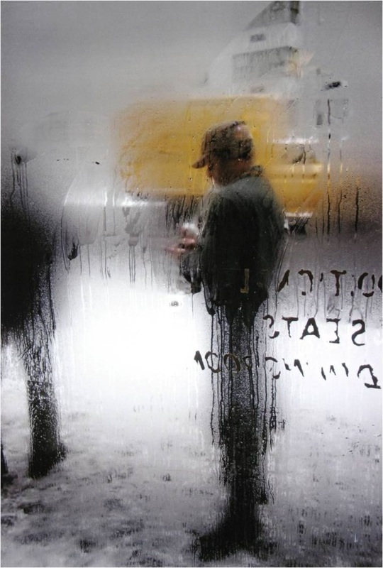
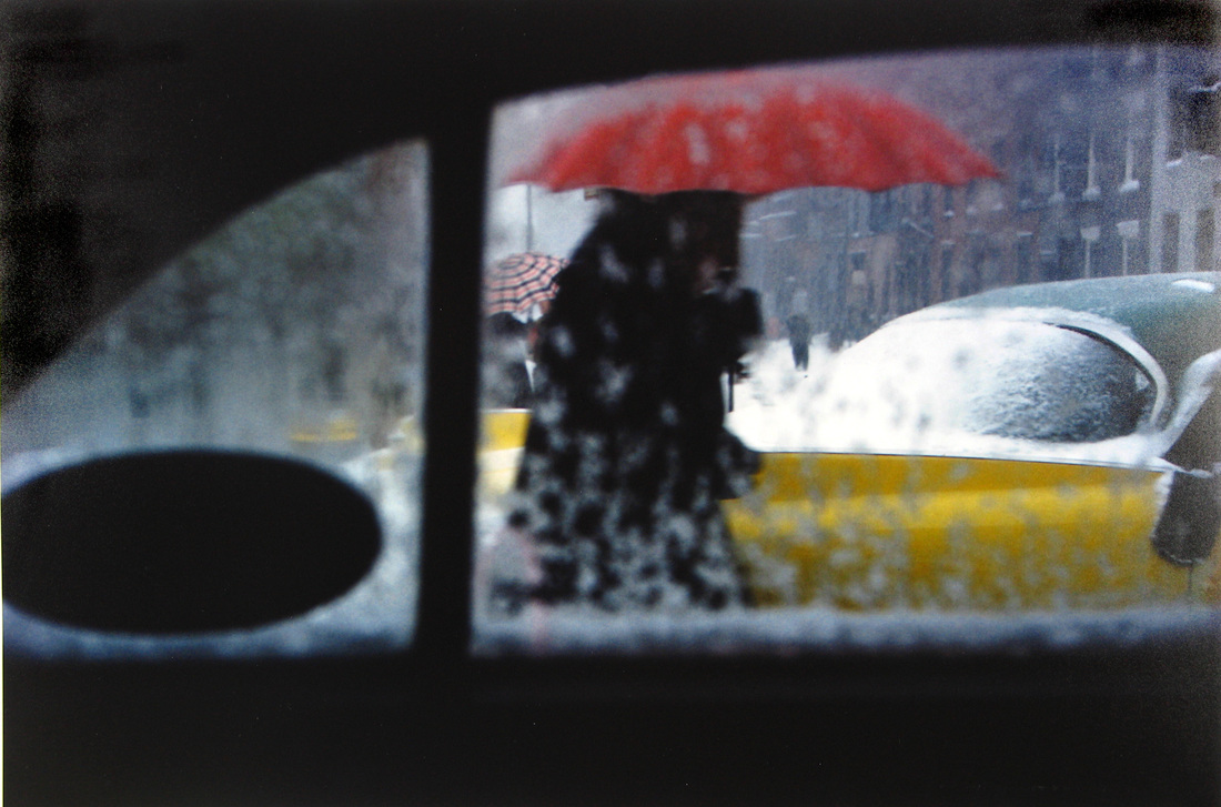
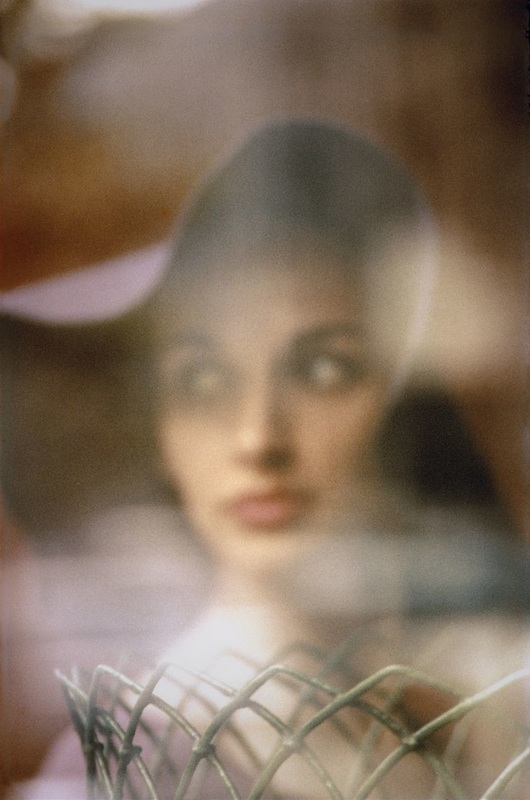
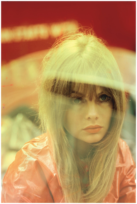
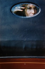
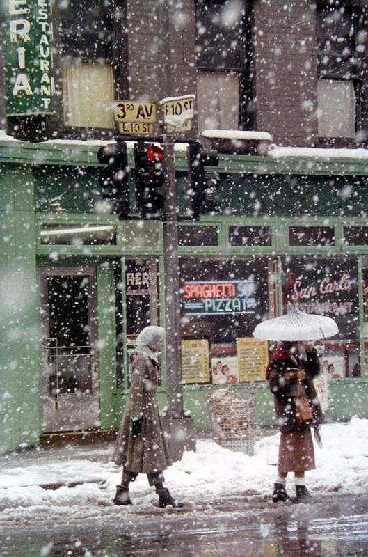
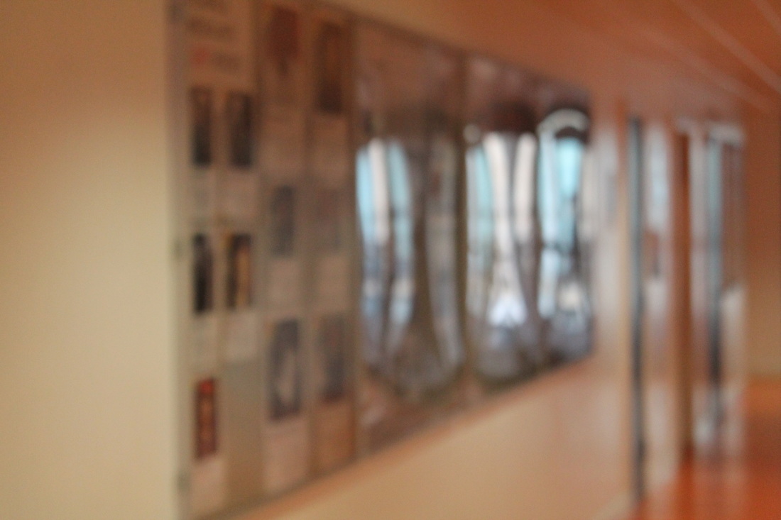
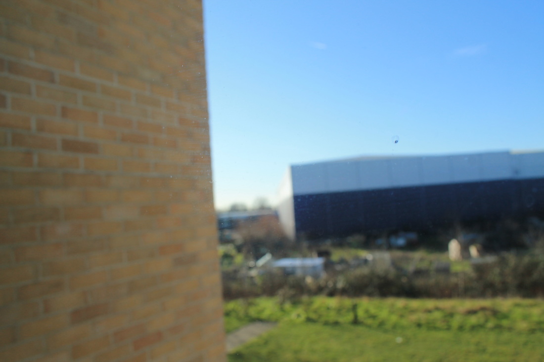
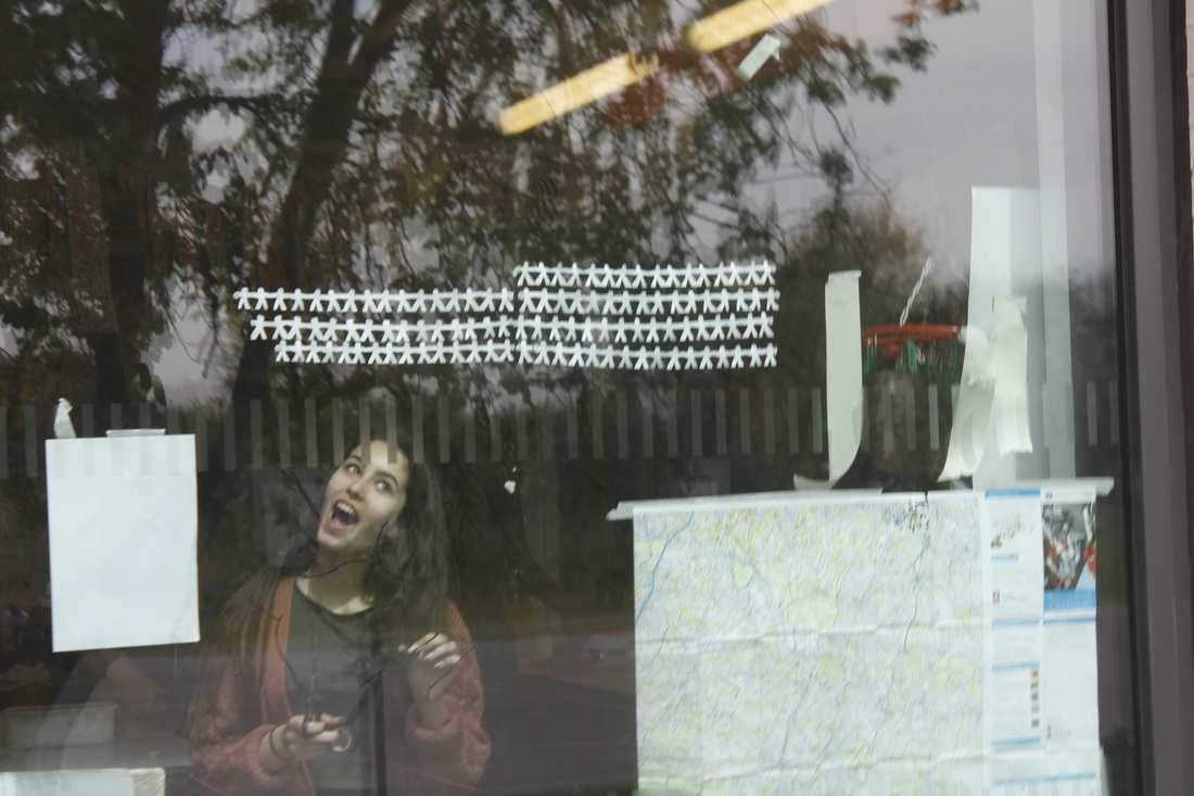
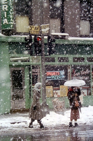
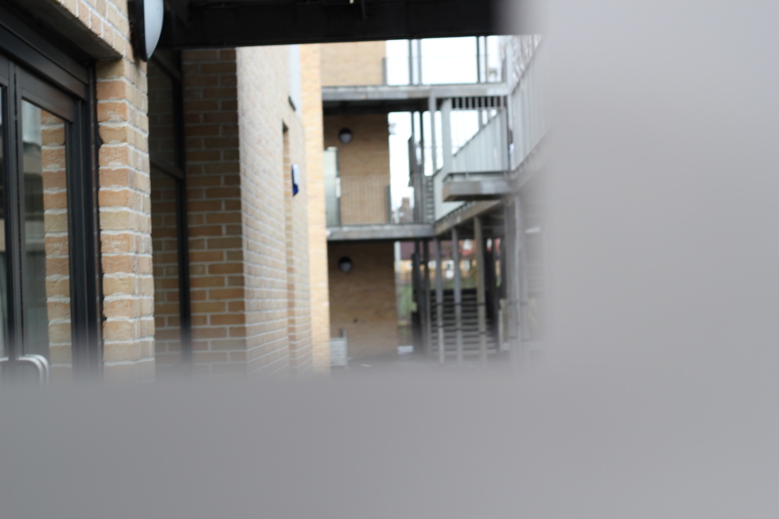
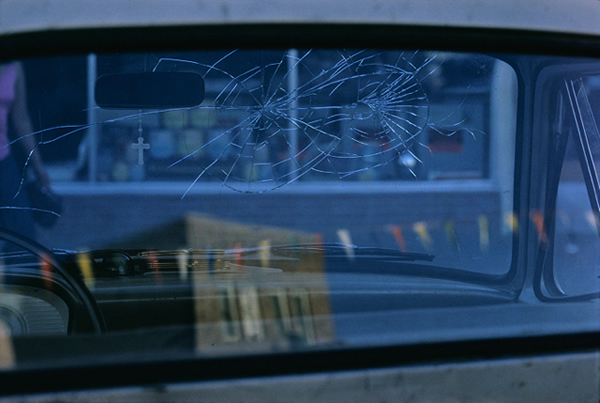
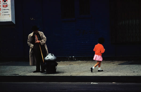
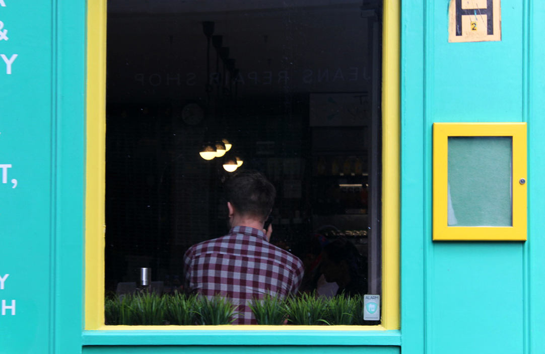
IN FOCUS: Saul leiter
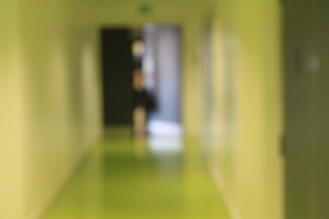
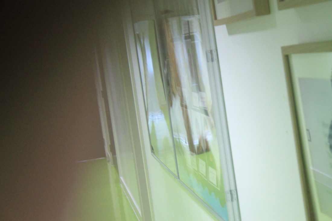
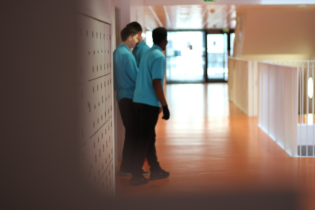
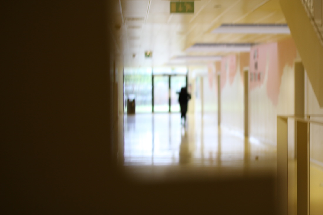
Here are some photos taken by American photographer Saul Leiter, he uses focus to abstract his photos. Common themes within his photos are what is happening outside or on the other side of glass. The abstraction in his photos varies between almost non-existent and very dominant, unlike other photographers who make abstract photos, Leiter gives the observer clues of what is in the picture.
Some of his photos have girls behind the glass.
Saul Leiter was an American photographer who was born its Pittsburgh, he died in 2013.
Lots of his photos have changed contrasts which also obscures the faces of people or the background.
Some of his photos have girls behind the glass.
Saul Leiter was an American photographer who was born its Pittsburgh, he died in 2013.
Lots of his photos have changed contrasts which also obscures the faces of people or the background.
my first interpretation
|
|
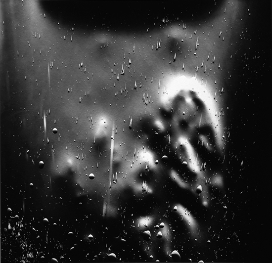
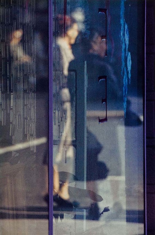
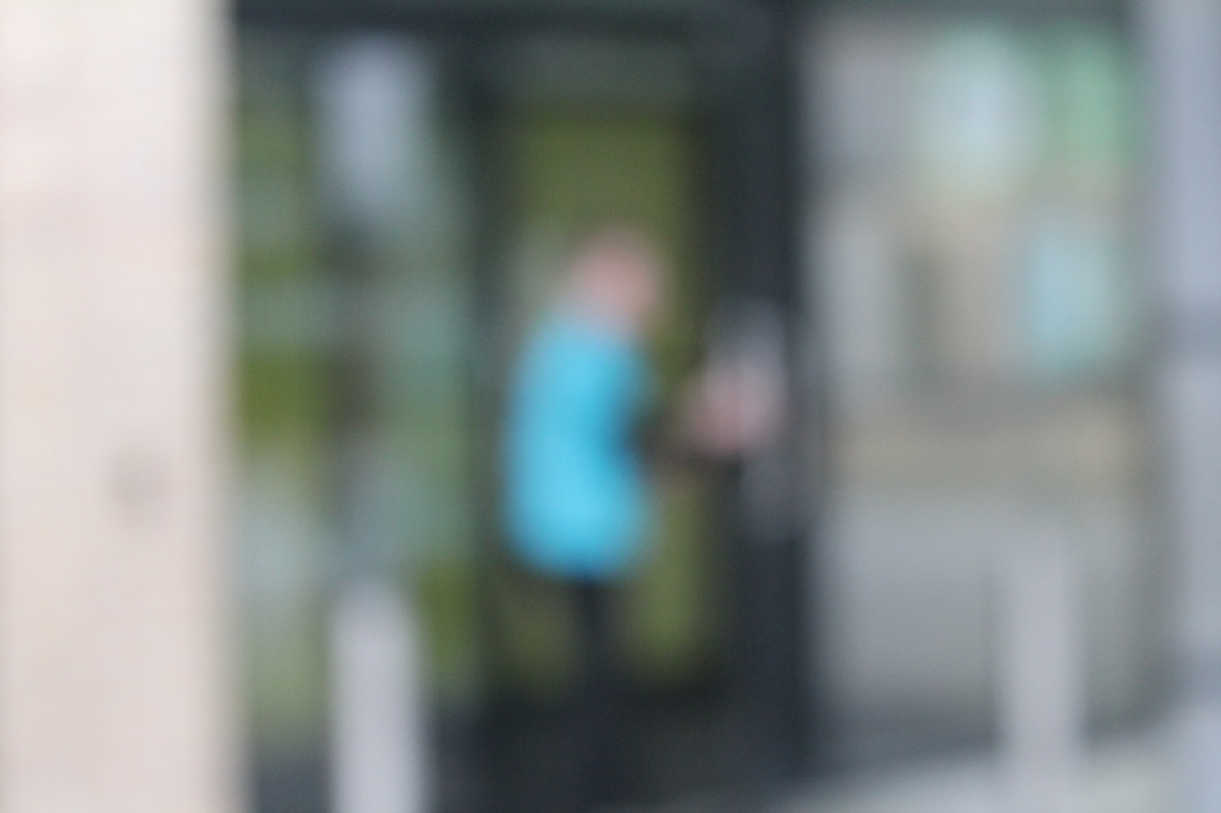
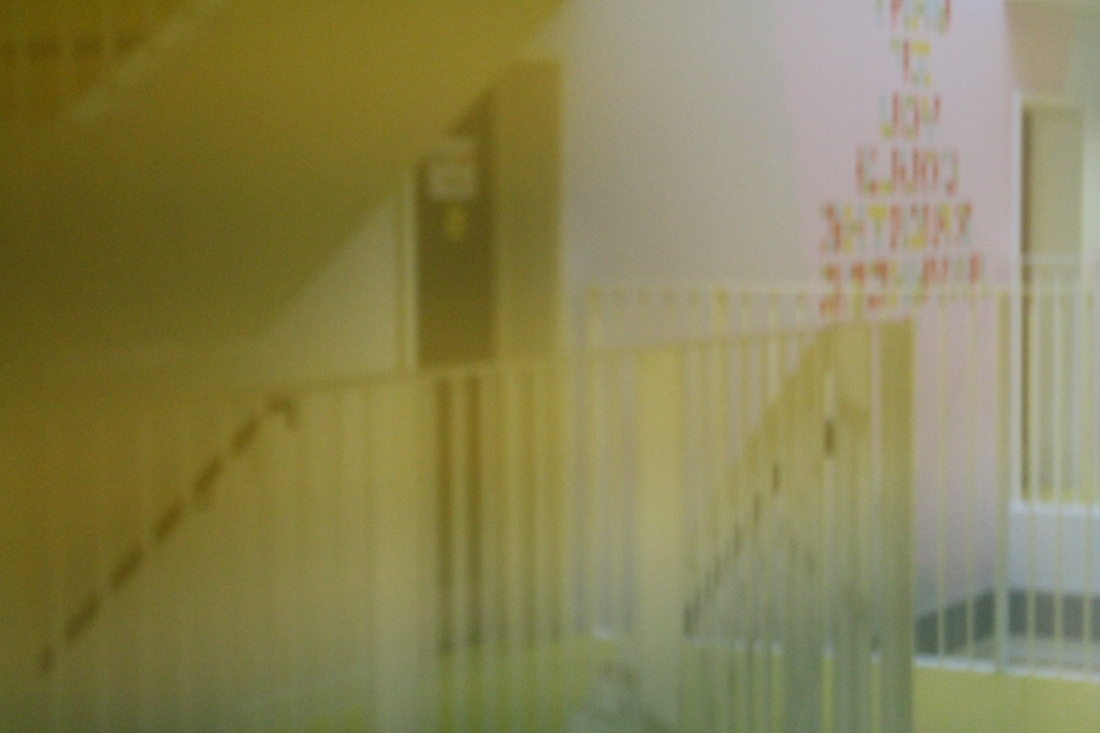
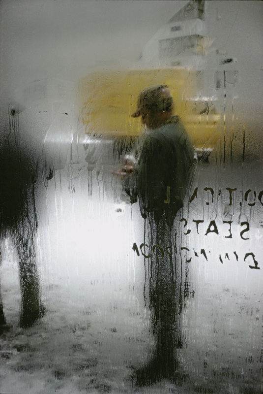
These photos are my first interpretation of Leiter's photos, I focused specifically on my use of focus and reflection. Some of the photos are too out of focus and crush the illusion of Leiter.
My favourite picture is the third on the bottom row because it incorporates reflection and focus, I took it by photographing a reflective surface, the yellow surroundings give the photo a filter. My least favourite photo is the last on the second row because it is too out of focus and doesn't really relate to Leiter. WWW: I like the way I changed thew focus every photo. EBI: Next time I will try to obscure the photos more with paper or foil. |
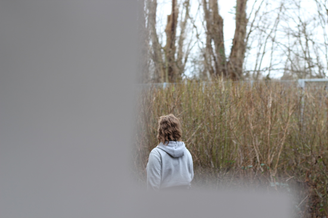
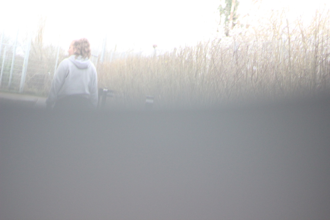
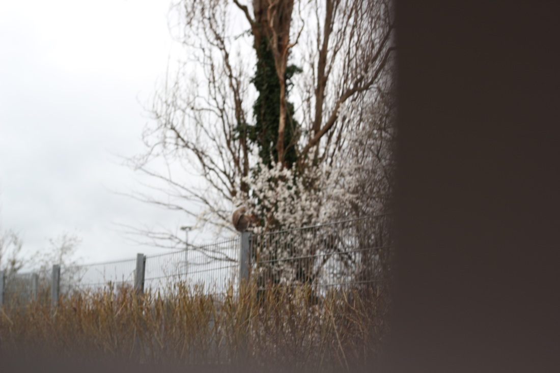
HOME INTERPRETATION

Here are photos that I took at home and outside of school, once again I was trying to duplicate Leiters work.
My favourite photo is the second on the second row because lots of the shot is covered up and only a little is on show.
My favourite photo is the second on the second row because lots of the shot is covered up and only a little is on show.
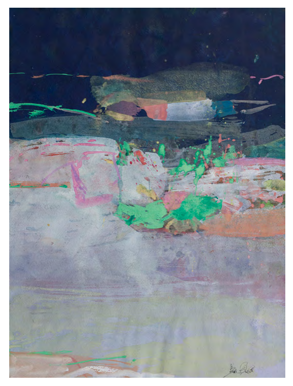
saul leiter paintings

Along with his Photography, Leiter was a painter. His paintings were abstract but contained a lot of colour, my favourite picture is the last painting in the gallery above. It is my favourite because the colours that were used compliment each other, for example the light Blue and the deep Orange.
|
|
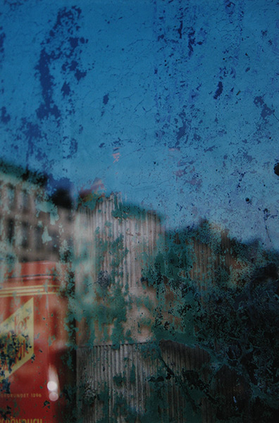
In my opinion these pictures are very similar, I think this because both pictures are sectioned off in the same way, they both have greens and the photograph has clear white and the painting has violet, there is a divide between two colours in both pictures in almost the exact same place, there are also interruptions in similar places.
In the painting there is almost a square and on the photo there is a traffic light.
In the painting there is almost a square and on the photo there is a traffic light.
painting interpretation
|
|
The paintings are my interpretation of Saul Leiter's photographs, In class we discussed that Saul Leiter's photographs were similar to his paintings, they share lots of lines in almost exactly the same places.
I decided to choose two fairly basic photos to paint, they are basic because they don't have lots of colour or detail.
I was fairly happy with my result, i felt that I managed to achieve what I set out to do, my favourite of the two is the painting to the right because it is very abstract and the only detail is the colour that is used.

|
|
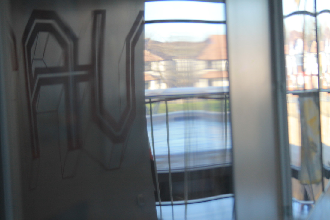
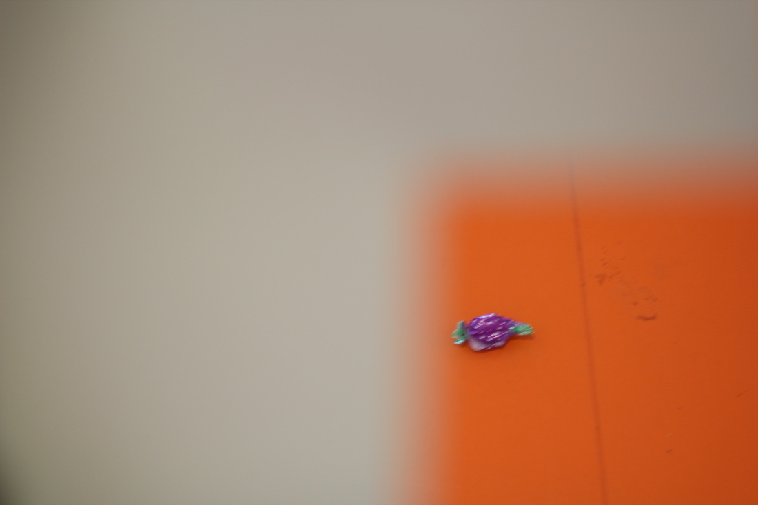
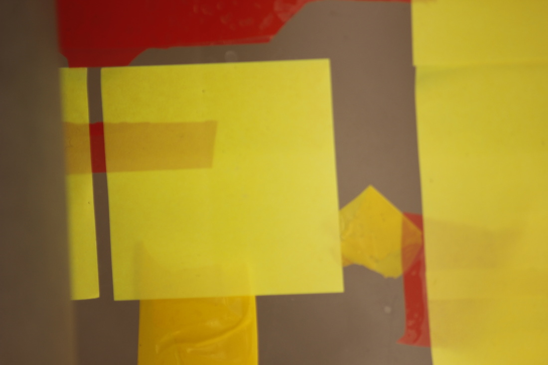
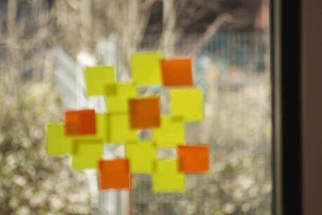
POST-IT NOTE OBScURINGWe obscured the lens of the camera with bright coloured Post-it notes, this, along with the sun, would of made the colours of the photos very bright and colourful.
|
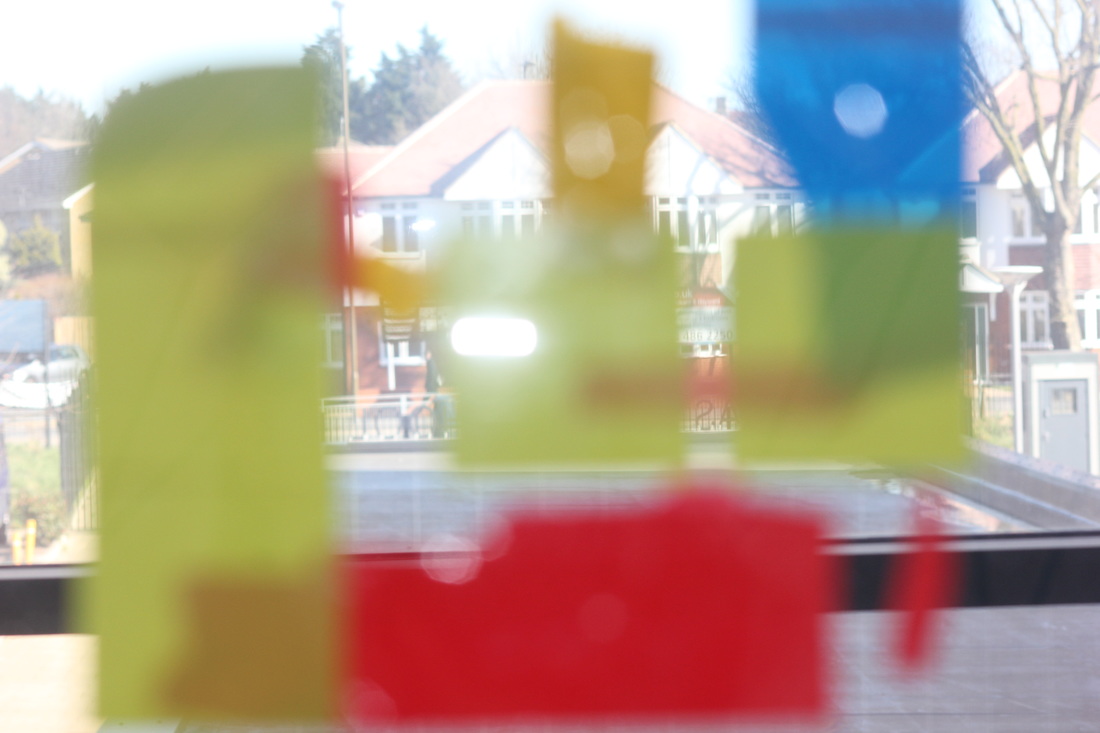
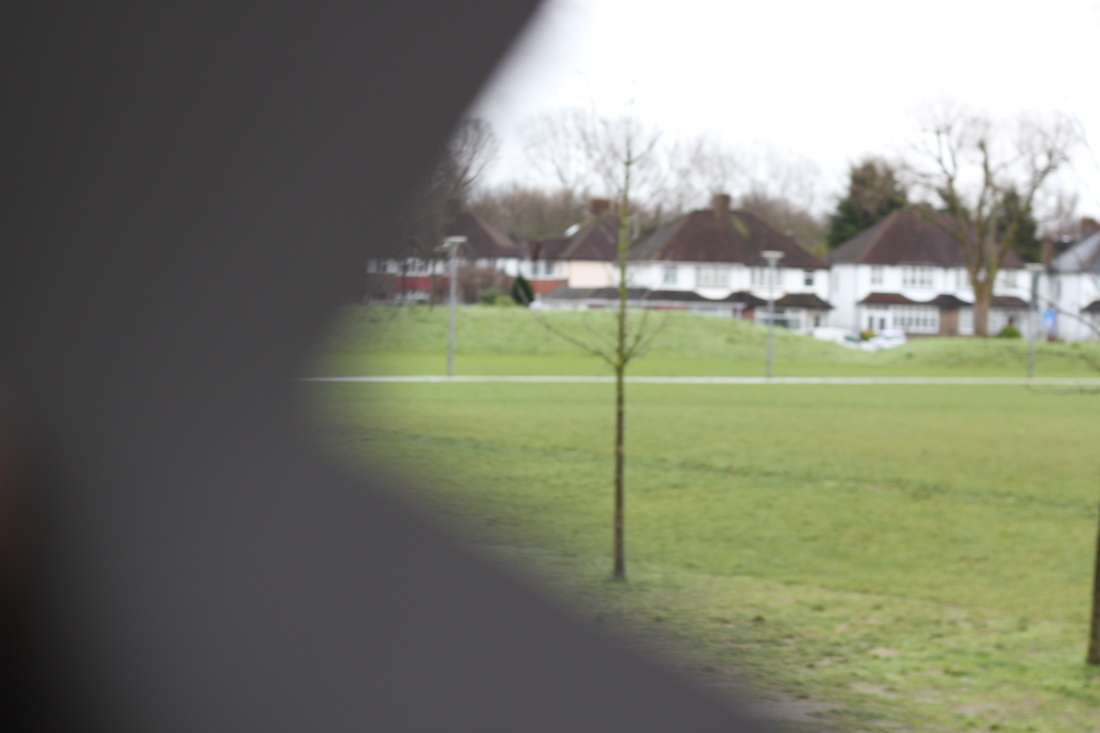
Last lesson in photography we attempted to create something to obstruct the lens like Saul Leiter used. To do this we cut up card into shapes.
The results werent as good as I had hoped, it was very hard to take the photo whilst to holding the card.
I did however manage to get a few photos that were spot on with the task.
To make the task easier I could have a parter hold the card whilst I take the photo.
The results werent as good as I had hoped, it was very hard to take the photo whilst to holding the card.
I did however manage to get a few photos that were spot on with the task.
To make the task easier I could have a parter hold the card whilst I take the photo.
|
|
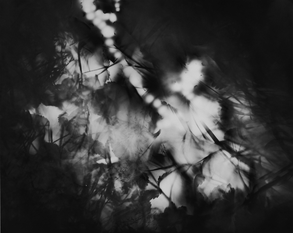
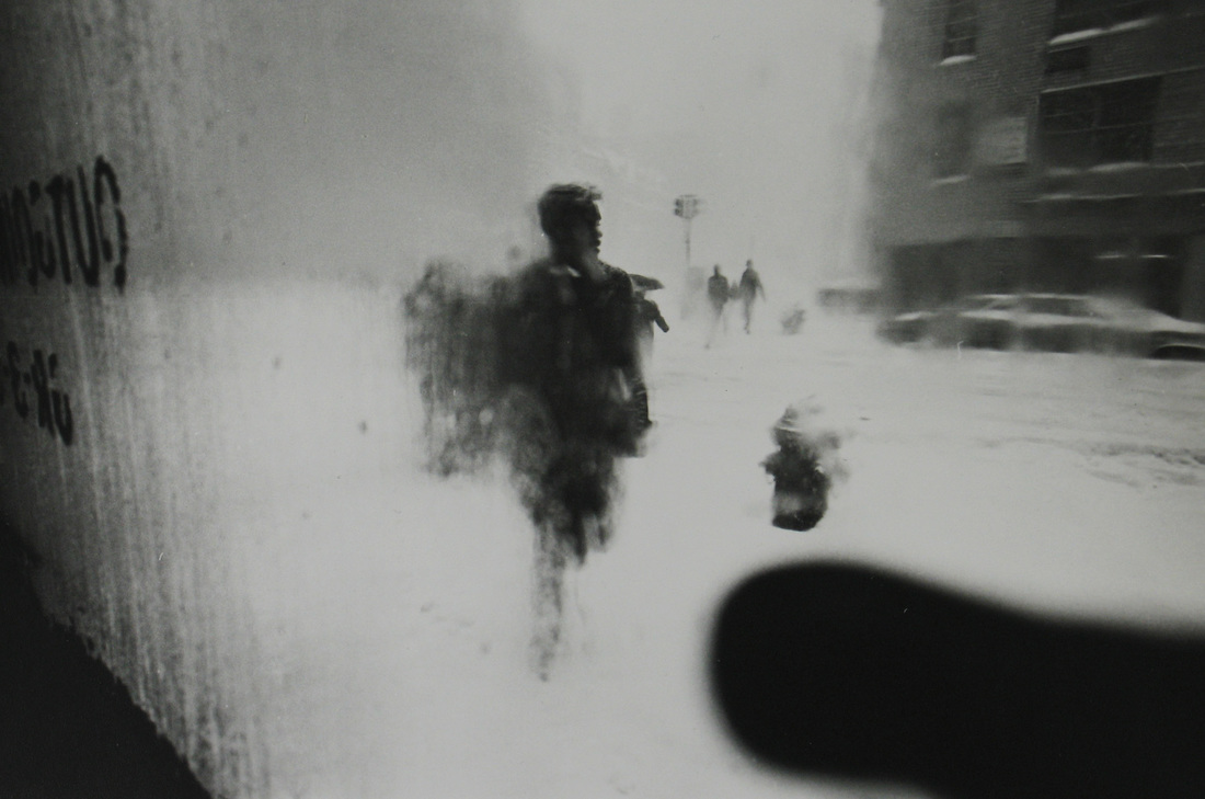
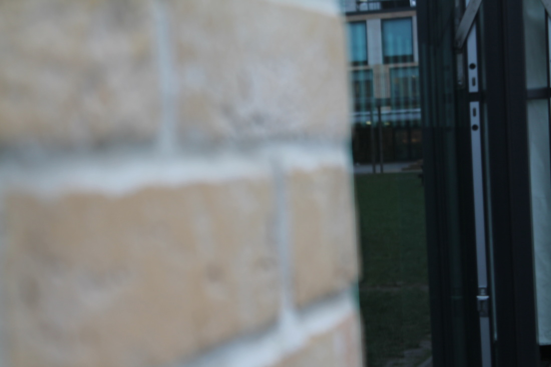
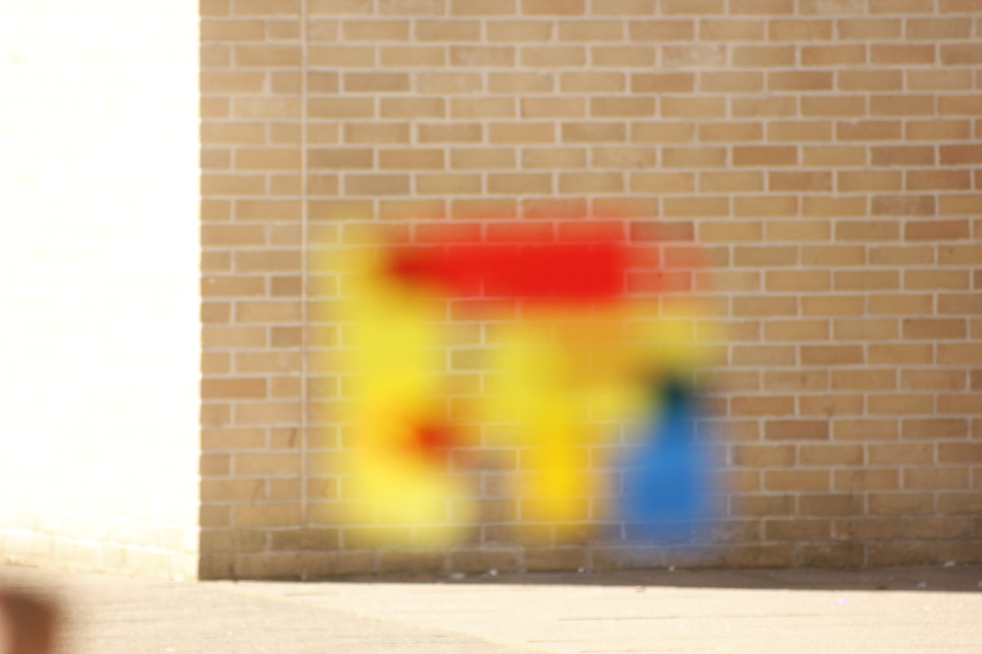
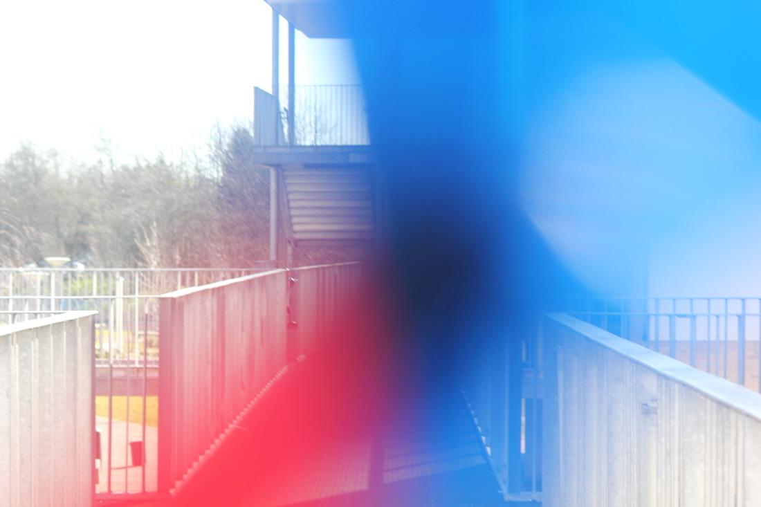
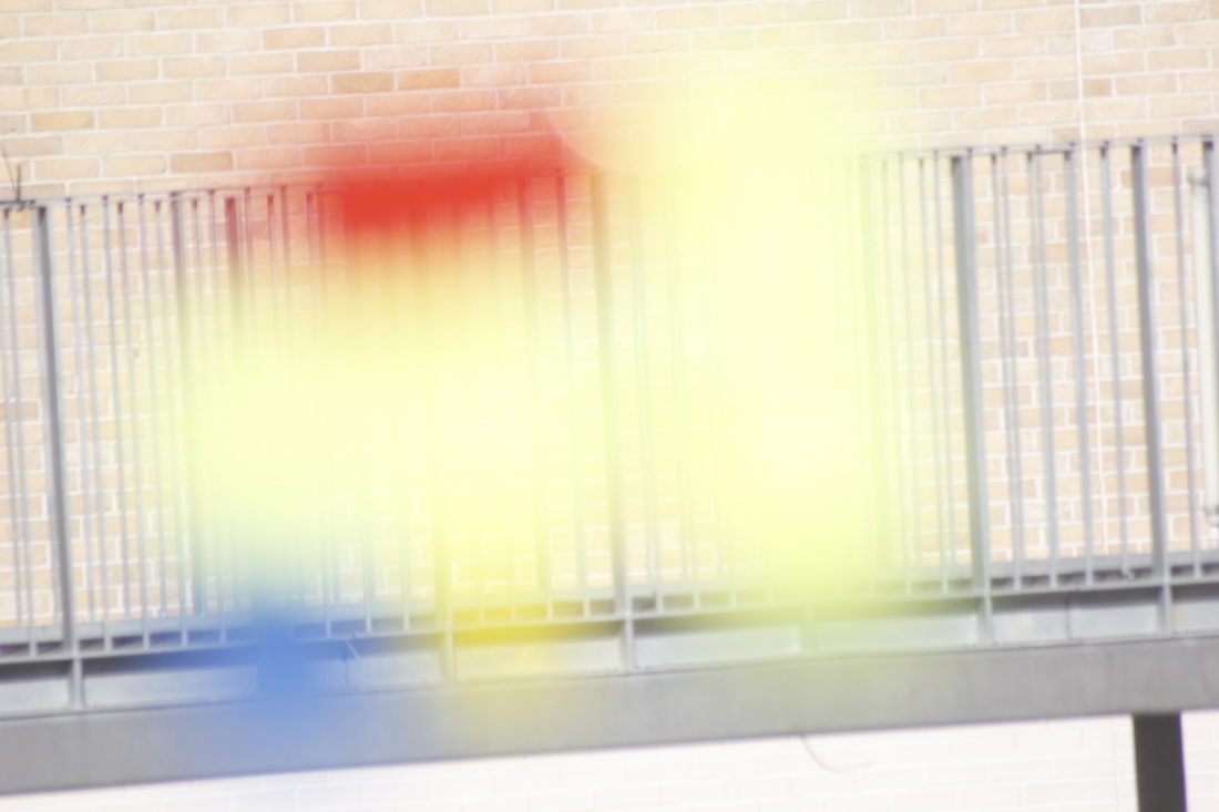
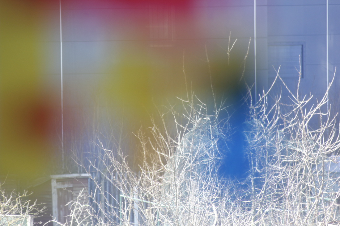
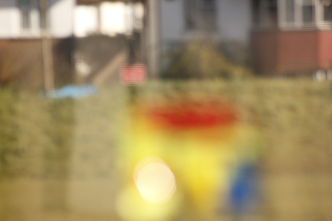
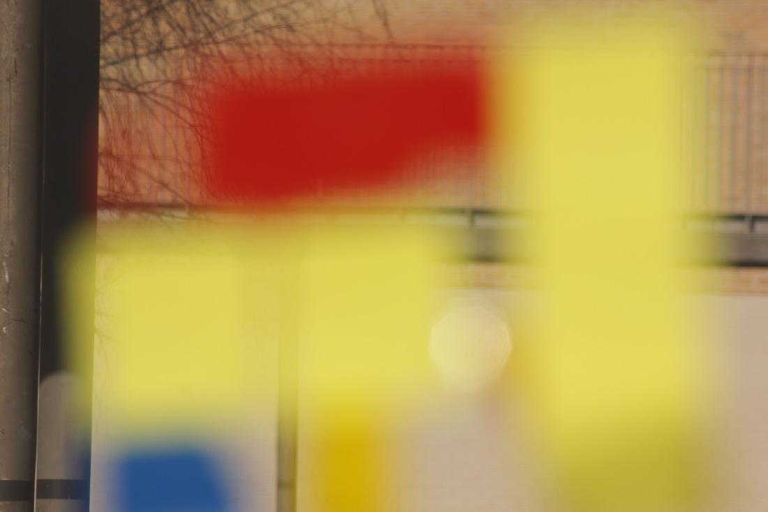
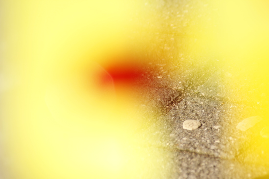
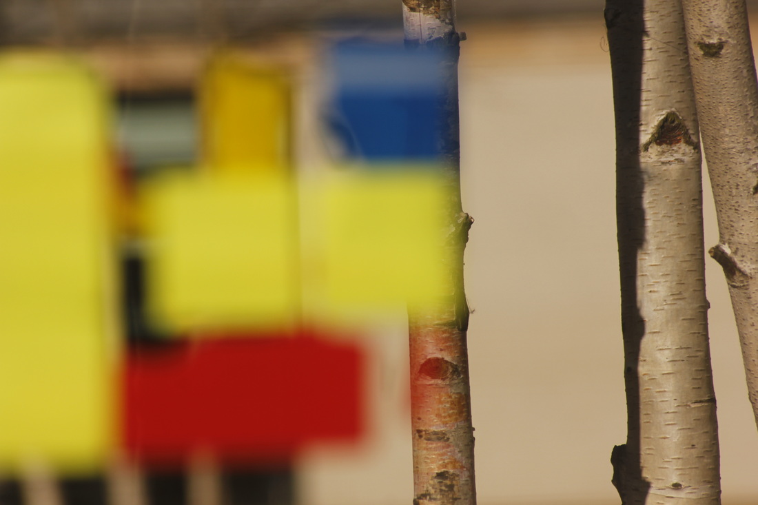
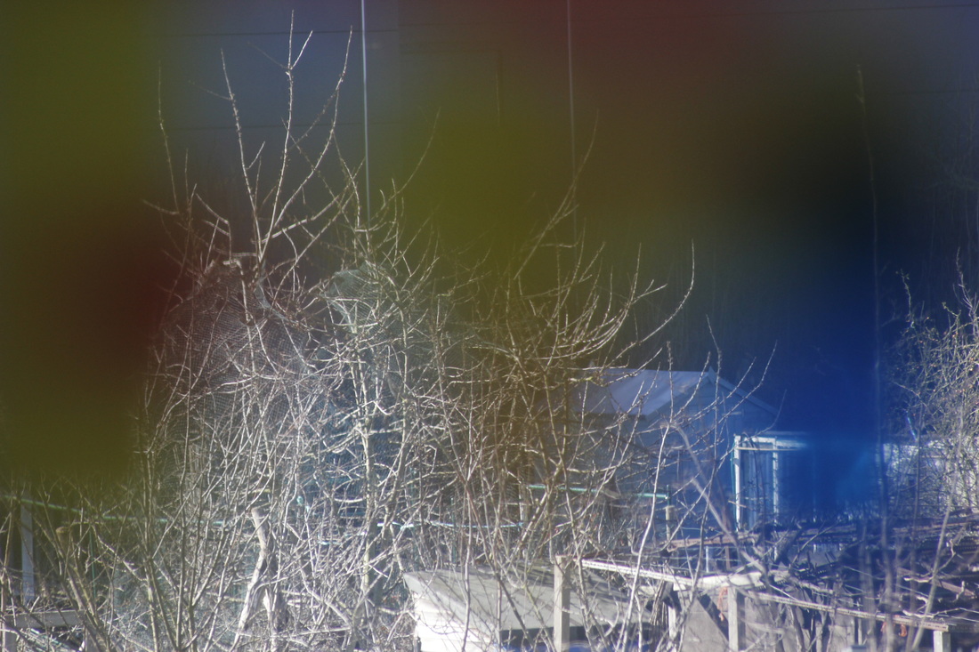
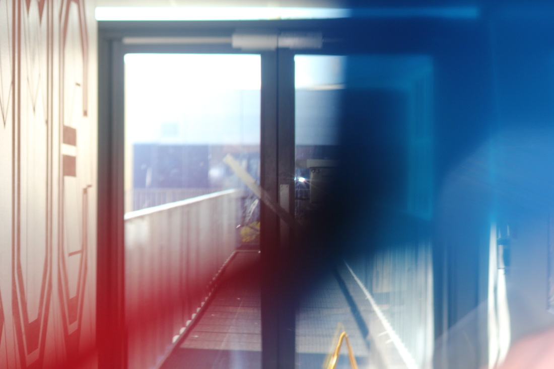
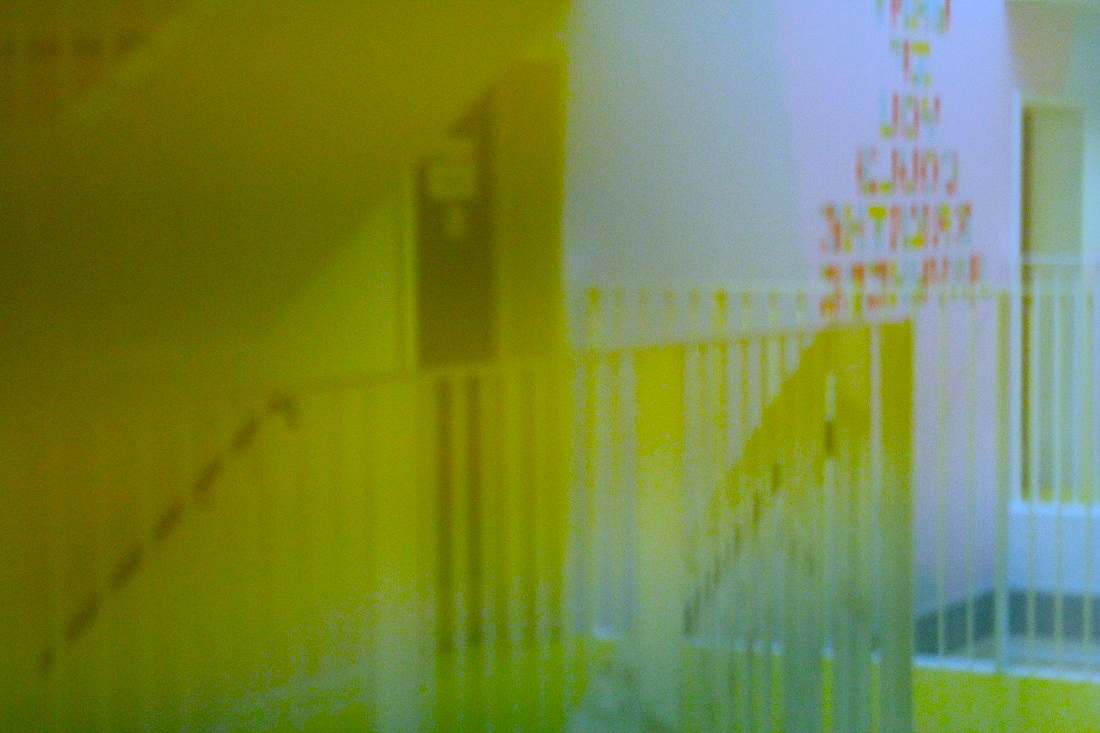
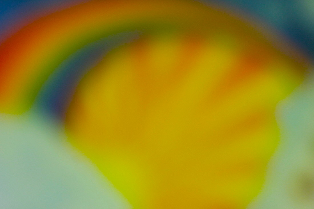
more saul leiter photosHere is my latest batch of Saul Leiter inspired pictures, this set I focused on colours, focus and shape.
For lots of the photos I made there be little to no focus, I chose to do this because it made the photos more abstract. |


FINAL PIECE PREPARATION
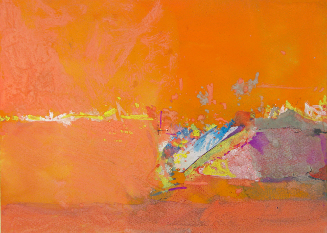
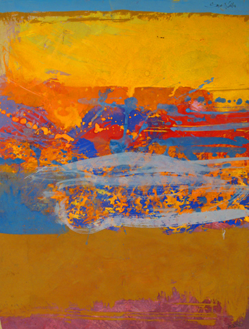
For my final piece for the abstraction unit I want to focus on colour and focus because through out the unit these themes have been the most interesting to me.
Photographers like Ernst Haas have been inspiring me to edit photos that I have taken and increase the colours.
Photographers like Ernst Haas have been inspiring me to edit photos that I have taken and increase the colours.
Here are some mock ups of the kind of colouring that I want to use for the final piece.
Ernst Haas demonstrates this also, lots of the colours he uses are contrasting.
Ernst Haas demonstrates this also, lots of the colours he uses are contrasting.
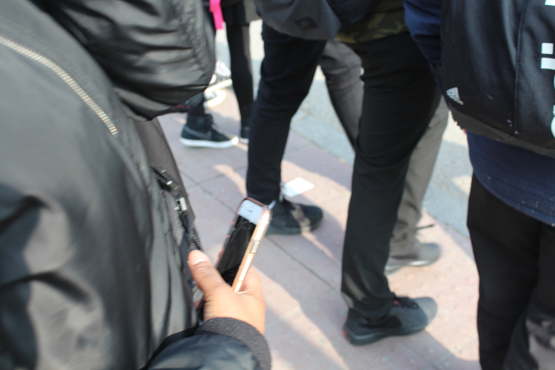
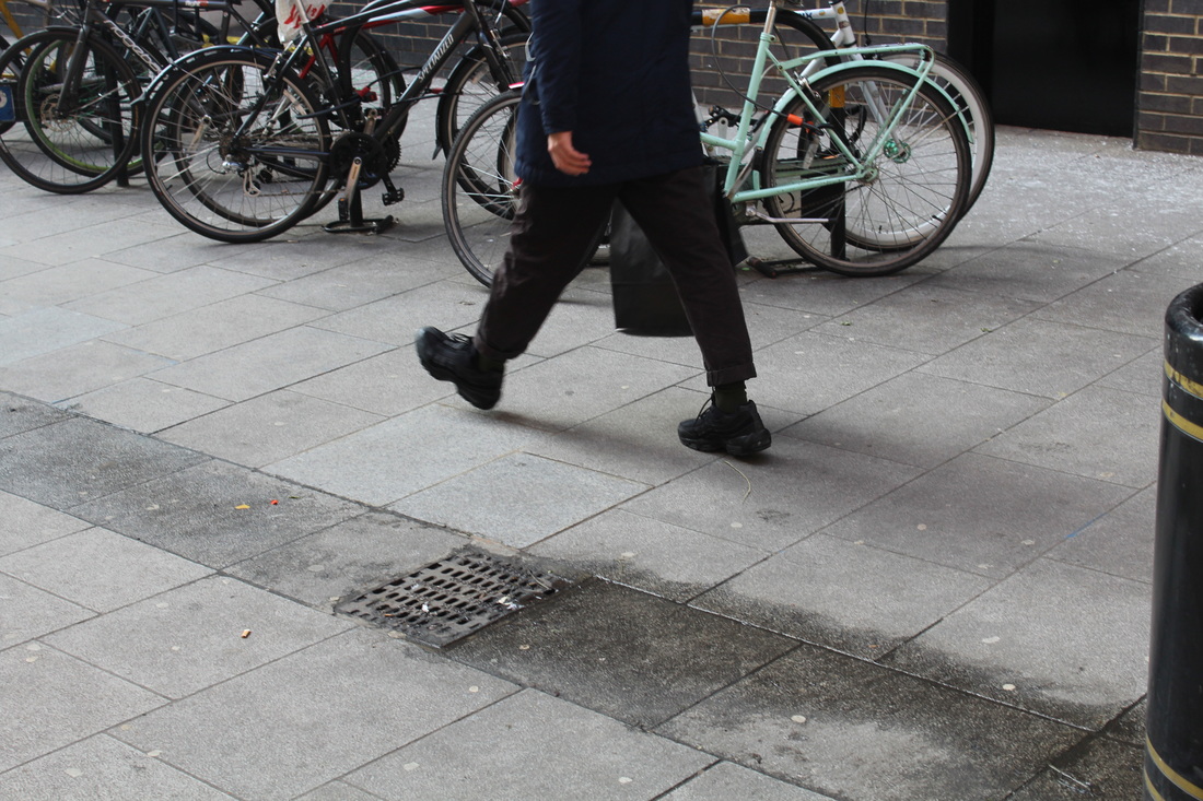
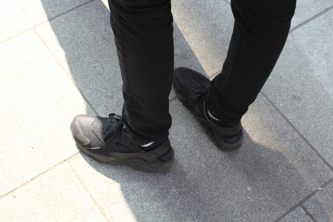
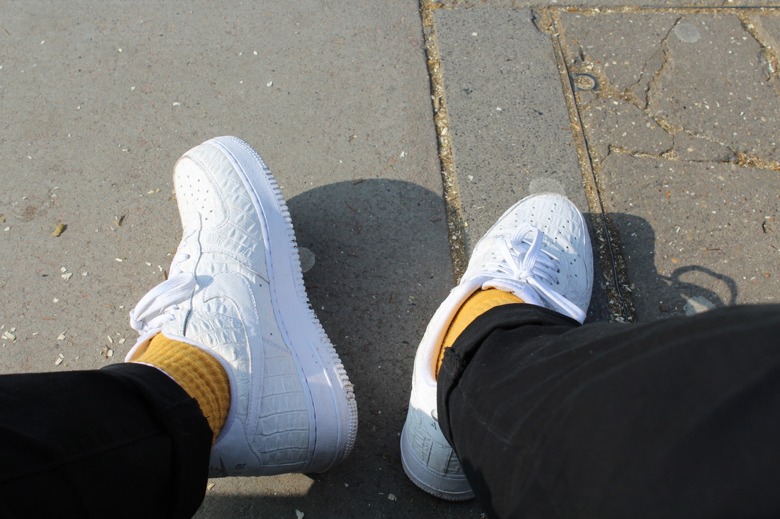
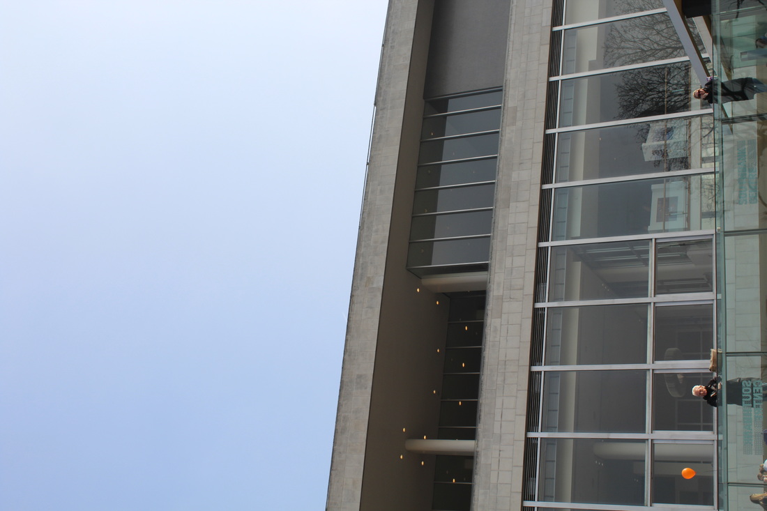
TRIP TO THE SAUL LEITER EXHIBITION and the southbank
|
On Friday the 10th of March our class went on a school trip to the Saul Leiter exhibition at the Photographers gallery in London, the exhibition had a vast collection of Leiters work including his paintings, photographs and his note books, it was very interesting to see work in real life that we had been studying.
editing the image
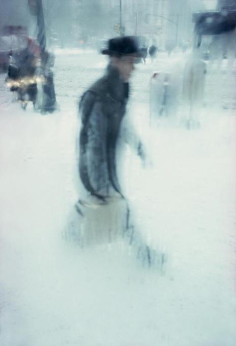
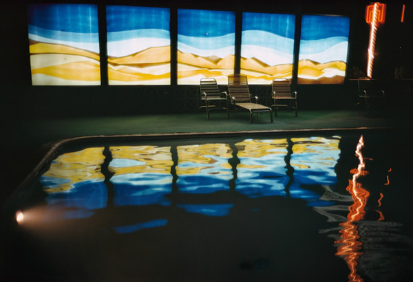
final picturesHere are the final pictures that I intend to use for my final piece for this unit of work, the themes that I ended up experimenting with were colour and focus.
|
|


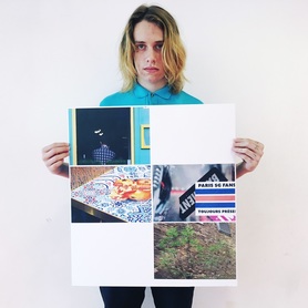
evaluation of my final piece
My final piece for the abstraction project consists of four pictures that I took on our school trip to the Saul Leiter exhibition. The themes that I tried to explore were Colour and Focus, I wanted all of the colours in the piece to be very bright and vibrant as I felt that the bright colours would make the abstract pictures quite unique as lots of abstract images are black and white, I also wanted to focus on focus or more specifically out of focus, this is because my work was inspired by Saul Leiter and often he plays around with focus.
Iam happy with my outcome as I feel I complete the task to a high standard.
Iam happy with my outcome as I feel I complete the task to a high standard.
