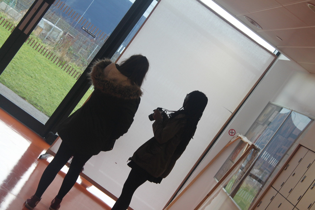
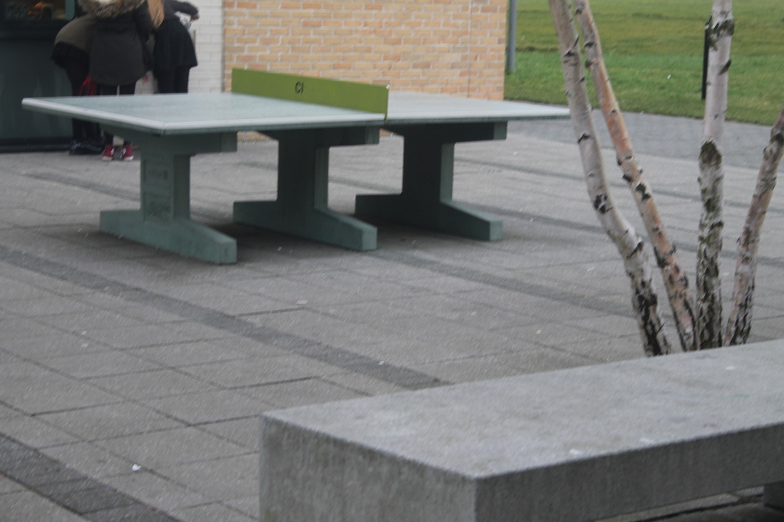
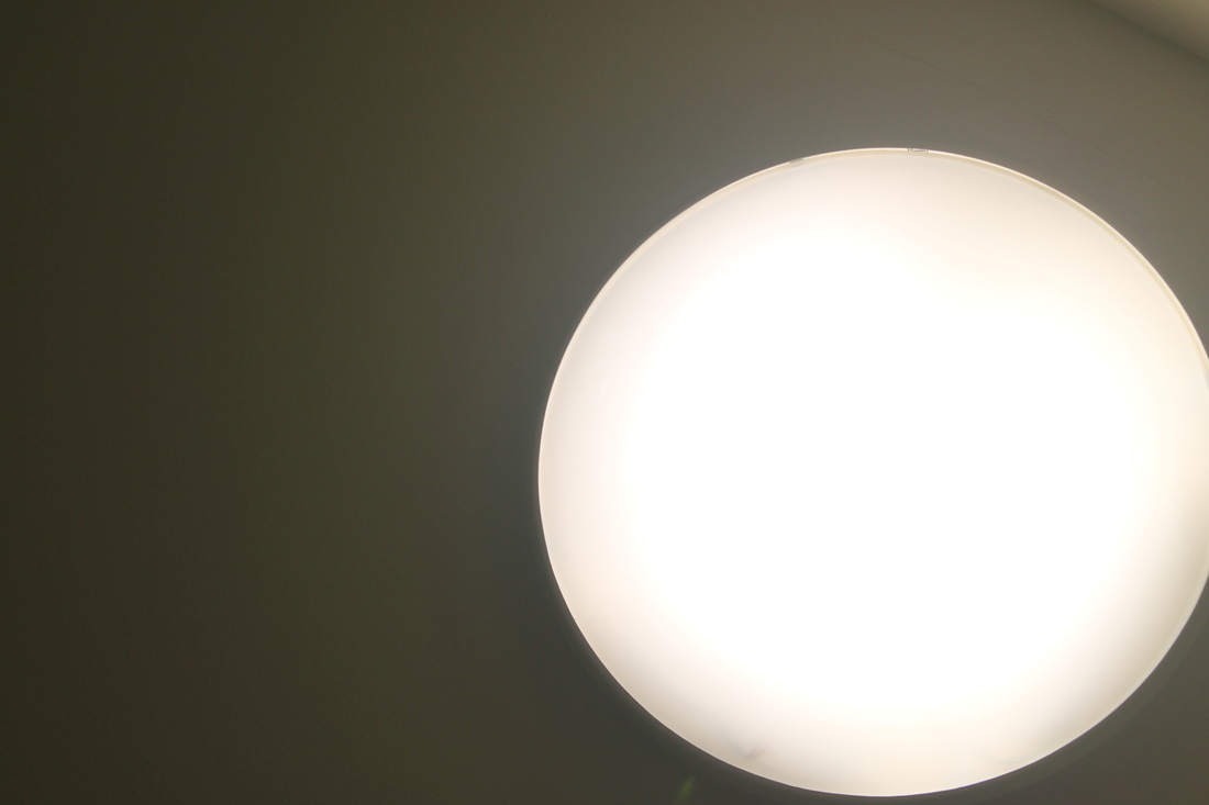
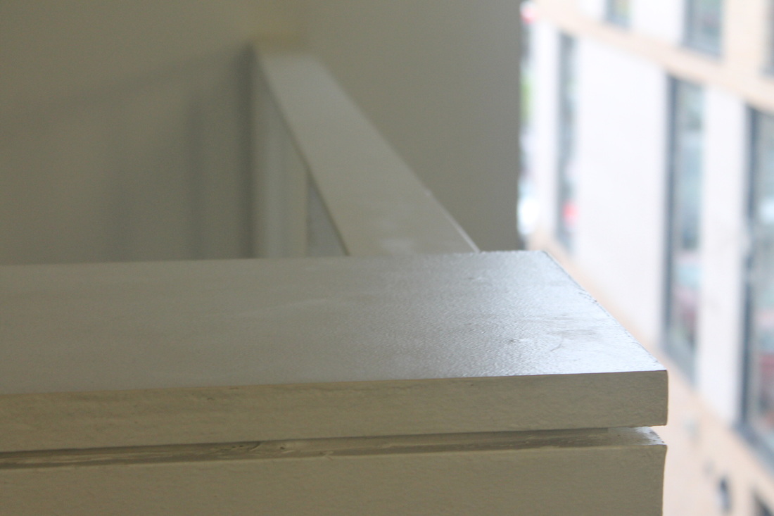
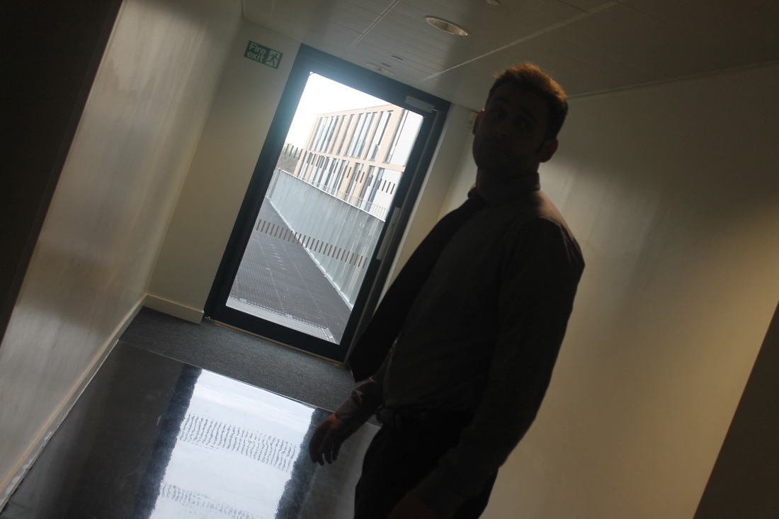
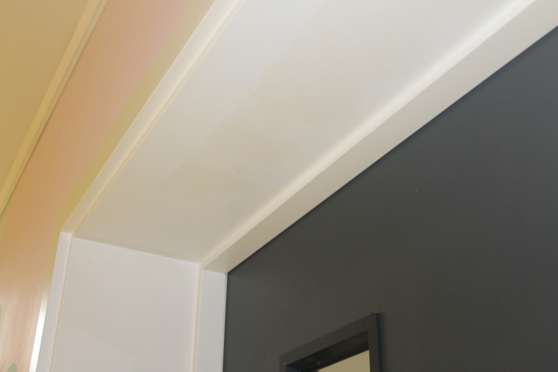
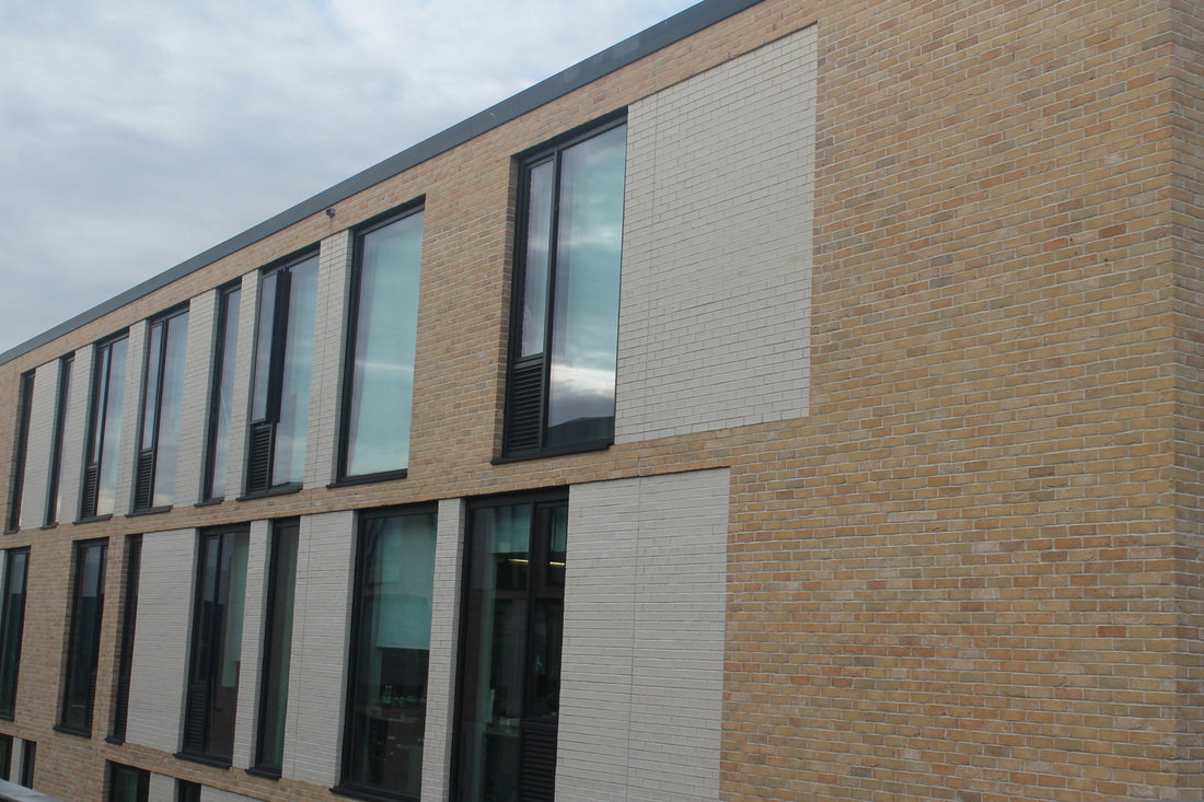
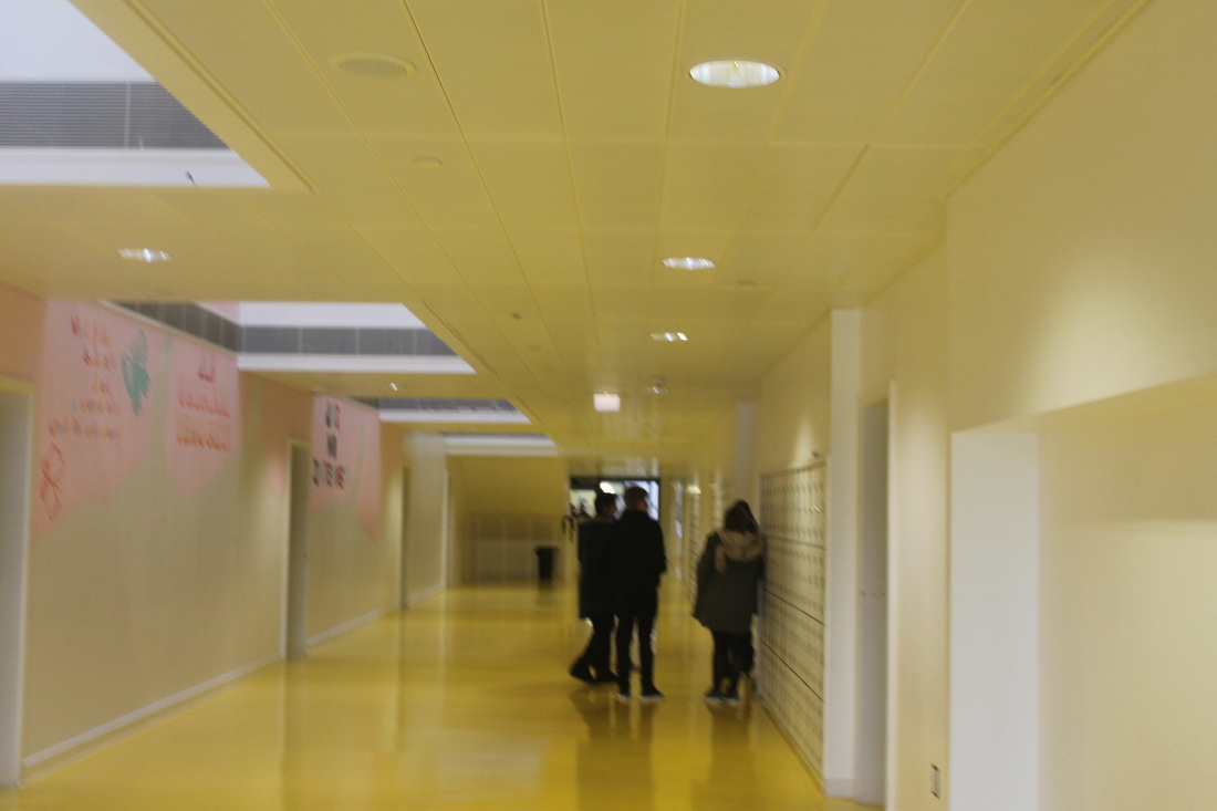
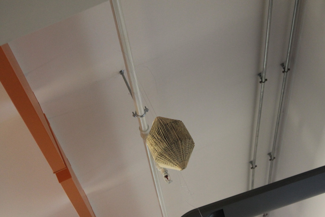
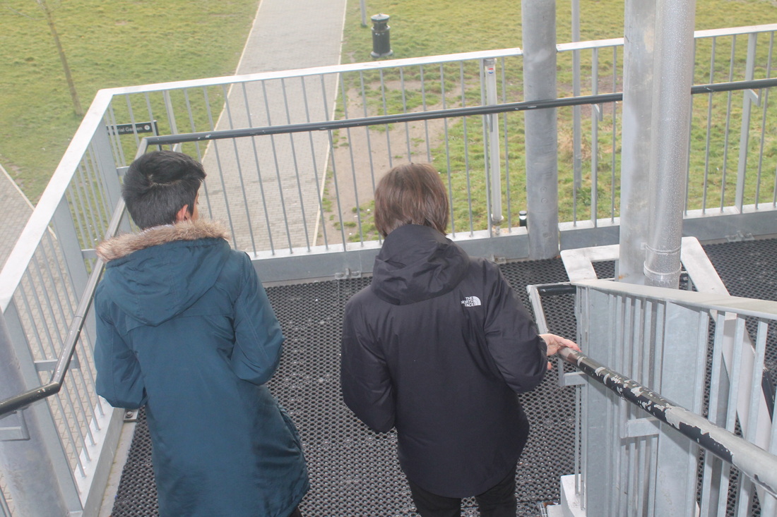
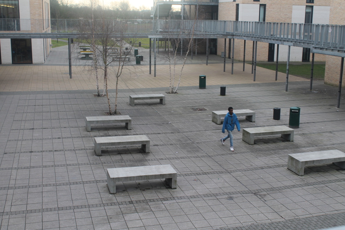
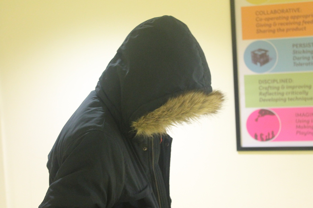
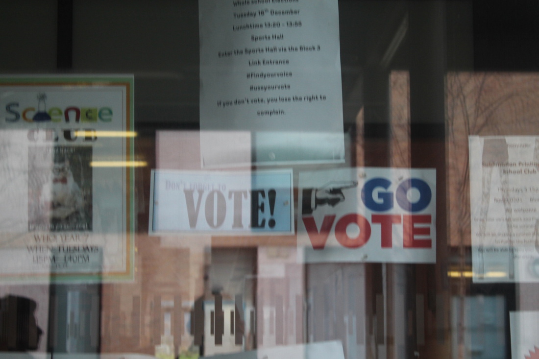
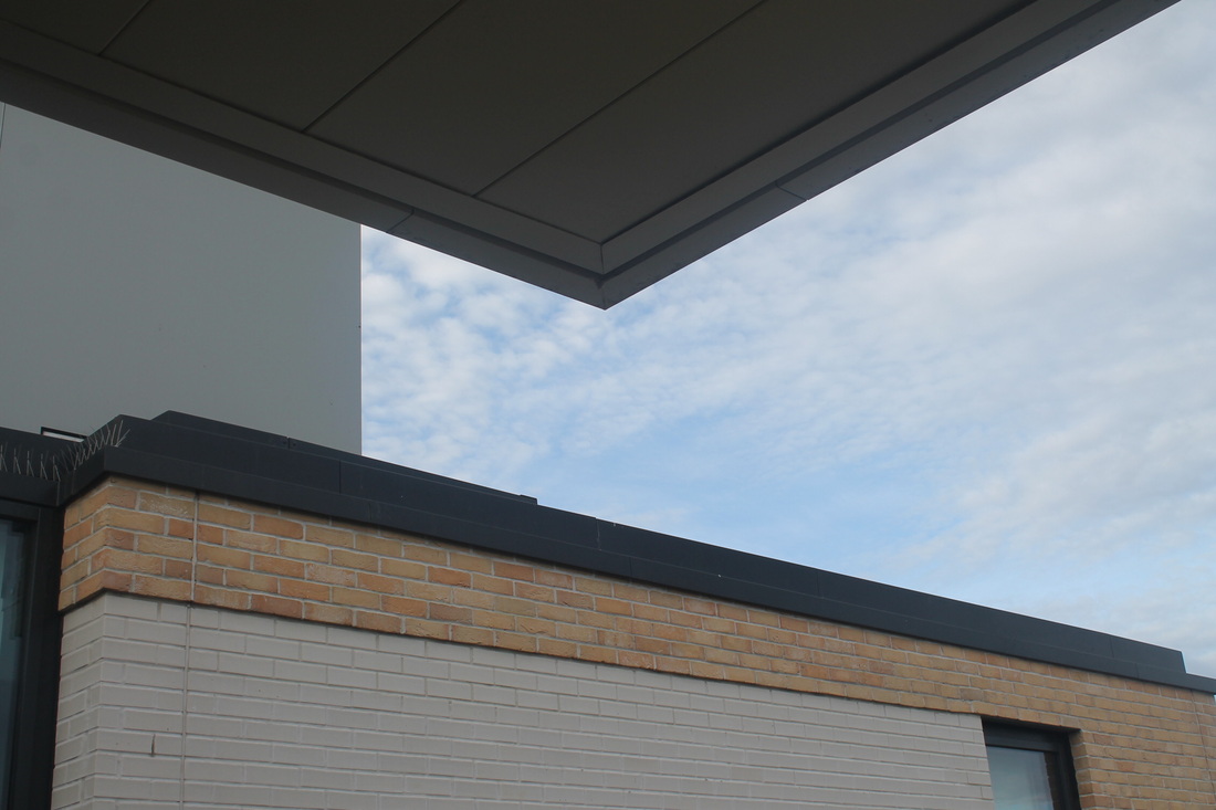
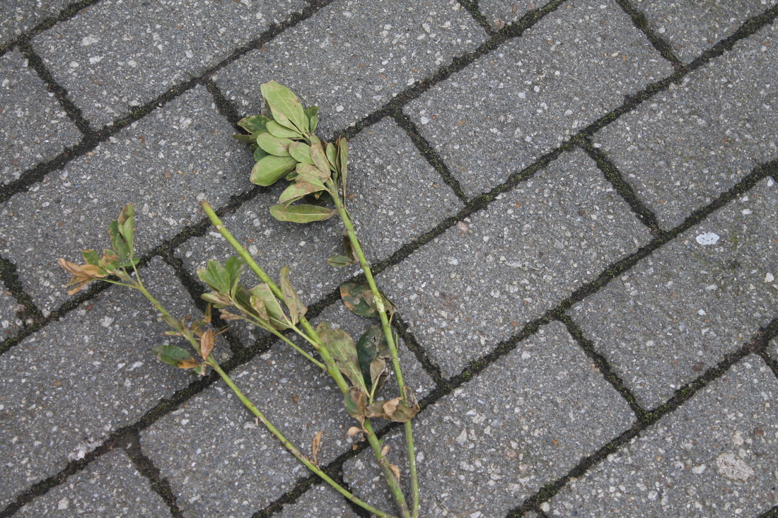
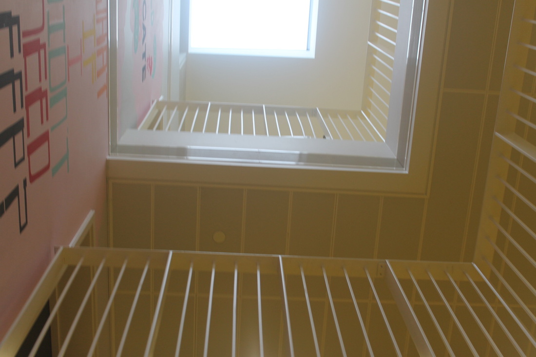
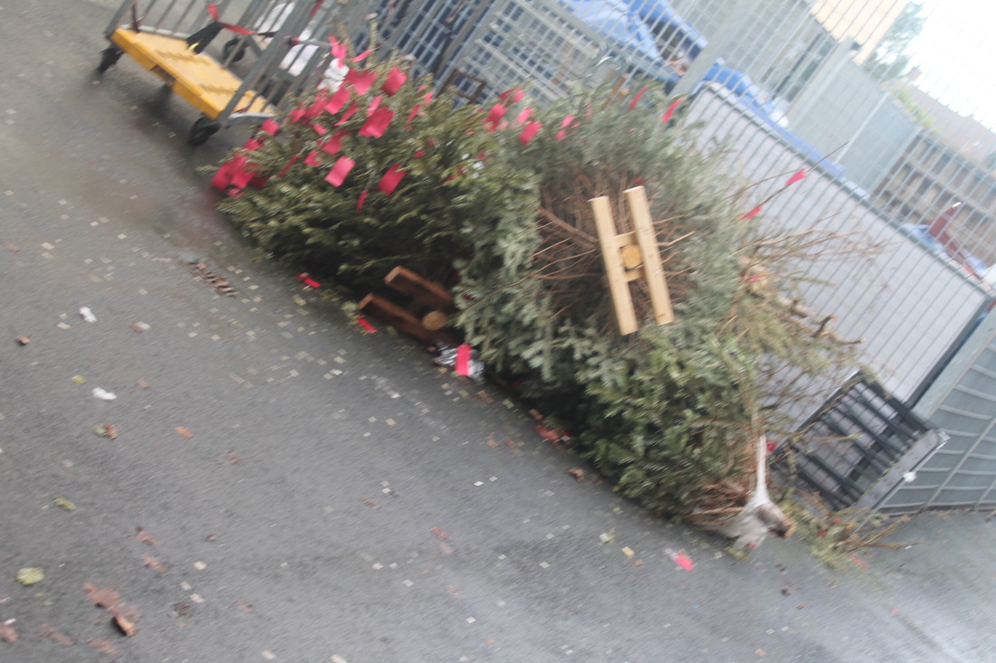
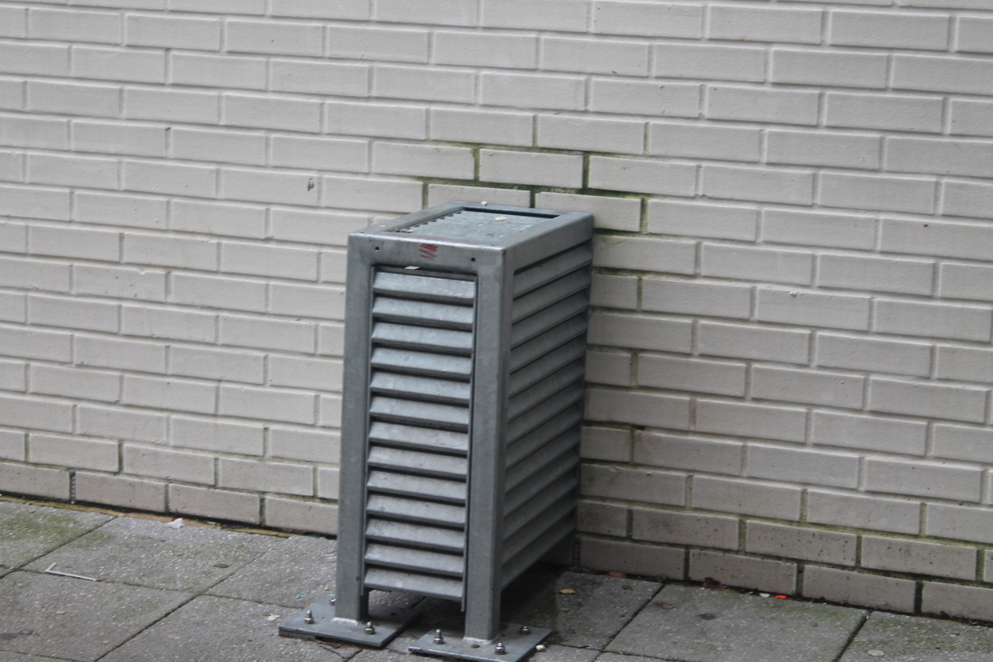
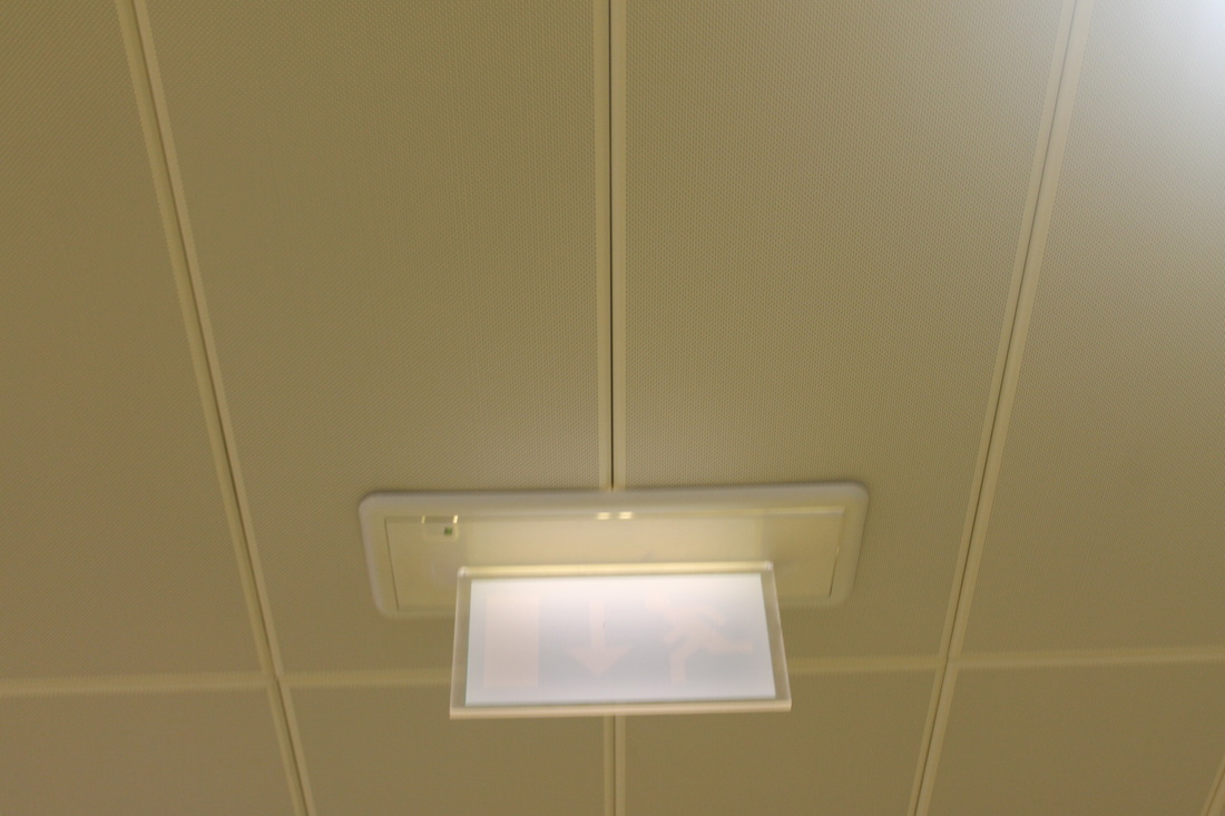
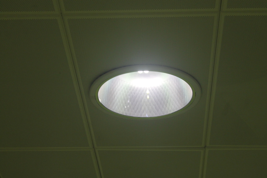
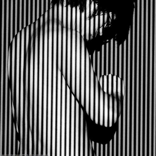
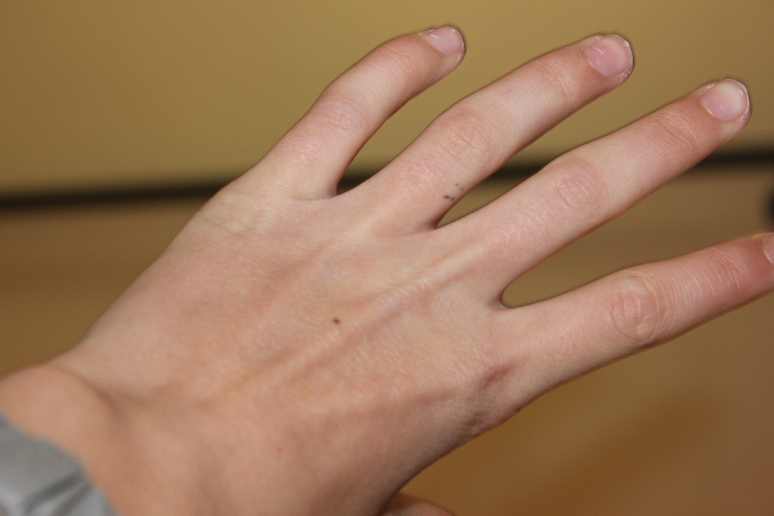
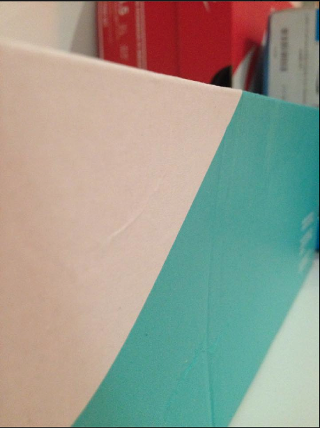
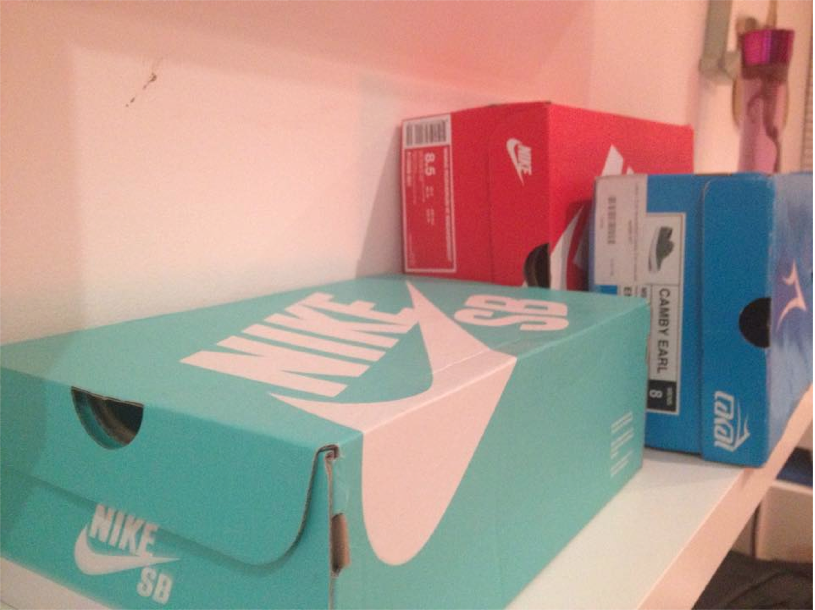
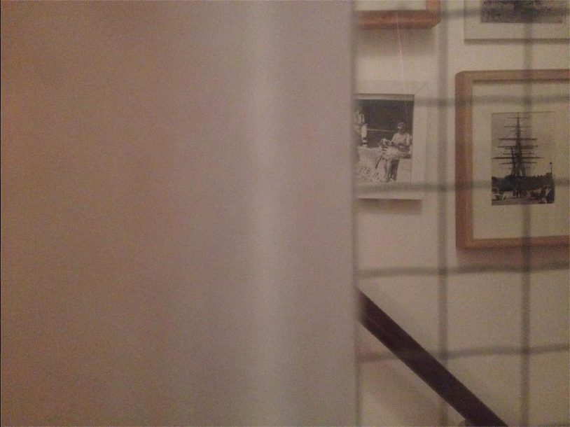
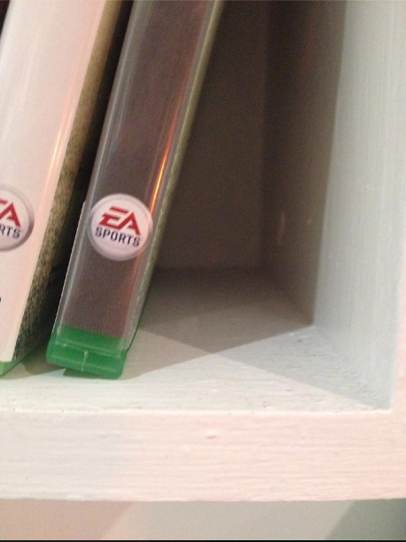
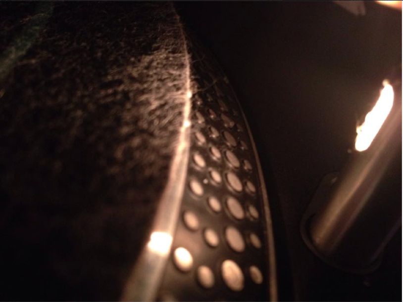
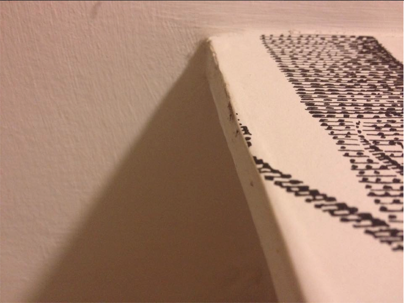
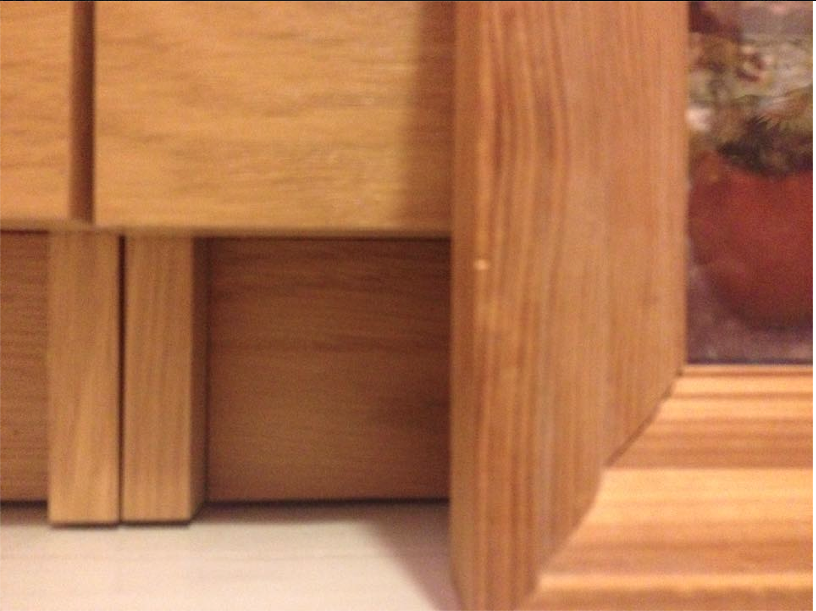
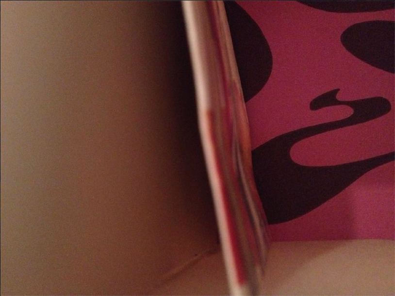
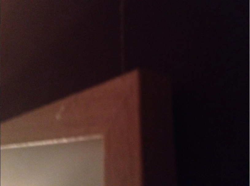
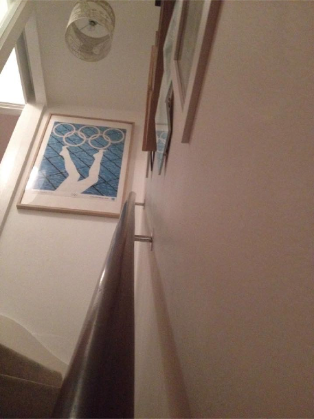
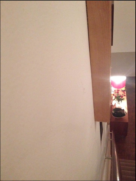
This term in Photography we are looking at edges and what they look like. Here is my first set of edge photos. I went around the school looking for interesting edges. Some of the edges we took photos of were better than others, for example my favourite photo is the white hand rail because it has clear edges and is very clean and crisp my least favourite is the window with the signs in, this photo is very unclear and I'am disappointed with it but next time I will learn from my mistakes. A photo that I could improve is the of the benches with the table tennis tables in the background, this could be improved by getting a better angle, the idea is good but I didn't execute it properly.
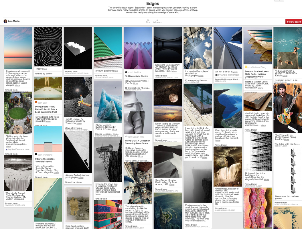
Here is my Pintrest Board on Edges, I found pictures that all show edges in a way. Some show beautiful landscapes, some show buildings and some just fascinate me. The photo that shows the multi coloured bricks is my favourite because the colours are just beautiful and they create a nice photo.
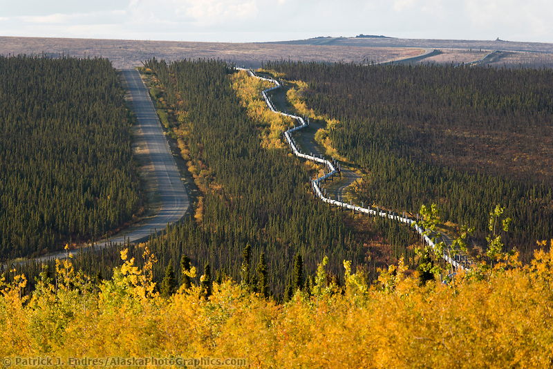
An artist who takes photos of edges is Patrick J Endres. He is known for his pictures of Alaska and the northern lights but he also takes photos that contain subtle edges. I used a picture of his on my Pinterest board. Here is some of his work.
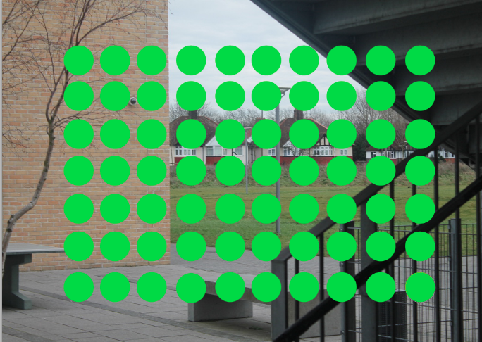
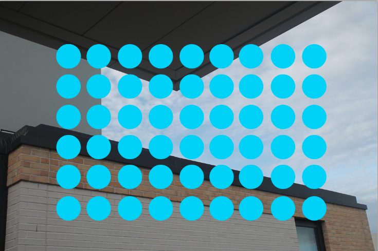
What I like best about the picture on the left is its amount of subtle edges. The yellow leaves that merge into to the green forrest creates a jagged edge, the straight road and the bendy pipe creates a parallel effect. Eventually the parallel edges fades into the bleak wilderness which creates a straight edge with the skyline. In total there are five edges.
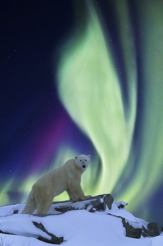
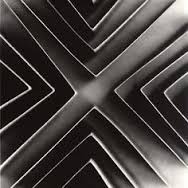
The picture on the right also has a large amount of edges, the rough edge of the rock creates a jagged horizon, we also see faint edges on the aurora.
Patrick J Endresis one of alaskas most published photographers, with photos being printed in various wildlife magazines. I chose Patrick J Endres because his work makes you say wow when you see it because of its extravagant nature. He has lived in Alaska for thirty years and is still as lured by its epic landscape as when he moved there. Here is a link to his website http://alaskaphotographics.com/patrick_endres.shtml.
What I like best about the picture on the left is its amount of subtle edges. The yellow leaves that merge into to the green forrest creates a jagged edge, the straight road and the bendy pipe creates a parallel effect. Eventually the parallel edges fades into the bleak wilderness which creates a straight edge with the skyline. In total there are five edges.
The picture on the right also has a large amount of edges, the rough edge of the rock creates a jagged horizon, we also see faint edges on the aurora.
Patrick J Endresis one of alaskas most published photographers, with photos being printed in various wildlife magazines. I chose Patrick J Endres because his work makes you say wow when you see it because of its extravagant nature. He has lived in Alaska for thirty years and is still as lured by its epic landscape as when he moved there. Here is a link to his website http://alaskaphotographics.com/patrick_endres.shtml.
|
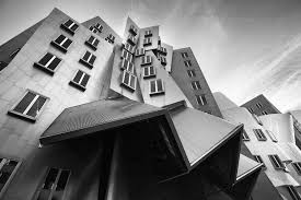
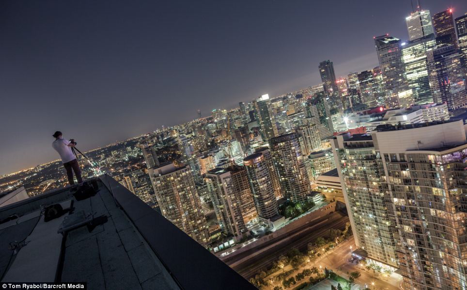
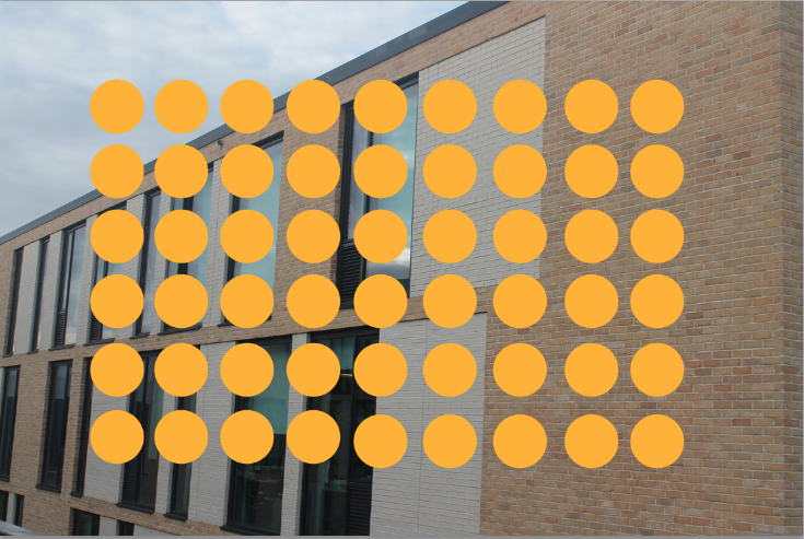
Here are some edges that I found on the internet. They all show edges, my favourite is the man standing on the edge of the building as it literally shows a edge.
|
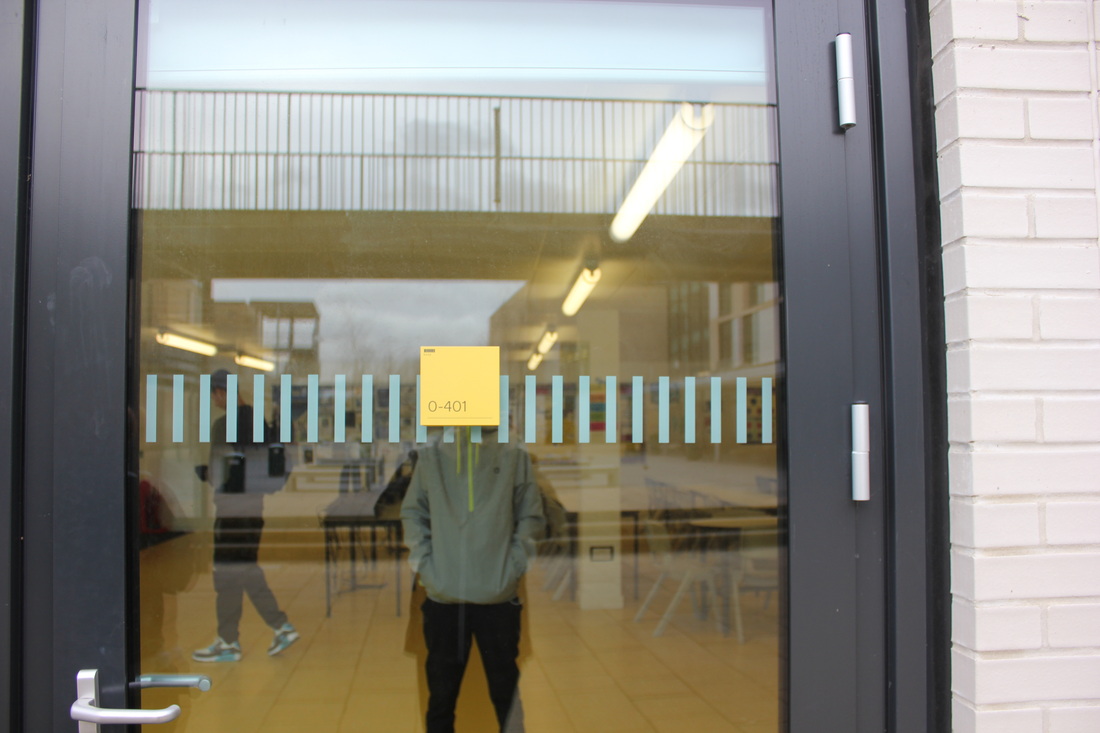
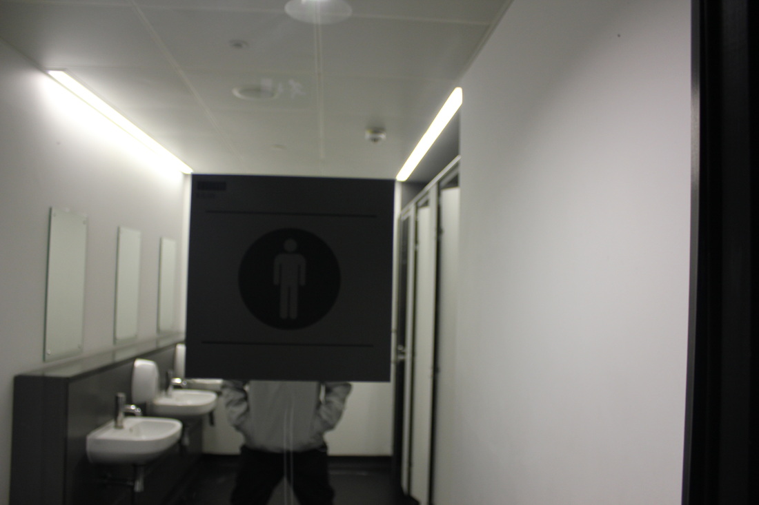
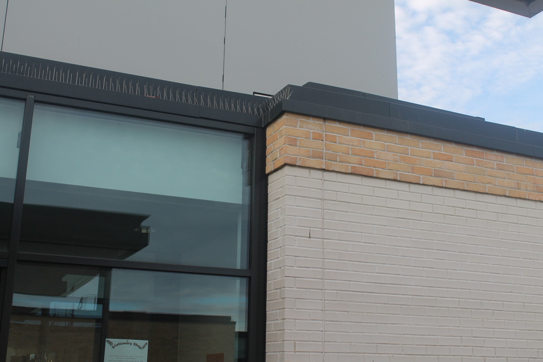
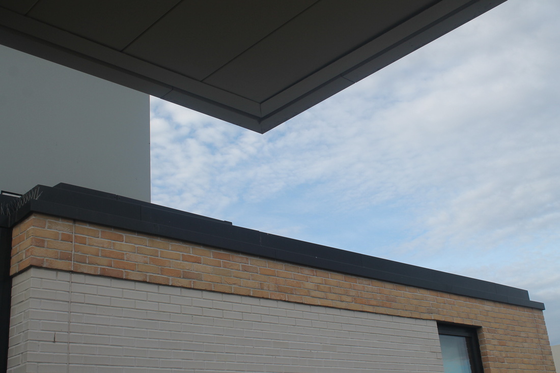
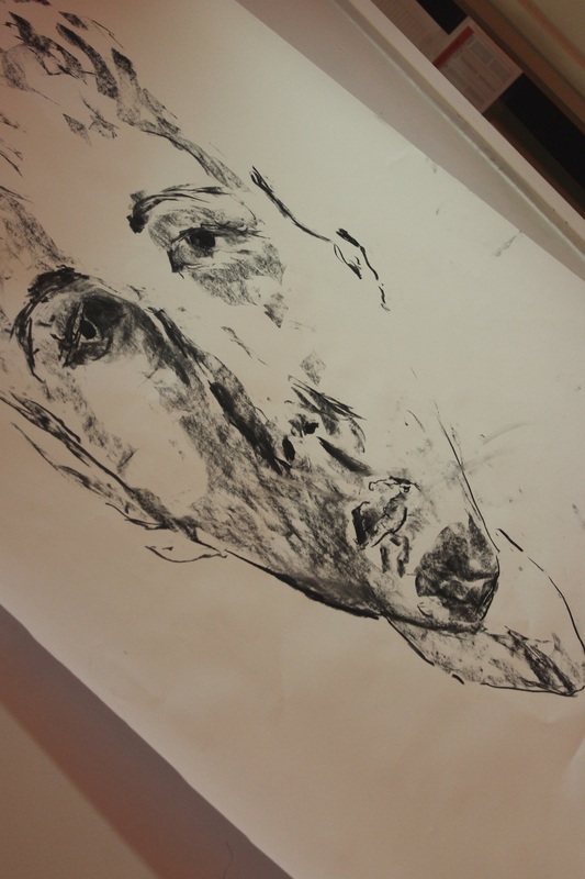
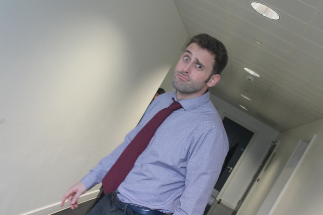
Here are my second set of photos from the DSLRs. We tried experimenting and linking disguising and edges, with this idea we tried using parts of the building like the room numbers to hide the face. The outcome of this was not perfect but next lesson we will work on this idea and develop it until it is what we were going for.
My favourite picture from this session is the picture in the bottom left corner. We took the photo because of the writing on the wall but when we took it we noticed the light reflecting. I think this looks cool.
My least favourite picture is the bottom right because the concept of disguising didn't really work.
Randy Grskovic
|
Randy Grskovic is a photographer who lives in Toronto, Canada.
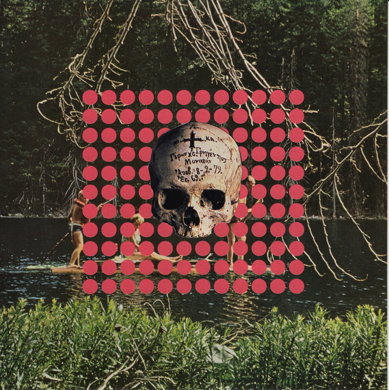
He specilises in cutting up and editing photos and changing them by adding effects. Here is a link to his website http://www.randygrskovic.com/About-Randy-Grskovic This is my favorite image by him. It is my favorite because of the pink dots, the dots remind me of the Tallis Habbits. I think Randy found the photo like he did with the one we looked at in class. If I could name the photo I would name it Pink because the color stands out in the photo and is the first thing you look at. If the artist walked in to the room I would ask him why he arranged the dots in this way. |
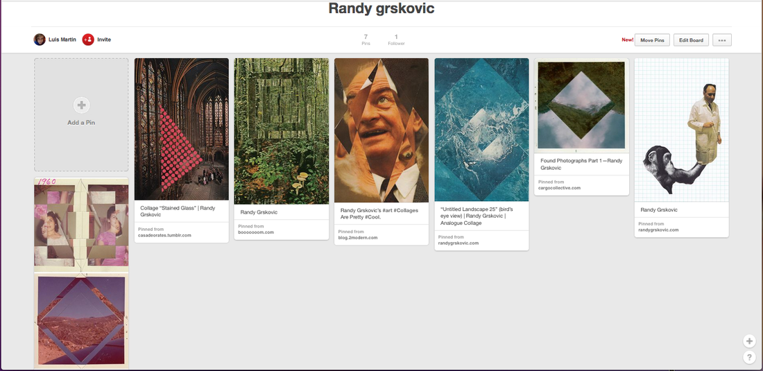
Here is my pinterest board, I will add photos to it all along the year.

|
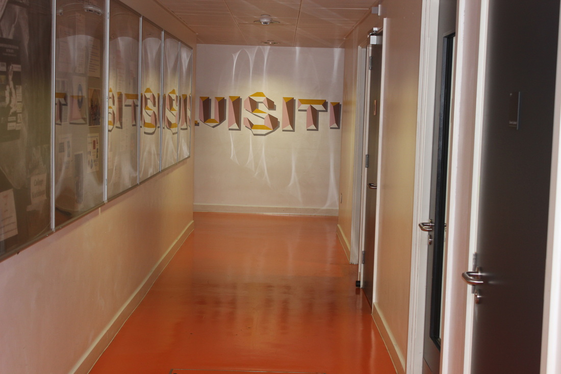
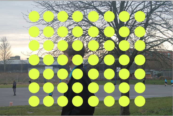
The picture above is my piece that I made in the ten hour controlled assessment. During the project I researched Randy Grskovic, this is the piece that inspired me
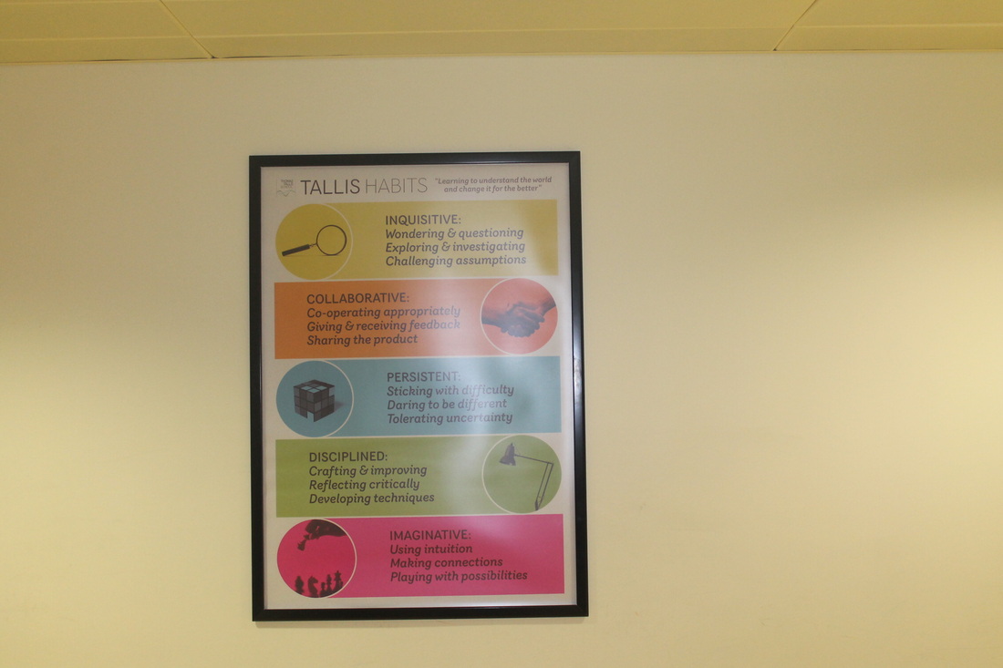
my piece was inspired by one of his which he put what look like stickers on a photo of the jungle. My first Idea with this theme was to physically stick the Tallis Habit stickers to the photos. I then worked out that I could digitally do this on photoshop. Whilst doing the assessment I had to experiment with the variety of ways to create this effect. First I planed to create this by creating the circles individually, I later learned that I could copy the shape, this helped my a lot as it saved me a lot of time. I decided to do this because I still wouldn't have finished making the piece. When making the piece I found that the colours matched the background, I felt that this worked well as it was a happy accident. A part that I found particularly challenging is the fact that the file with my work got deleted twice so I had repeat the process three times. Along the way the photos changed, this was because I felt that the colours didn't match. I am extremely happy with my outcome because the layout sets the pictures out in a way that I wanted. The pictures are laid out in the order of the Tallis Habits, INQUISITIVE COLLABORATIVE PERSISTENT AND DISCIPLINED, this was extremely pleasing, if I had more time to do it again I would add IMAGINATIVE to the piece.The reason i didn't have imaginative was because of a printing issue. Also the colours resemble how I took the picture, for example I had to take four pictures for the PERSISTENT photo. I feel that I explored the theme successfully because the final outcome resembles my first initial idea. Thomas Tallis is a community that thrives off the habits and when people view my work I want them to see Tallis not as a school but as a community like all of us at the school do. The piece exceeded my expectation as when I look at it I feel that I have achieved something and that was something I was not expecting, after the project I will have learnt how to use the new skill on photoshop, this is a skill that will help me with the rest of the coarse. |

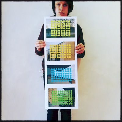
This is the piece that inspired me.
|
