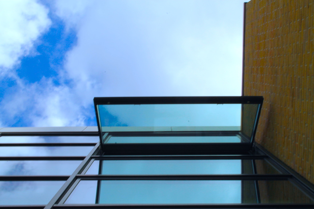
OPENINGS
For my final personal project of Unit 1 have chosen to work with the theme of Openings, I feel that I will be able to successfully take and evaluate photos that link to the theme.
Openings could mean holes, cracks or windows, my perspective of a opening is an interruption in a surface.
Here is the actual definition of opening
Openings could mean holes, cracks or windows, my perspective of a opening is an interruption in a surface.
Here is the actual definition of opening
My plan going into this unit is to start with typical openings like windows and doors but then advance into more complex openings that I can create with other photos.
I chose this theme as I know that I will be able to create unique and interesting final pieces that will clearly show my understanding of the theme.
I chose this theme as I know that I will be able to create unique and interesting final pieces that will clearly show my understanding of the theme.
early plans for my final piece
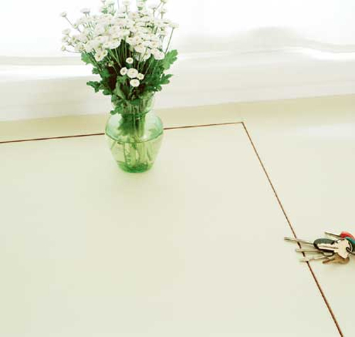
As soon as I picked Openings as the theme for my project I had an idea for my final piece, the idea would include lots of the themes that fall under openings (Open spaces, Empty walls, bright colour and holes).
My idea was to take a photo of an open space outside, then edit the colours in the picture to make them brighter, I will then print the picture or group of pictures and place it on a blank wall, this will give the effect of the wall having a hole in it.
My idea was to take a photo of an open space outside, then edit the colours in the picture to make them brighter, I will then print the picture or group of pictures and place it on a blank wall, this will give the effect of the wall having a hole in it.
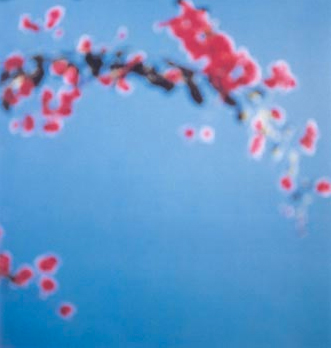
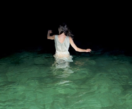
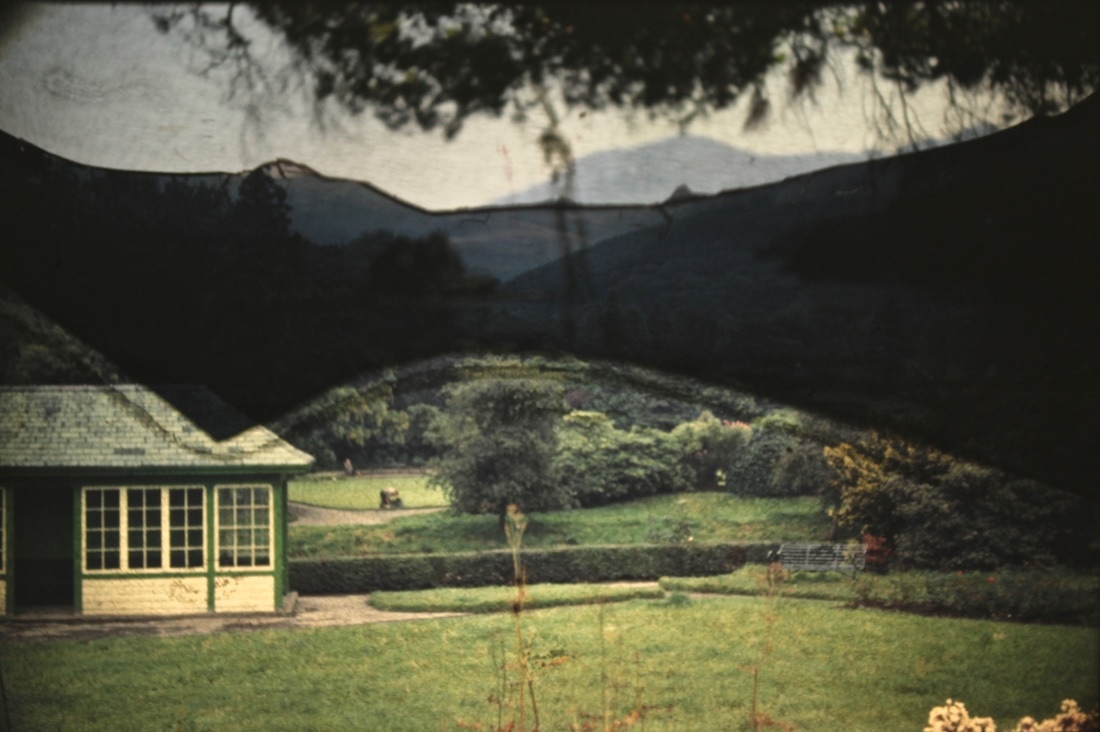
Rinko Kawauchi
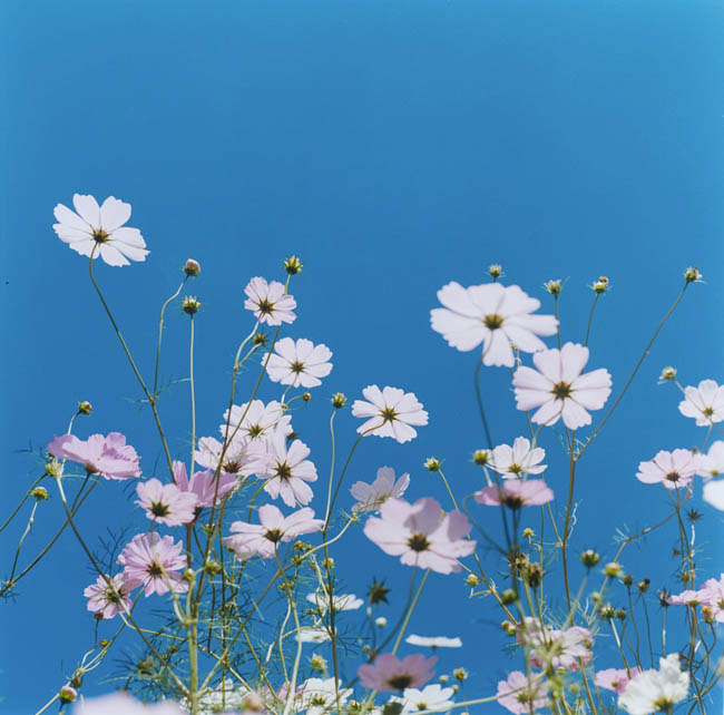
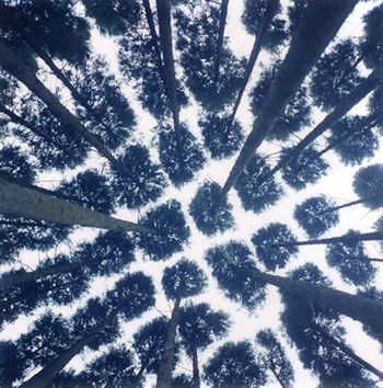
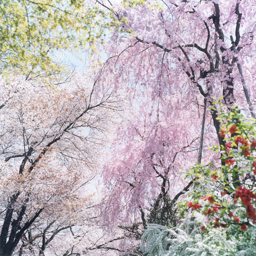
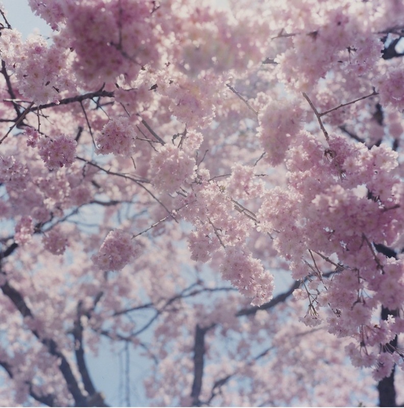
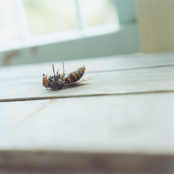
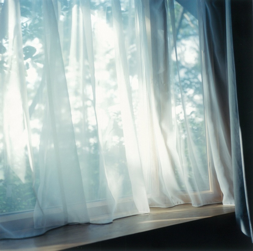
A photographer who uses openings as a theme that I like is Rinko Kawauchi, lots of her photos are bright and have lots of bright colours, she uses lots of pastel colours which remind me of the summertime.
Here is some of her work. My two favourite photos are the first and the last because they show life and death, both pictures have beautiful colours that are very positive, I will taking inspiration from her work.
Her work links to openings in a very unique way,she makes the viewer think about the different openings that she has created by lighting, spacing and colouring.
A clear example of openings in her work is in the middle image on the top row. Kawauchi has created visible openings inbetween the trees which form a grid shape.
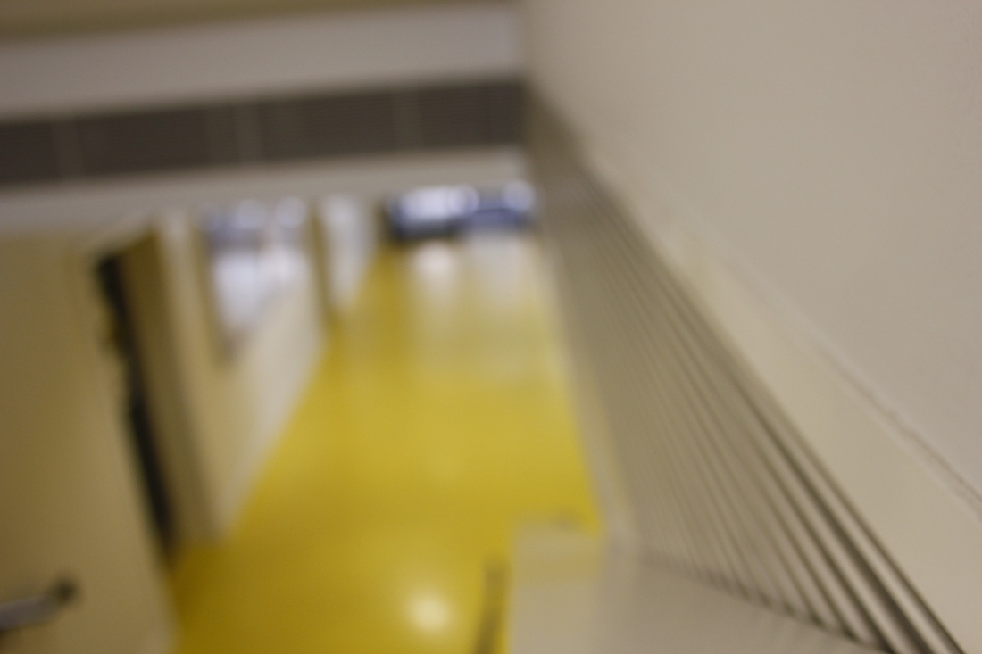
FIRST SET OF IMAGES
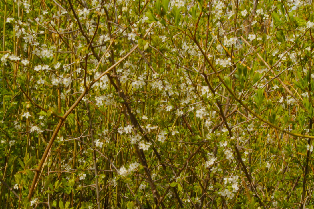
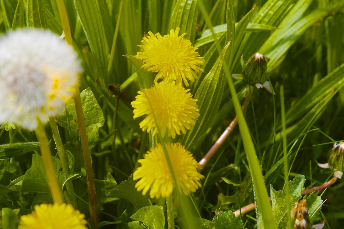
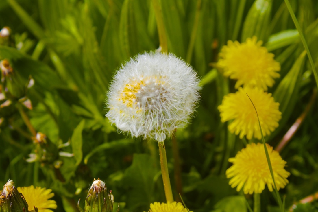
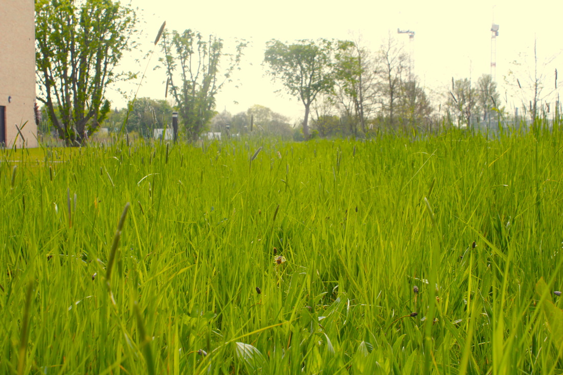
For my first set of photos based around the theme of openings was inspired by Rinko Kawauchi and the colours that she uses in her work, I started to take photos of nature, I edited the natural colours and enhanced them on Photoshop so they would be brighter. I feel like I created a responce that demonstrates my understanding of her work. I combined the theme of openings with her photographs of nature.
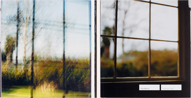
Uta Barth
|
Uta Barth is another photographer who experiments with the idea of openings, she is a German artist who is based in Los Angeles.
A common theme for her work is to make the photo out of focus, alike Rinko Kawauchi, Uta Barth's pictures include enhanced colours. In my opinion Uta's photos all have a fairly spooky vibe, they very rarely include people. |
|
response to uta barth
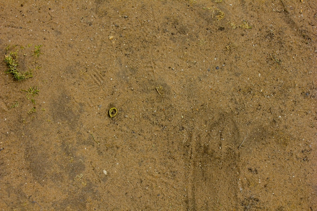
Bellow is my response to Uta Barth. I continued to focus on the idea of plants and trees, I really enjoy taking those types of photos.
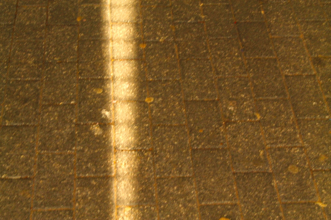
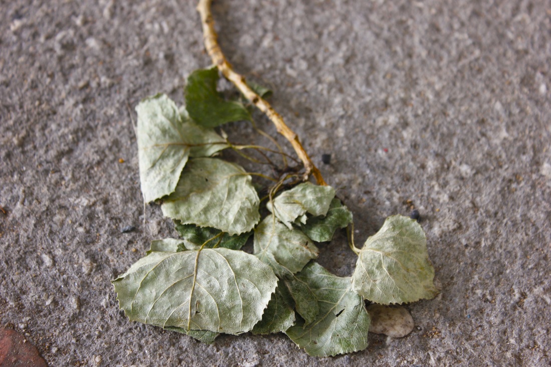
My favourite photo from this set would have to be the last on the first row, this is because the placement of the twig creates a disruption from the gravel and allows there to be an insertion of colour, another photo that I like would be the fourth image on the first row, this picture is intersting to me because it manages to combine the cololur of the leaves and bleakness of the pale sky.
To make the set of images better I could of tried to create a more cohesive set of pictures, next time that I take pictures I'll try and do this.

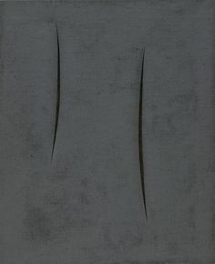
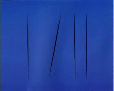
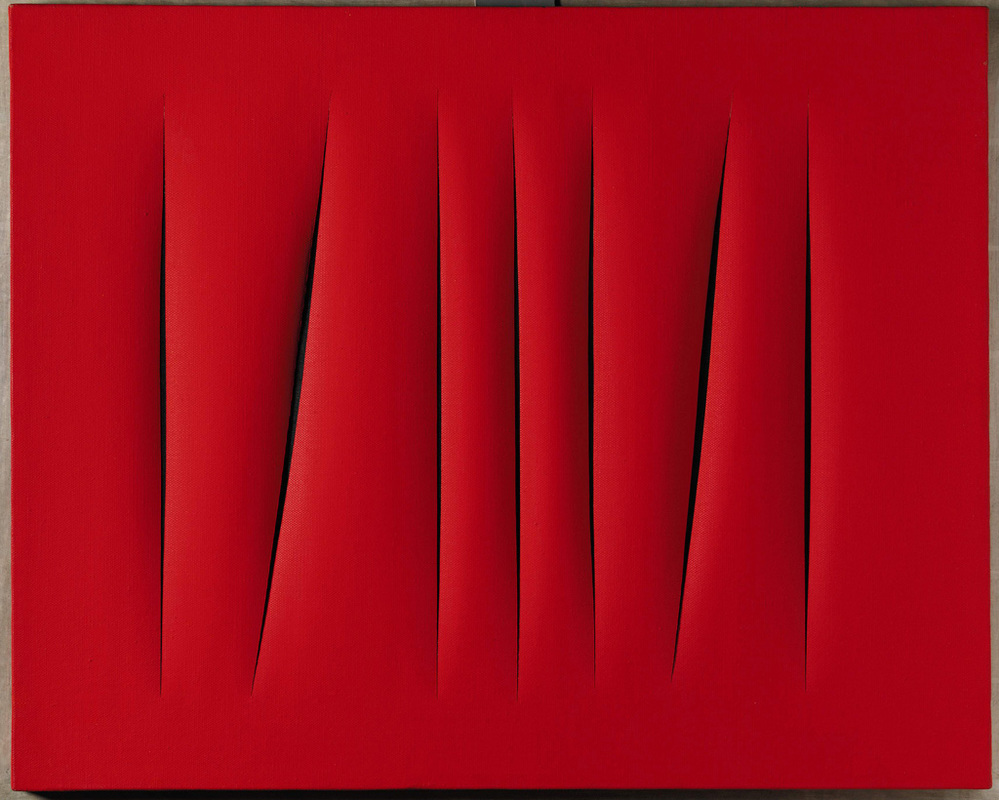
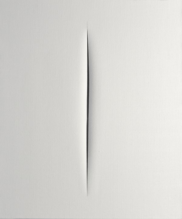
Lucio fontana
|
Lucio Fontana was an Italian artist and sculpture, his work gives a very different way of showing openings, his most notable work is of a plain space with slits cut into it. This is very unique, it still conveys the theme of Openings. His other work mainly revolves around sculptures and paintings.
I like his work because it is unique and very abstract. |
|
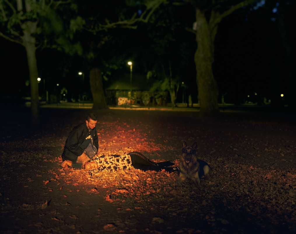
TOM HUNTER
|
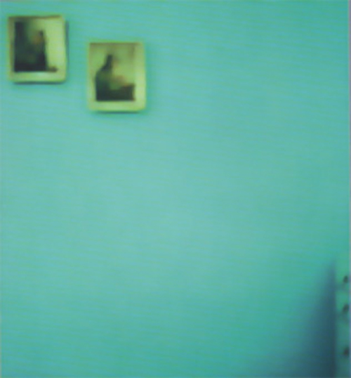
Tom Hunter is a photographer and artist from London, a common theme of his photographs is that he reimagines classic paintings from through out history.
His work has a very bleak and cold feeling to them, this is because of the use of cold colours such as green and light blue, he focuses on lighting which if you look at the pictures often causes a disruption which is used as an opening. |
|
PHOTOGRAPHY WRITTEN ASSESMENT
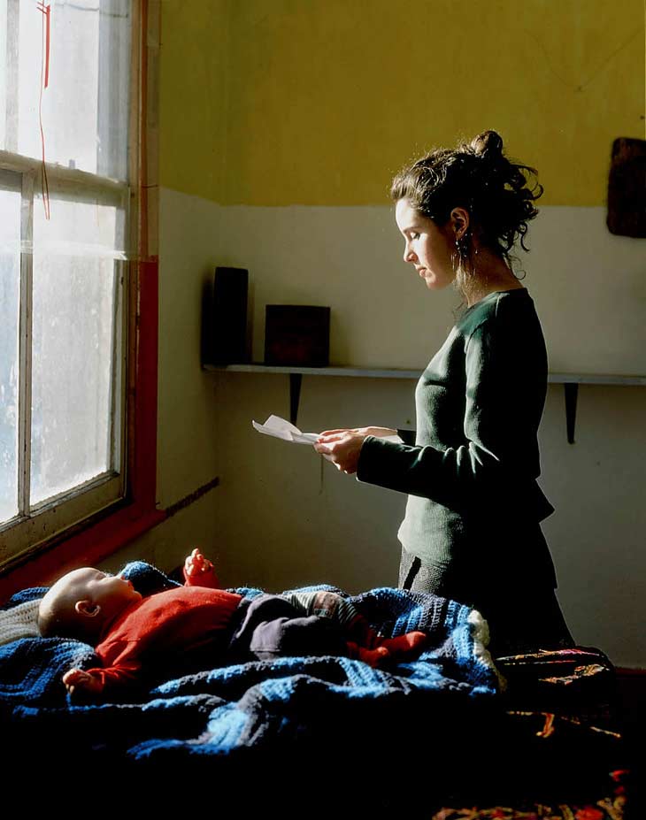
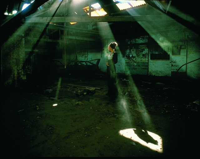
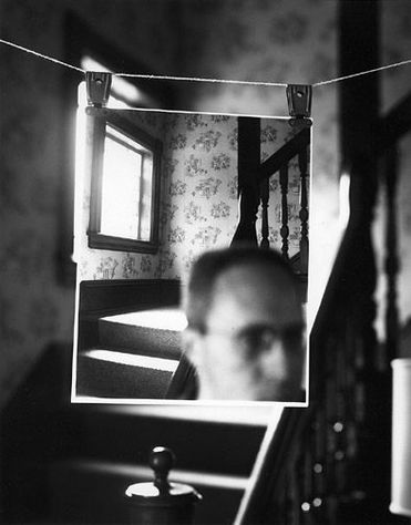
Openings- Richard Koeing- Pearl Street 4
In the photograph Pearl Street 4 by Richard Koeing, I can see a washing line holding up a photo of a set of stairs, in the background is the set of stairs, the photographer has made the background out of focus, in the photo that is being held up the stairs are in focus. There is also a man in the foreground of the picture however he is out of focus. All of the picture is in black and white, this adds to the spooky nature of the photo.
If I were to give the picture a name I would call it “Death”, I chose this word because the picture gives off a morbid feeling, there is no sign of positive life.
The photo combines both the themes of Abstraction and Openings, at a first glance the photo is more naturalistic but the more you attention you pay the more abstract it becomes, I think this is because of the use of layering the same location with the small photo in the foreground and the stairs in the background. The only visible source of light in the picture comes from a square window which is located above the stairs. This may be a contributing factor towards the photos mystery.
The section of the photo that I find to be the most interesting is the small photo which has been added into the scenery by the photographer, it is the most interesting part, in my opinion, because it also helps to build the spooky or mysterious atmosphere, it would also make the viewer ask questions like “Who is the man in the picture and what is his relevance in the picture?”.
The name of the photo is “pearl street 4”, this title to an unknowing viewer would make no sense, if I was to give the photograph a new name I would call it “Grief”, this title would continue on the spooky vibe, it would still make the viewer ask questions like “Who is in grief?” or “Why are they grieving?”.
I think that this photo embodies the unknowing of a location, perhaps the picture in the foreground is of an older generation who used to live in this house, it could also represent not knowing the full story of a past event. I started to develop this idea because when I first saw this picture I was an unknowing viewer, this caused me to originally struggle to interpret the picture and what it stands for.
I think that the photo has lots of excellent qualities, for example the focus and the decision to make it black and white, the only criticism that I have for this picture is that the light causes to much of the photo to be obscured, this was most likely done intentionality.
I think that the layout of the picture is the main thing that I will remember abut it, I will defiantly be taking lots of inspiration from Koeing’s work, I will also be interested to see the other Pearl Street photos, this may give this photo more context.
|
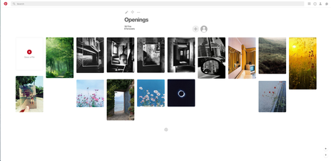
Here is a link to my pinterest board for the theme of Openings, it includes photos that are inspiring my final piece, there are also photos that I think fit my exact interpretation of what Openings are and what they can be.
It features artists like Rinko Kawauchi and Richard Koeing. |
Pieces of evidence for my final piece
|
For my final piece on Openings I have decided to mix elements from other themes like abstraction.
I have also taken inspiration from artists like Richard Koeing and Rinko Kawauchi. A person who has influenced the layout of my work is legendary fashion designer Raf Simons, more specifically a sweater that he designed for his 2002 Autumn collection. The scattered layout of the writing and pictures of the piece has really made me think about interesting was that I can layout my photos, it has also made me think about adding quotations into my work. Another inspiration for my final piece would be Tom Hunter and his photos, the thing that I like about Hunter's work is that it follows a bleak theme also the images could come off as spooky which is definatly an idea that I would want to explore when creating my piece. |
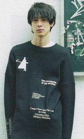
Raf Simons 2002 Sweater
|
first experiments
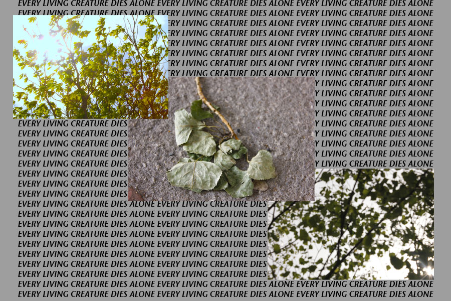
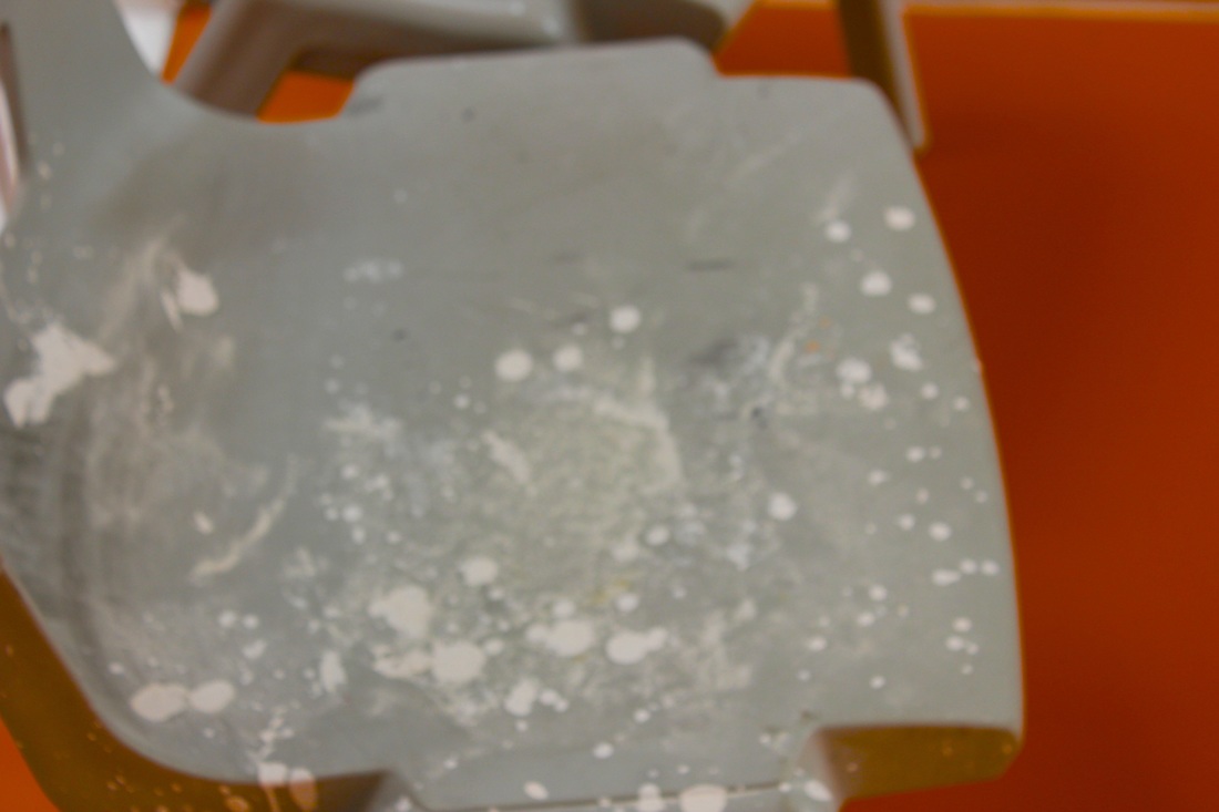
My first experiment for my final piece was intended to be a response to Karl Blossfeldt. Originally I was happy with the piece but now I feel like it is too messy and cluttered.
However I do like how obvious the theme of the picture is. Next time I will try to make the text more secluded from the images, I also want to remove the plain grey background, I think that I could replace it with a different image, I also dont like that the images are out of line.
However I do like how obvious the theme of the picture is. Next time I will try to make the text more secluded from the images, I also want to remove the plain grey background, I think that I could replace it with a different image, I also dont like that the images are out of line.
This was the second experiment that I made in relation to my initial idea. Visually there are alot of changes compared to the first experiment, firstly for this piece i decided to remove the text element, I did this to get an idea of how the layered images would look without the text, personally I prefer the images look with the text, it adds a contextual layer to the images and begins to show the cohesive theme that I have tried to create.
I used the same image twice to try and get an idea on how the repetition would visually effect the image
I used the same image twice to try and get an idea on how the repetition would visually effect the image
DAFNA TALMOR
Our class was handed the oportunity to spend a day in a workshop with an artist called Dafna Talmor. Dafna is an artist based London, her work has been displayed all around the world, her art consists of images that she has manipulated using other images. Here is some of her work.
In the images there are lots of empty, black spaces, this is because she has cut out a section of the image. The black space creates a puzzle for the viewer, they would have to work out what was previously there, what was happening when the picture was taken.
In the images there are lots of empty, black spaces, this is because she has cut out a section of the image. The black space creates a puzzle for the viewer, they would have to work out what was previously there, what was happening when the picture was taken.
The specific workshop that we took part in was called "Constructed Landscapes", in the workshop we were given a selection of random images from the past, the images were on film, Dafna showed us how she created her work and then sent us off to create our own personal responces to her art. The equiptment that we were given was a stanley knive, a balck and nail polish remover. The nail polish remover would act as an eraser and would obscure the original image.
Bellow are my four responces, before creating the images I wanted to create a scary and spooky vibe, I selected a few subtle images that created this kind of feeling and I got to work.
I feel that as a set of pictures there is a clear theme and all connect together.
My favourite image would be the first image because of the disruption of the light coloured photo with the dark obviously spooky image, I think when combined both of the images contrast each other and build a scary feeling for the viewer.
My least image is the third image, I feel that the two images together are ruined by the black space.
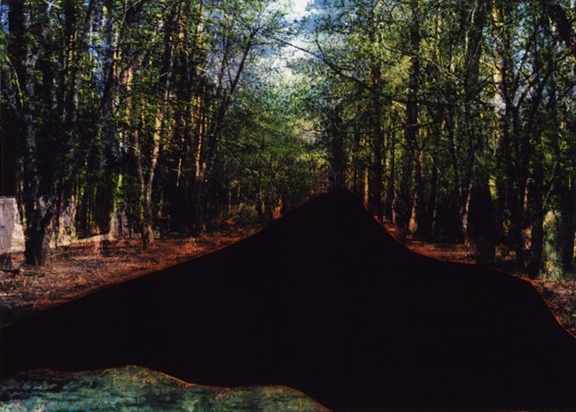
My final pieces
FIRST finAL PIECES AND EVALUATION
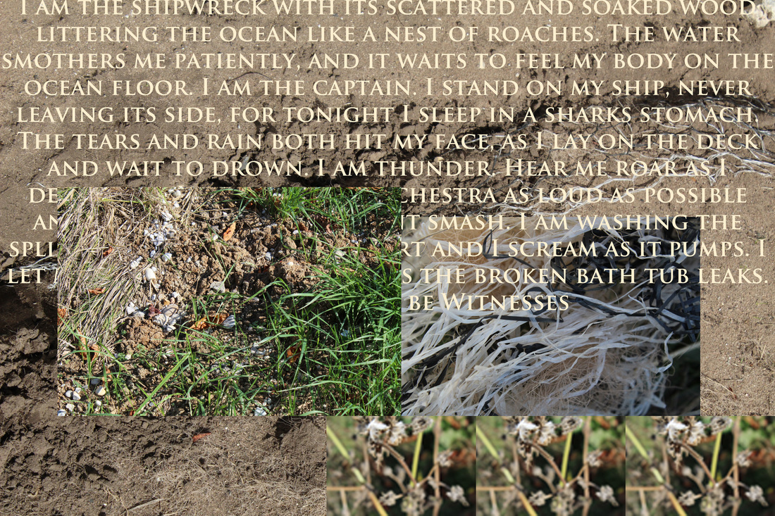
The three images above are my final pieces for the theme of Openings, the initial idea was to add photos to one base photo creating a window effect, the window would act as the opening.
The theme of the photos is that eventually despite its beauty, everything will start to decay and then die, that is why i decided to incorporate nature into the pictures, nature is the perfect example of the cycle of life and the inevitable death of everything.
At the start of the project I was looking for new and interesting ways of laying out images, one specific thing that caught my eye was a fashion designer called Raf Simons. Simons has in prior collections experimented with patches and scattered layouts. The piece that caught my eye was the Poltergeist sweater from his 2002 Autumn Winter collection. The sweater uses a mixture of images and text to create a spooky theme, the layout of the images and writing is very scattered and creates almost an organised chaos.
Along with the sweater I was inspired by Rinko Kawauchi and her unique use of colour and focus, her work does not follow the typical characteristics for the theme of openings, this is why I am so drawn to the artists work.
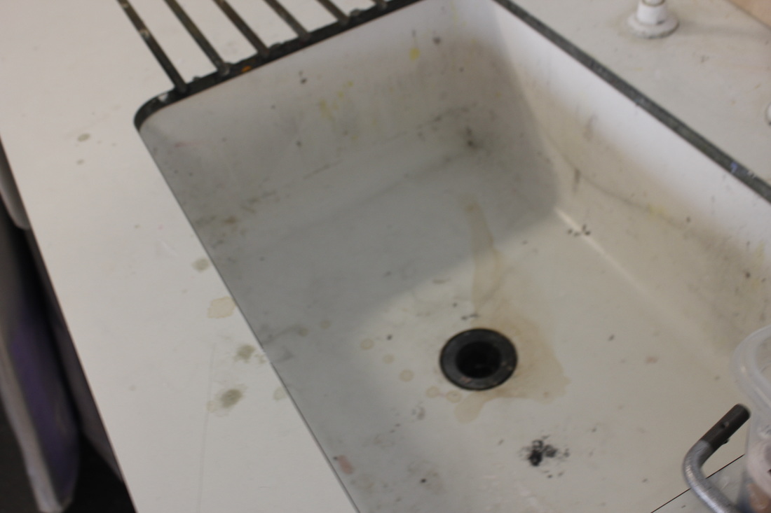
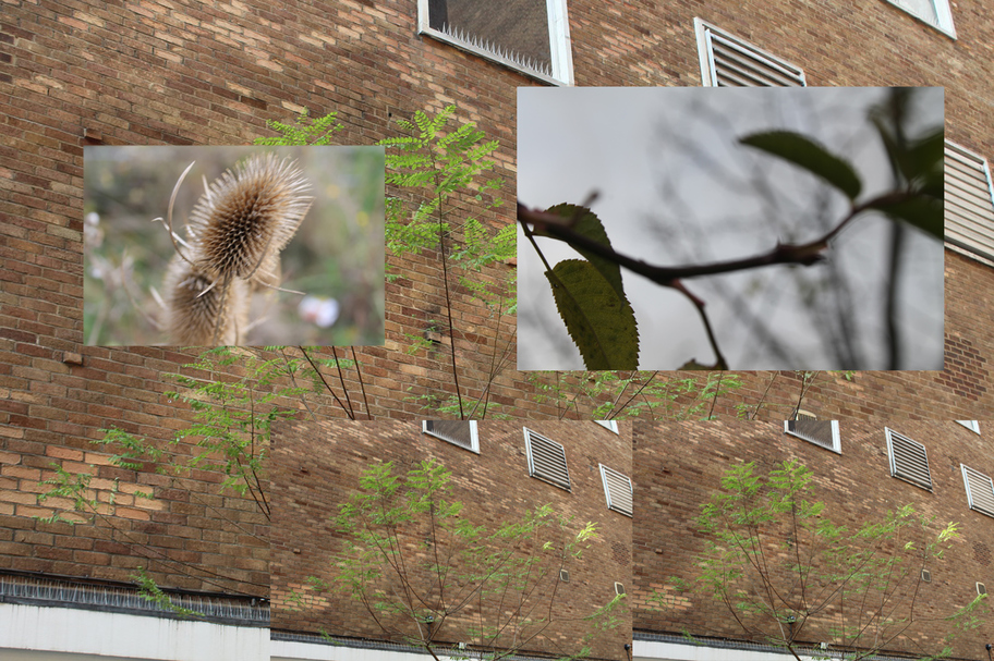
I then started to take a collection of photos that I felt would help me create my pieces, whilst wondering around I noticed this shredded plastic and rope tied in a long knot, this made me think of shipwreak and a nautic theme.
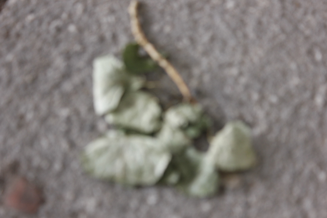
I then took three other pictures from the surrounding area, I tried to keep a colour scheme of beige, white and green.
I imported the pictures into photoshop where I began to layer the images, once I had organised them I still felt like I could make the image more complete, I then found a quote that fitted with the nautic theme. Once that had been copied onto the picture I was happy with it.
I like this specific piece because it fits in with a unique theme whilst still linking back to Openings. To make the image better I feel like I could refine the spacing of the text, I could shift it so that it would be pushed to the left of the picture.
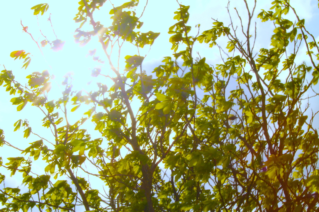
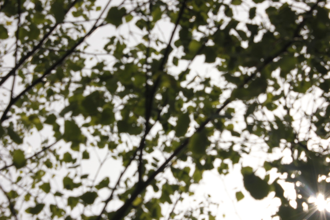
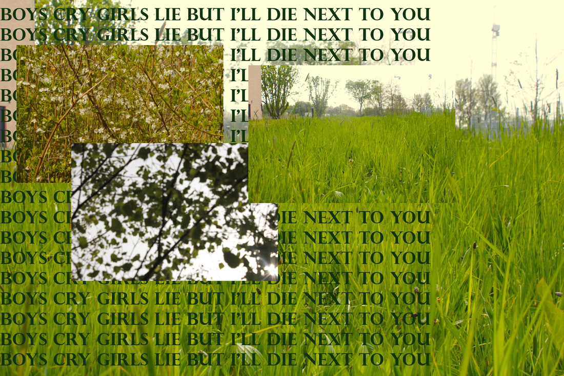
For the second piece I wanted to make a brighter image with more colour, I still wanted to use Kawauchi's combination of nature and openings. I started to take pictures looking up at trees from a low angle, by doing this I can almost create a silhouette of the branch, I was able to take a picture that still has colour to it but has very defined lines and edges, I then thought that as the background of this image is a very pale blue and white that it would be perfect for a window, I decided to then take pictures of the grass and trees, this added lots of green into the image.
Once again I started to layer the images, once layered I wanted to add a layer of text, I chose to use the chorus from the song that I was listening to, once added the second image was complete.
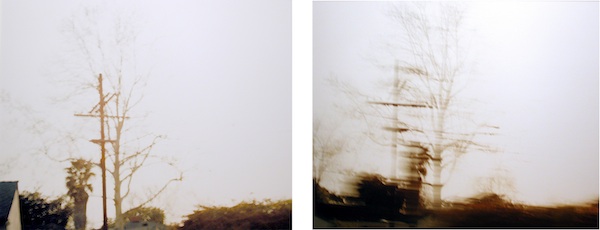
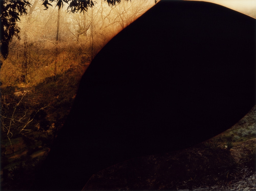
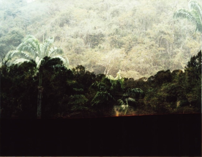
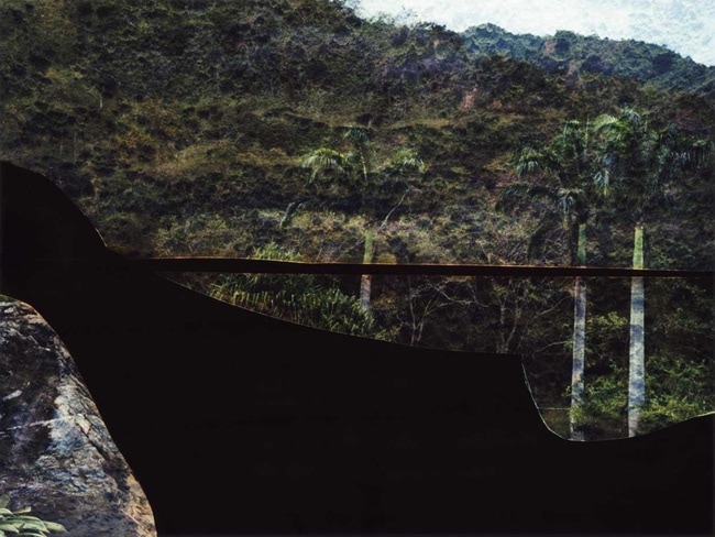
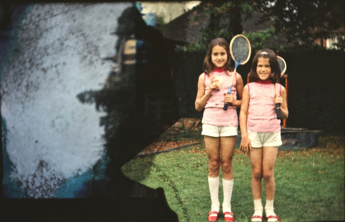
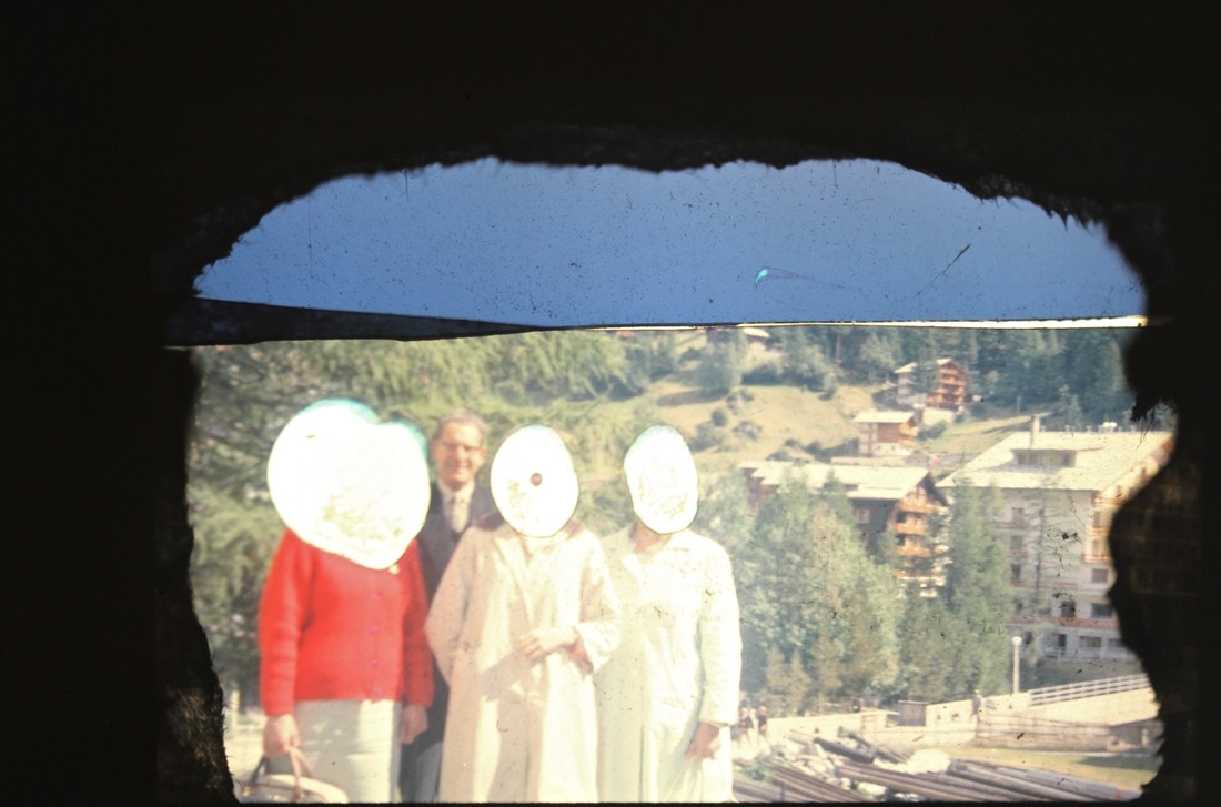
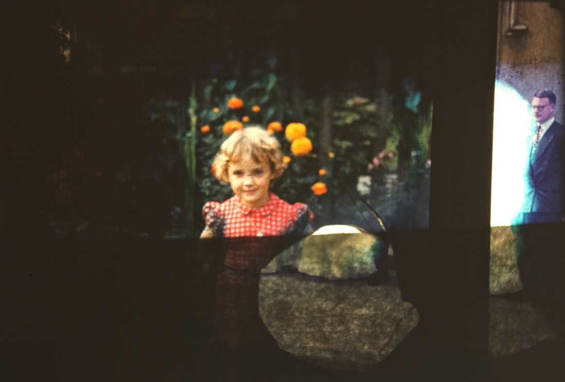
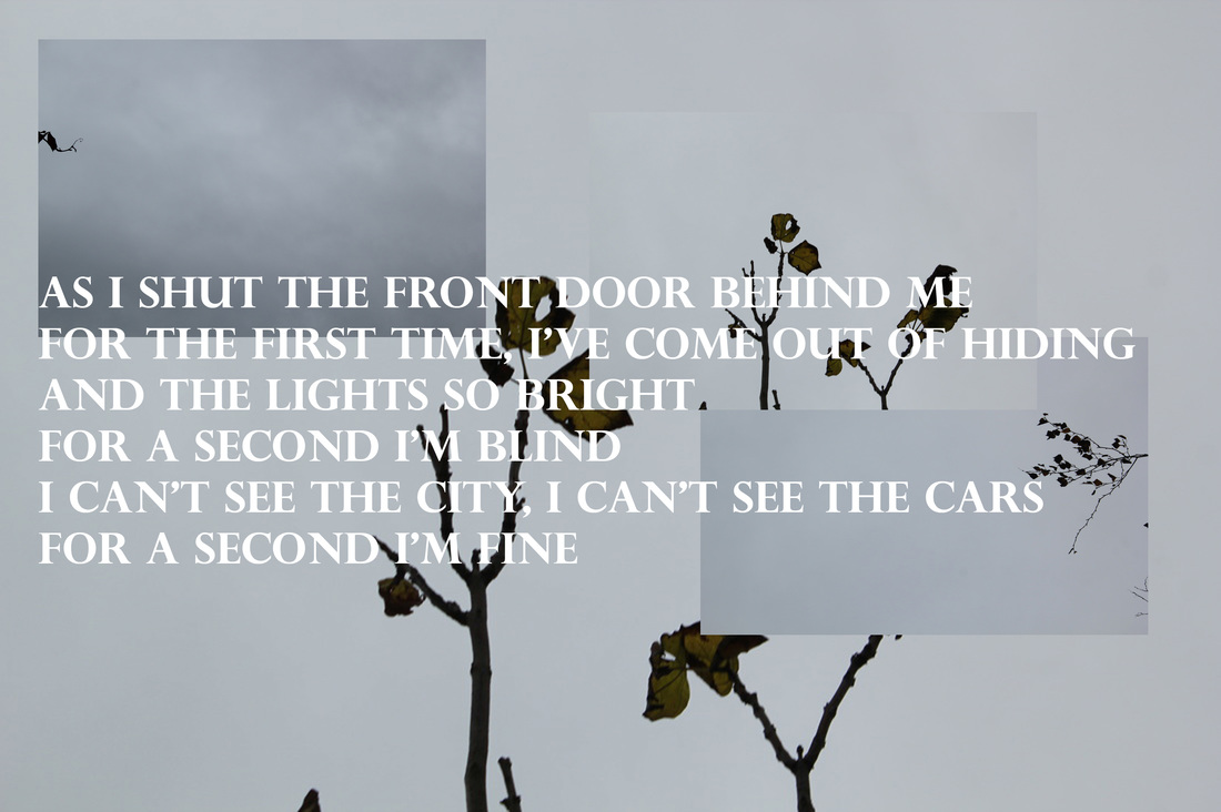
For the final picture of my piece I wanted to create an image that was darker and less colourful. As I was searching for inspiration on the internet I stumbled across three old pictures that are in the edges section of my page, I felt that I had found the perfect images to create my photo.
I put the pictures into photoshop and played around with the placements, I decided to remove one of the images and repeat one of the other images but at a smaller size. I once again added song lyrics and the picture was complete, the specific lyrics I felt represented the feeling of the entire picture.
I like this image because it contrasts the first two images, it also follows a unique theme.
Overall I'am happy with the outcome of this project, I feel that I implemented my own unique and creative twist on a fairly average theme.
The theme of the photos is that eventually despite its beauty, everything will start to decay and then die, that is why i decided to incorporate nature into the pictures, nature is the perfect example of the cycle of life and the inevitable death of everything.
At the start of the project I was looking for new and interesting ways of laying out images, one specific thing that caught my eye was a fashion designer called Raf Simons. Simons has in prior collections experimented with patches and scattered layouts. The piece that caught my eye was the Poltergeist sweater from his 2002 Autumn Winter collection. The sweater uses a mixture of images and text to create a spooky theme, the layout of the images and writing is very scattered and creates almost an organised chaos.
Along with the sweater I was inspired by Rinko Kawauchi and her unique use of colour and focus, her work does not follow the typical characteristics for the theme of openings, this is why I am so drawn to the artists work.
I then started to take a collection of photos that I felt would help me create my pieces, whilst wondering around I noticed this shredded plastic and rope tied in a long knot, this made me think of shipwreak and a nautic theme.
I then took three other pictures from the surrounding area, I tried to keep a colour scheme of beige, white and green.
I imported the pictures into photoshop where I began to layer the images, once I had organised them I still felt like I could make the image more complete, I then found a quote that fitted with the nautic theme. Once that had been copied onto the picture I was happy with it.
I like this specific piece because it fits in with a unique theme whilst still linking back to Openings. To make the image better I feel like I could refine the spacing of the text, I could shift it so that it would be pushed to the left of the picture.
For the second piece I wanted to make a brighter image with more colour, I still wanted to use Kawauchi's combination of nature and openings. I started to take pictures looking up at trees from a low angle, by doing this I can almost create a silhouette of the branch, I was able to take a picture that still has colour to it but has very defined lines and edges, I then thought that as the background of this image is a very pale blue and white that it would be perfect for a window, I decided to then take pictures of the grass and trees, this added lots of green into the image.
Once again I started to layer the images, once layered I wanted to add a layer of text, I chose to use the chorus from the song that I was listening to, once added the second image was complete.
For the final picture of my piece I wanted to create an image that was darker and less colourful. As I was searching for inspiration on the internet I stumbled across three old pictures that are in the edges section of my page, I felt that I had found the perfect images to create my photo.
I put the pictures into photoshop and played around with the placements, I decided to remove one of the images and repeat one of the other images but at a smaller size. I once again added song lyrics and the picture was complete, the specific lyrics I felt represented the feeling of the entire picture.
I like this image because it contrasts the first two images, it also follows a unique theme.
Overall I'am happy with the outcome of this project, I feel that I implemented my own unique and creative twist on a fairly average theme.
refining my first final piece
For my refined final piece I have decided to create a Fan Zine complied of images that I have created using the techniques and templates from my first set of final images. I think that by creating a Zine I will be able to demonstarte an understanding of my theme, it is also an intersting way of lay out a collection of photographs.
I will follow my first set of images with an even more cohesive collection of photos. My new pieces will continue on the theme of life and death but will also include ideas of suburbia and urban life.
In my previous pieces the images consisted of only nature, in my new work I want to try and implement humans into the pictures, I will the obscure them with the overlaping images creating the effect of an opening.
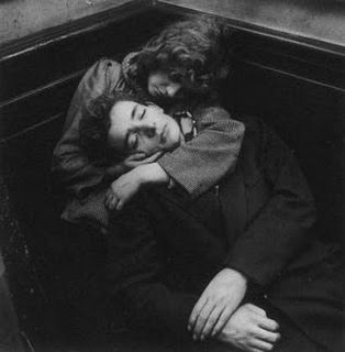
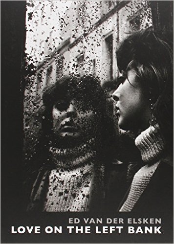
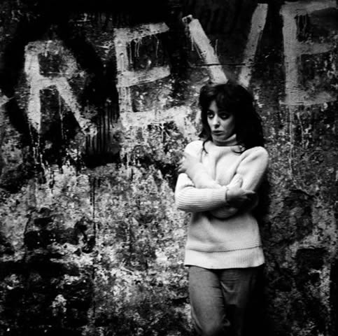
Ed Van Der Elsken
I was reading a photo book called Love on the Left Bank by Ed Van Der Elsken, the book is regarded as one of the classical photography books of the century, the book features photographs depicting the lives on locals who live on the the left bank of Paris, there is a clear story that leads through the pictures.
This interested me a lot because I would ideally like to have my final piece be a cohesive collection of photos.
There is also a meloncholic and nostalgic vibe to the photographs in the book.
Here are some images from the book.
This interested me a lot because I would ideally like to have my final piece be a cohesive collection of photos.
There is also a meloncholic and nostalgic vibe to the photographs in the book.
Here are some images from the book.
final images
Here are my final images that I will be putting into my Zine, the theme of the pictures is the realisation of eventual death whether in a more industrial or urban setting or in the midst of nature.
I made 18 pages to my zine using images taken in and out of school, the photos taken from outside of school for the most part act as the original image whilst the pictures from school are the windows, the idea of including text into my work was an idea that I developed early on in the project after viewing certain clothing pieces that used scattered quotes.
I made 18 pages to my zine using images taken in and out of school, the photos taken from outside of school for the most part act as the original image whilst the pictures from school are the windows, the idea of including text into my work was an idea that I developed early on in the project after viewing certain clothing pieces that used scattered quotes.
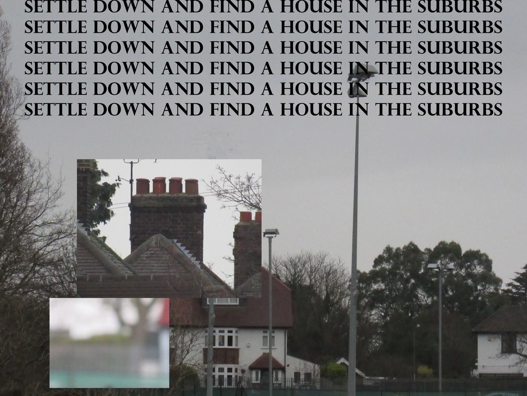
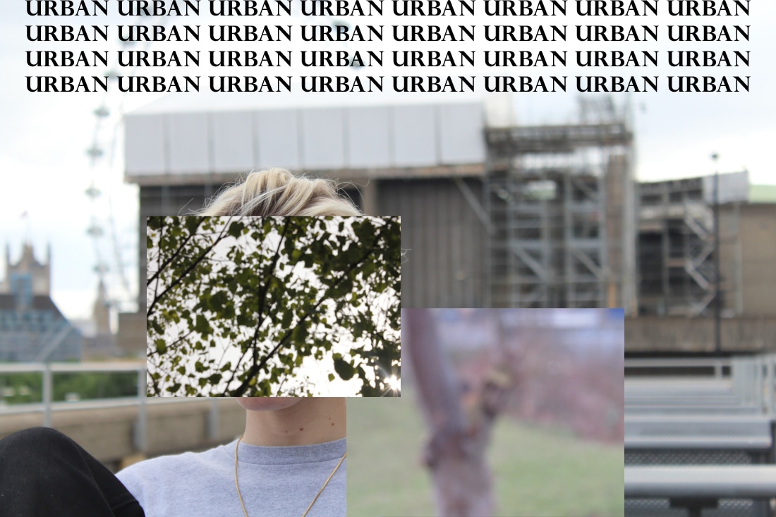
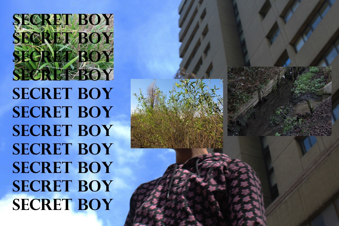
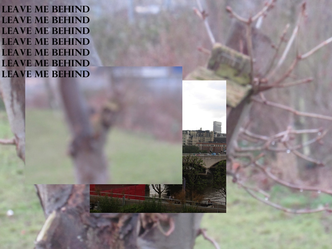
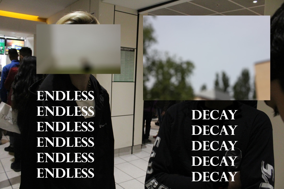
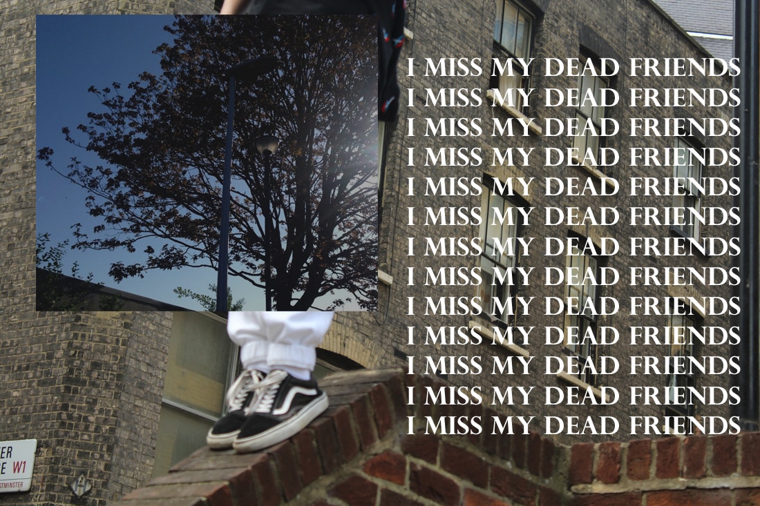
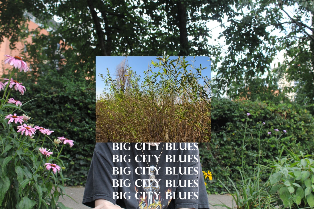
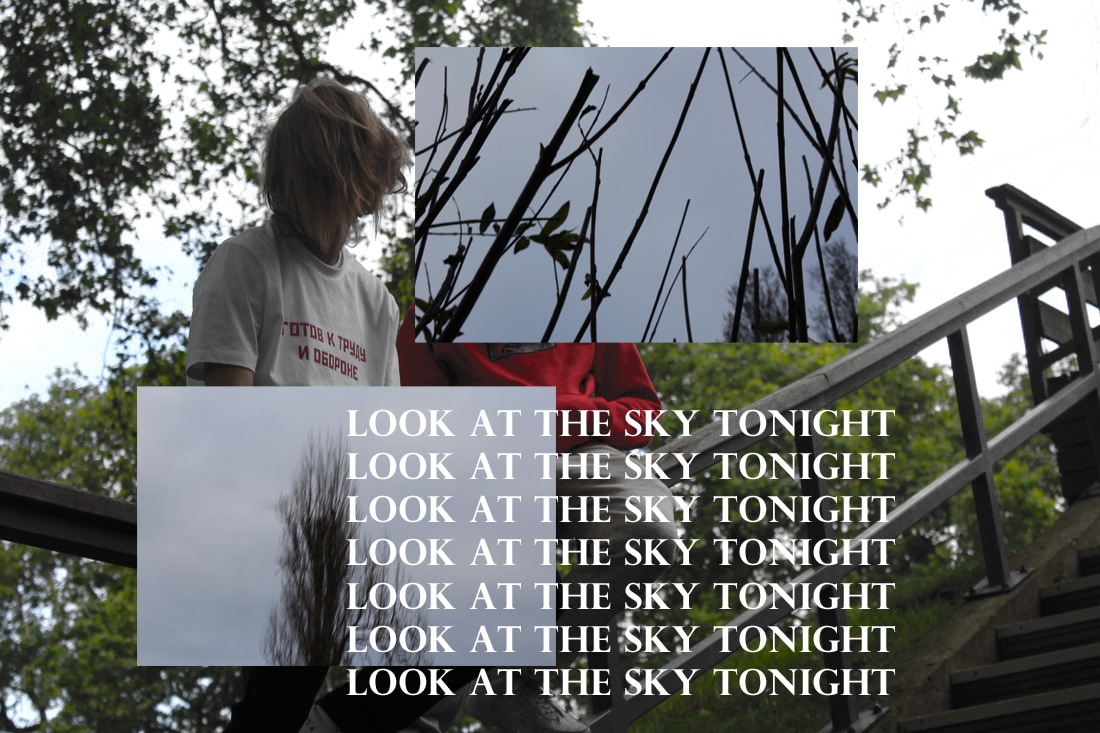
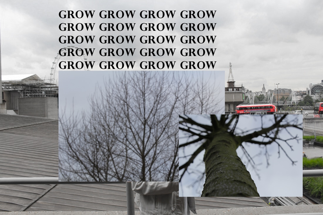
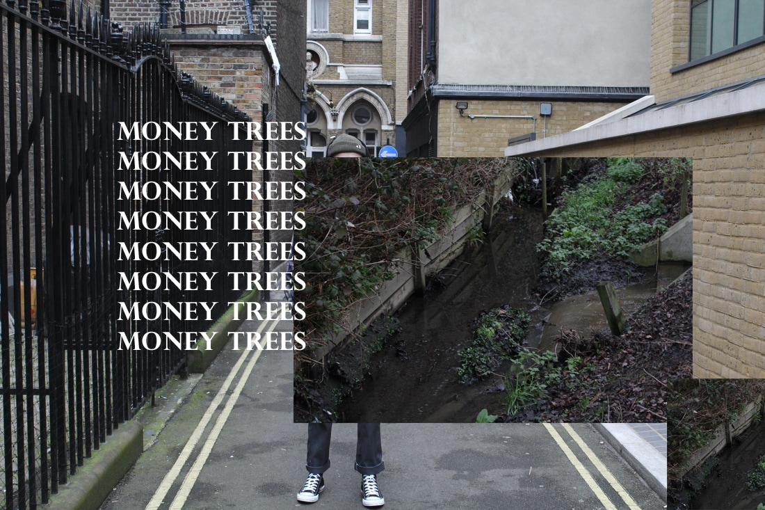
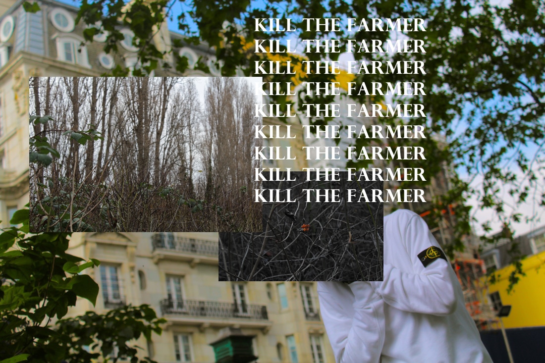
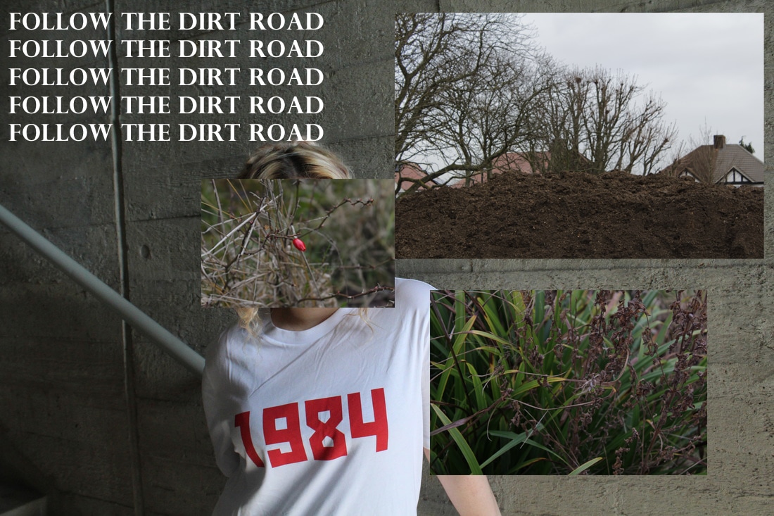
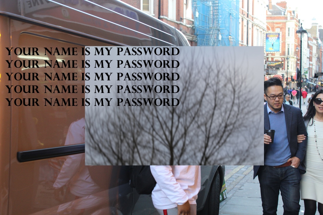
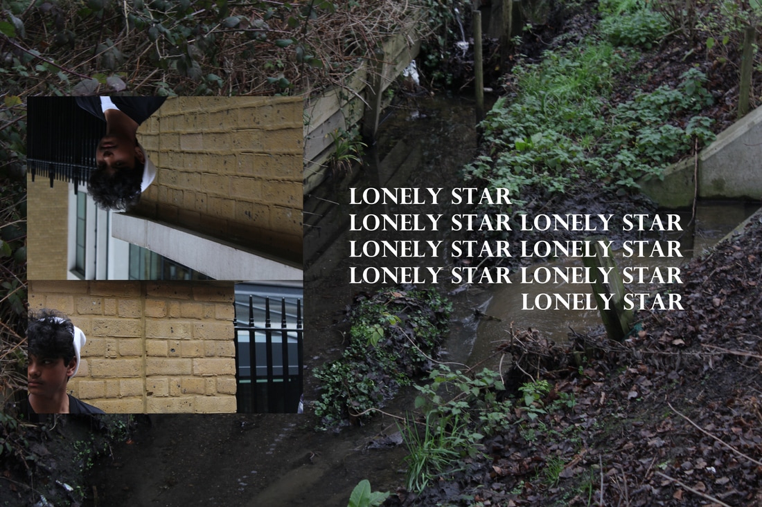
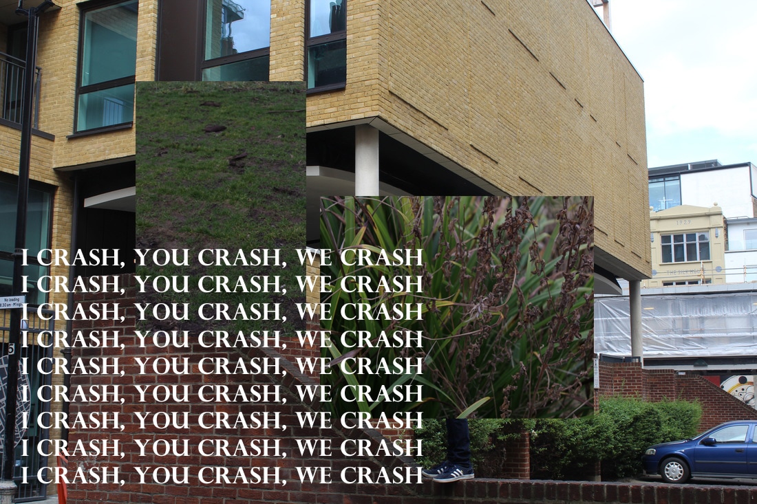
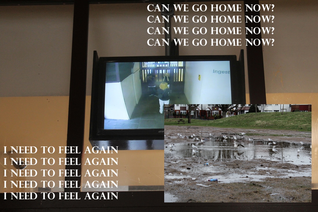
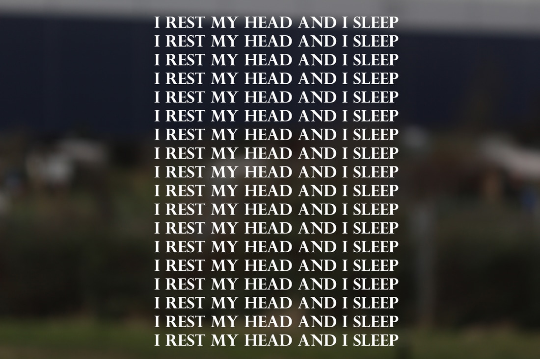
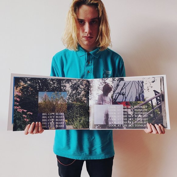
The outcome of my project was successful, I created an 18 image zine that featured photographs that I created by layering images which created a window effect which acts as an opening.
To improve my piece I could of written a blurb at the back of the book which would give the viewer an idea of what the themes presented are.
To improve my piece I could of written a blurb at the back of the book which would give the viewer an idea of what the themes presented are.
